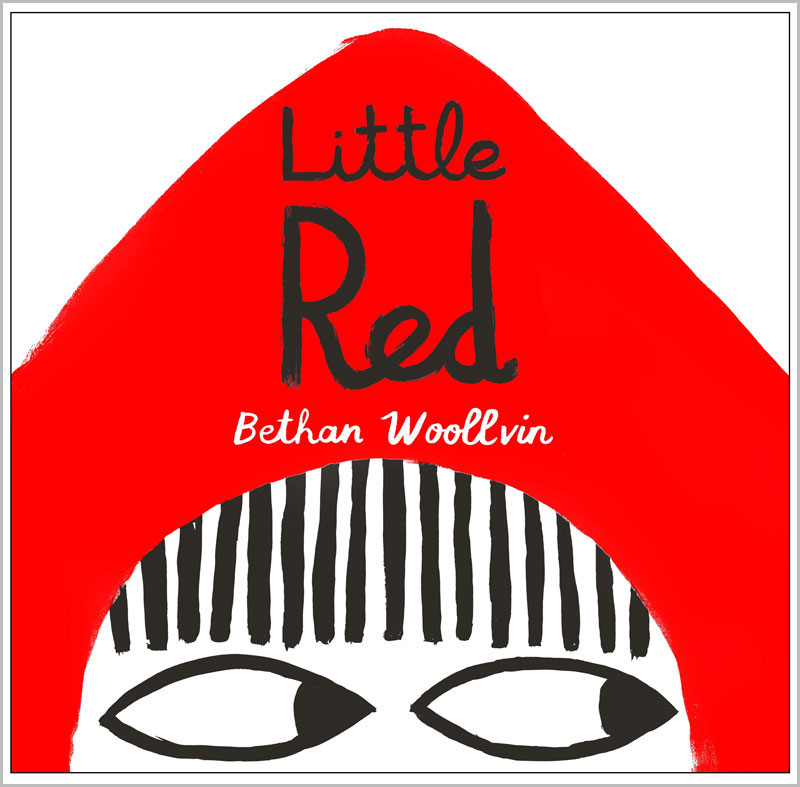
An interview with Suzanne Carnell, Publishing Director at Two Hoots, and editor of Little Red by Bethan Woollvin.
Little Red by Bethan Woollvin is one of five books on the shortlist for the 2017 Klaus Flugge Prize. The judges loved its humour and originality, and the way the apparently simply illustrations convey so much.
When did you first come across Bethan’s art and what was it about it that caught your eye?
Little Red was our winning entry in the Macmillan Prize for Illustration - a prestigious prize for students, which in its 32 year history has had many of today's best known illustrators among its winners. Bethan's wonderfully bold and graphic artwork stood out straight away, as did the wit and charm of her storytelling.
How complete, or at what stage was Little Red when you acquired it for your list?
It was a complete book. We worked with Bethan on some elements of the artwork, and on the text, but the book that we published was pretty much the same brilliant book that Bethan first presented.
Could you describe how you and your designers worked on the book with Bethan. What sort of editorial advice did you give her?
Emma Farrarons was Bethan's designer for this book. Bethan repainted much of it, in some cases tweaking the layout a little to help with the narrative flow. One of Emma's suggestions was the dramatic cover under the dust-jacket, which is so in keeping with the tone and character of the book, and such a wonderful surprise. We did some work on the text together to get the rhythm just right and bring out Bethan's natural wit - but the storytelling style is pure Bethan.
Which is your favourite spread in the book and why?
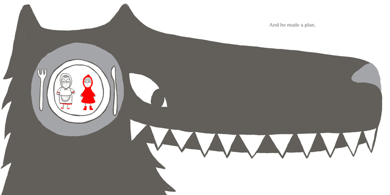
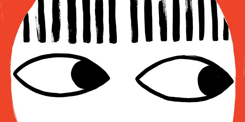
The whole book is a triumph, but I particularly love the wordless spread showing a close up of Little Red's eyes. It is hugely satisfying in itself, from the stark red, white and black (the only colours used throughout the book, and which we printed in pantone inks carefully chosen by Bethan) to the visible brushstrokes (which tell you this image has been made by hand, and offer a warmth and engagement that mechanically perfect, sharp lines would not). And then it is such a marvellous piece of storytelling, and a bold choice to have made. It acts as a pause in the middle of the sentence which begins on the previous spread (Which might have scared some little girls . . .) and finishes on the next one (. . . but not this little girl.) and it suggests so much. The page turn into this enormous close-up of Little Red's eyes is quite a shock, and also quite ambiguous - is she frightened after all? Is she about to be eaten? Or is she about to carry out her own clever plan? The previous spread shows the enormous jaws of the wolf poised over a diminutive Little Red, snarling the jagged words "EAT YOU WITH", and we all know how the story of Little Red Riding Hood should go from here. But Bethan's Little Red is not like other Little Red Riding Hoods, and the eagle-eyed among the audience will have seen that she is holding an axe in the previous spread. The wordless eyes spread carries the reader seamlessly from that moment to the next, where Little Red is seen dressed in a wolfskin. Exactly what has happened is not spelt out and Bethan has avoided the more obvious image of Little Red dispatching the wolf, but the eyes spread gives enough pause for the deed to have been done - the equivalent of a blackout on stage. The wolfskin coat is a witty nod to what has happened, but things are still a little ambiguous: because we didn't see the actual moment, we don't know whether Grandma might have escaped the wolf's belly, as in the traditional tale. Bethan would say not - once eaten by a wolf, you tend to stay eaten - but for those of a more delicate disposition, I would say we don't know for sure. Because all we have seen are those eyes. Read into them what you will.
What single piece of advice would you give to those wanting to make a career in children’s book illustration?
For me the most important thing is to develop your own style, and be true to yourself. Look at the work of others and take your influences, but then take the time to master your chosen medium for yourself. Especially at the beginning of their career, when they are still finding their own "voice", illustrators often seem to mimic current favourites in the field, and there are undoubtedly fashions in book illustration as there are in anything. But the artists whose work really stands out, which lasts, and which publishers are always looking out for, are the true originals -- the illustrators whose work is full of character and personality, who have their own way of looking at the world, and a line that could only come their pen, or brush, or pencil. And Bethan Woollvin is a wonderful example of that: confident in her approach and her vision, and unlike anyone else.
The Klaus Flugge Prize is funded personally by Klaus Flugge and run independently of Andersen Press.
Website maintenance & Copyright © 2024 Andersen Press. All Rights Reserved. Privacy & Cookie Policy.
