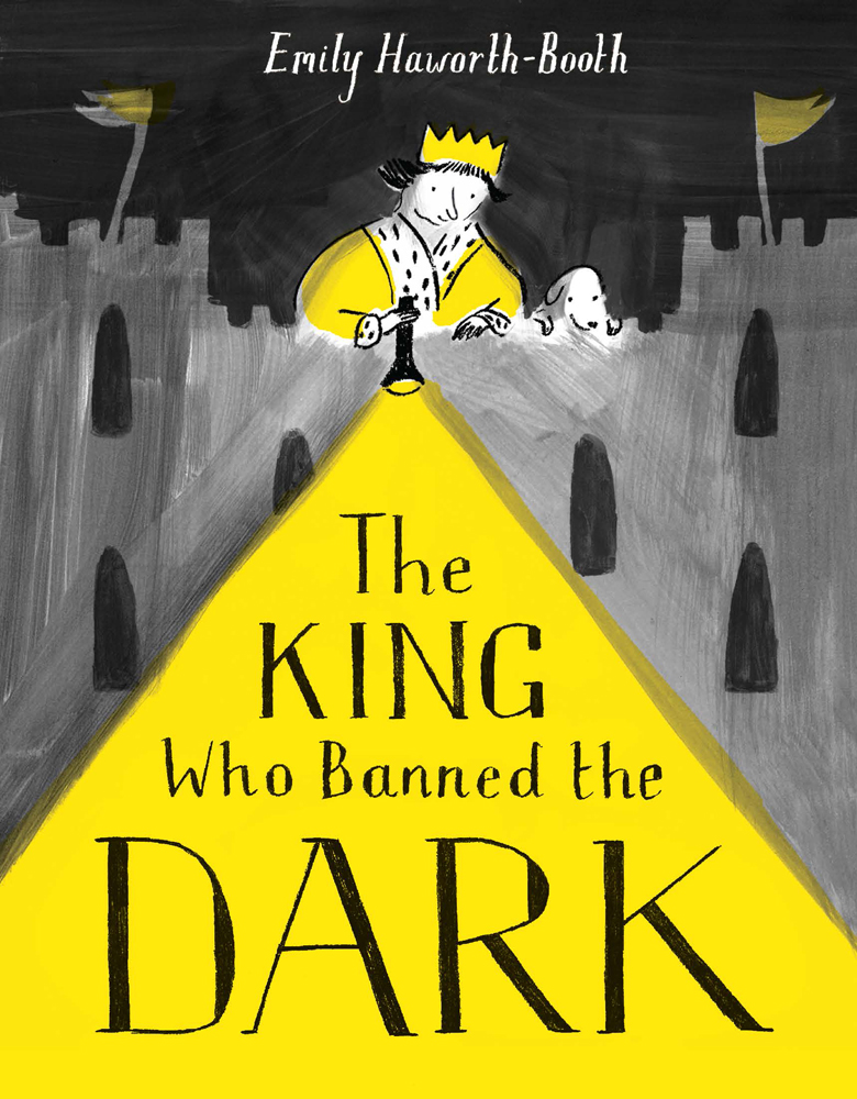
The King Who Banned the Dark, illustrated by Emily Haworth-Booth
The King Who Banned the Dark written and illustrated by Emily Haworth-Booth is one of the six books on the shortlist for the 2019 Klaus Flugge Prize.
The judges thought it was a great idea and praised the way Emily Haworth-Booth makes the most of light and dark. They found lots of variety in the use of page layout, and lots of surprises, and described the book as full of energy and humour.
Here Emily Haworth-Booth describes the effort she put into creating her all-important opening scene.
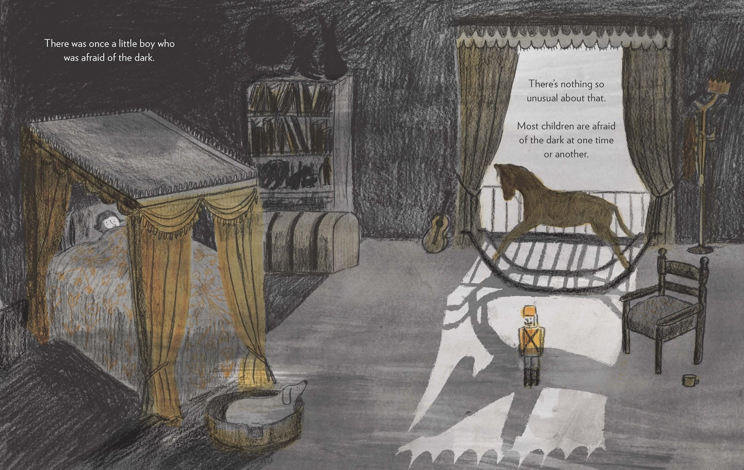
There were many challenges for me in creating the artwork for The King Who Banned the Dark! Perhaps the trickiest thing to manage was the slow move throughout the book from dark to light and back again, while keeping the artwork consistent enough for it to feel like it all belonged in the same book. The first spread was therefore of special importance in setting the base marker of darkness to which the rest of the book would relate, contrast and return.
When I showed the dummy book to my publisher (Pavilion) I only had three spreads of ‘finished’ artwork, including this opening image. However, the image that I considered finished at this point ultimately went through more changes than any other page in the book.
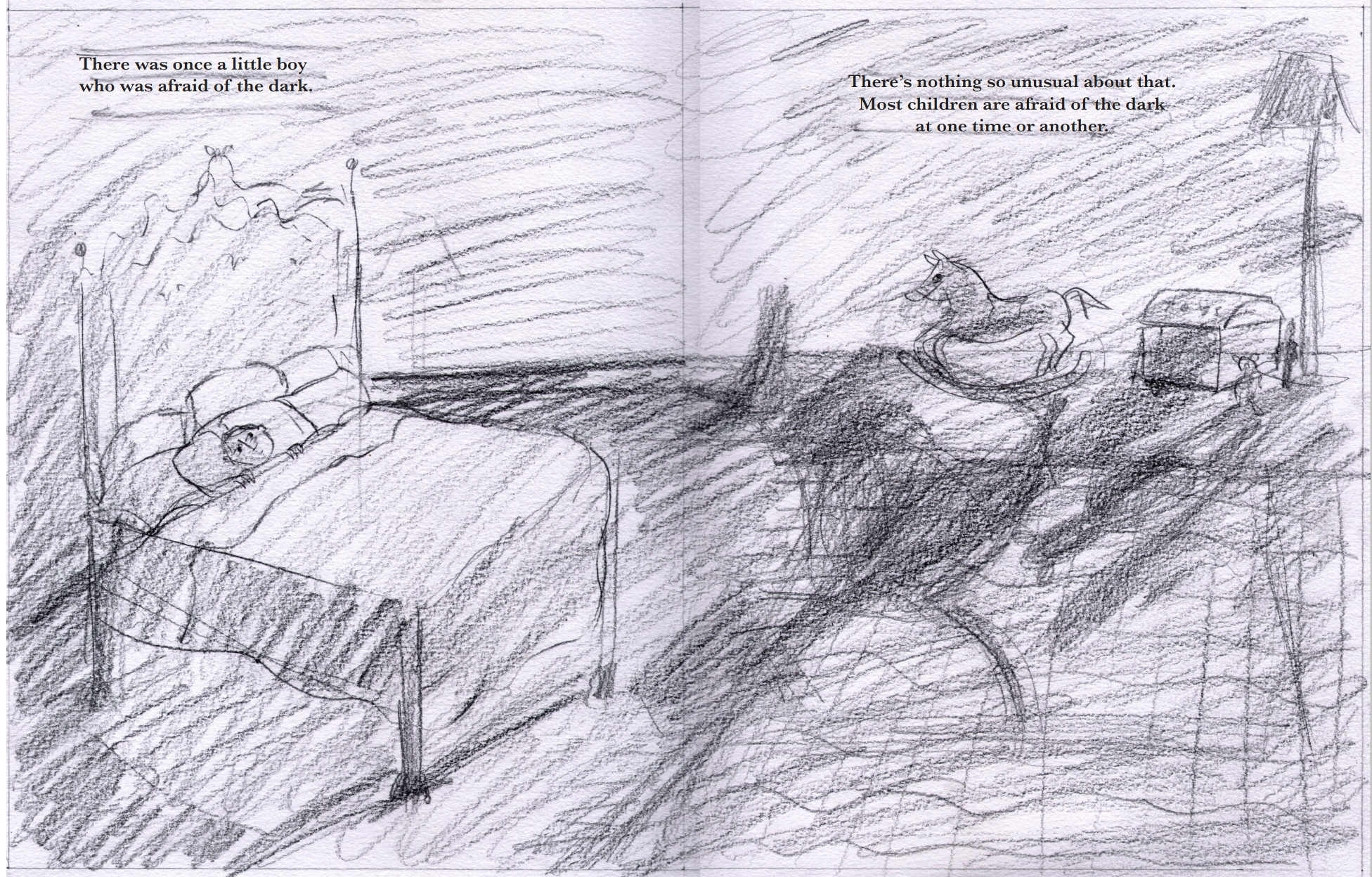
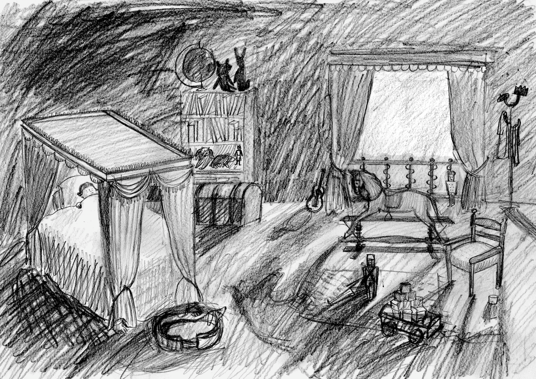
Here’s how it looked when I first began showing it to publishers:
I’d focused only on what I saw then as the two main elements of the image: the dark, and the little boy’s fear.
Once I began working with Pavilion, they pointed out quite rightly that the room would need to look much more ‘royal’ to hint that the boy’s bedroom was in a palace. And also that it would need to include more childlike elements such as toys.
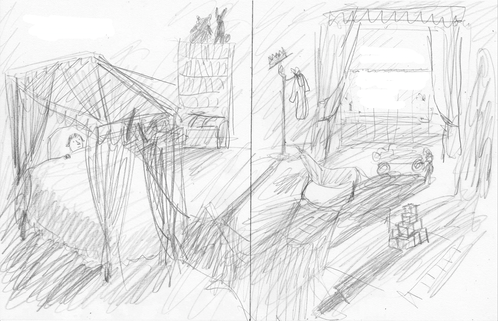
I’m quite embarrassed to be showing my roughs on here: I have been accused before of doing ‘lazy’ roughs. But like my retired greyhound, I’m a bit of a sprinter – I know the process of making a book takes so much energy that I like to save mine for the bits that really matter rather than spending hours making perfect roughs that I end up having to throw away. That can be really dispiriting.
I soon re-drew this rough to include a window as I realised that the picture also needed to have a light source to create the shadows that would make the composition more interesting and spooky, but a lamp or open door would undermine the sense of being trapped in a dark room. I also added a four poster bed, and some more toys and objects that would not only look (I hoped) royal and childlike, but also help in the creation of interesting shadows.
Before making a tighter pencil drawing I spent a day at the Royal Pavilion in Brighton looking at and sketching furniture and immersing myself in the feeling of a rather overblown Regency aesthetic!
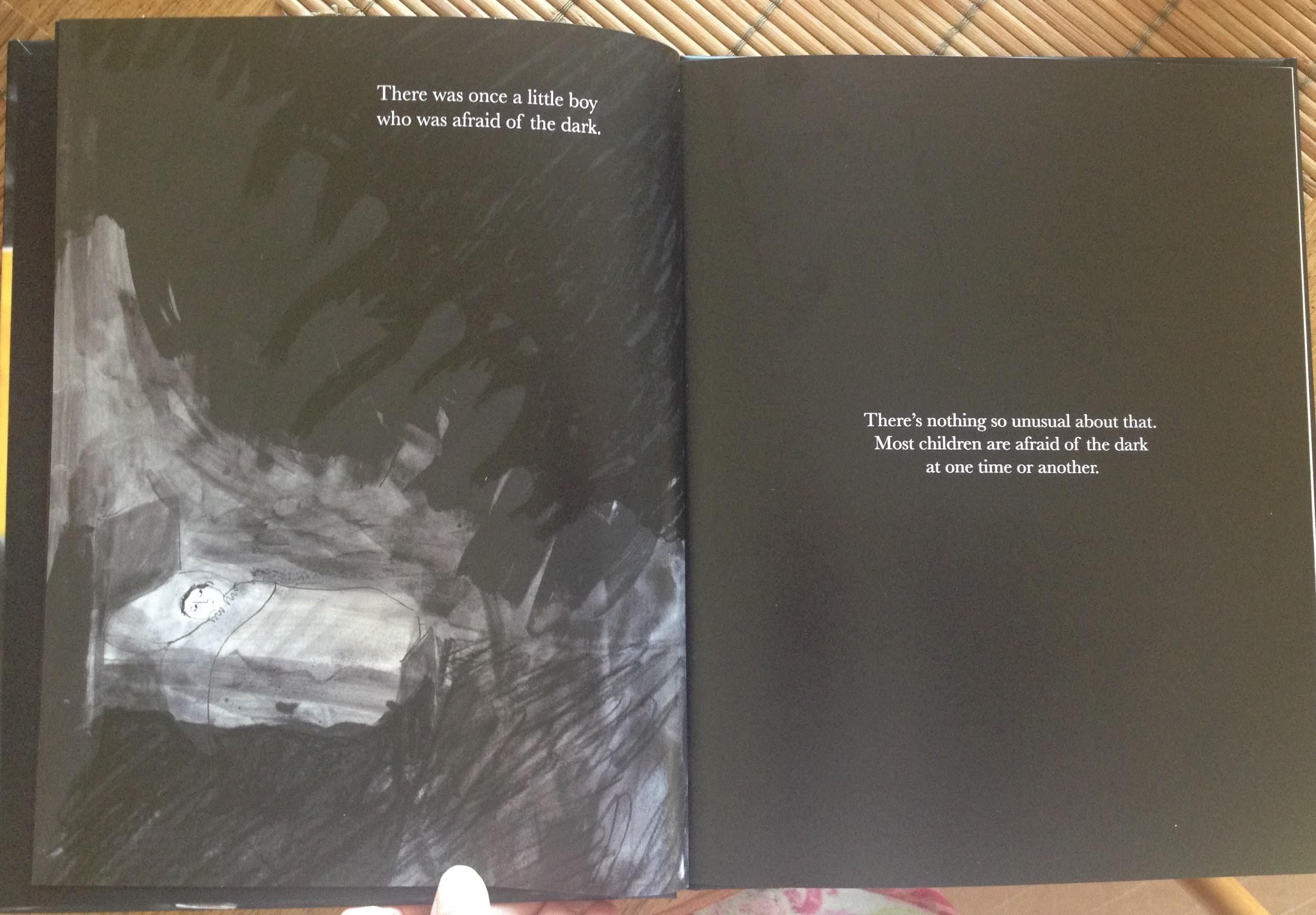
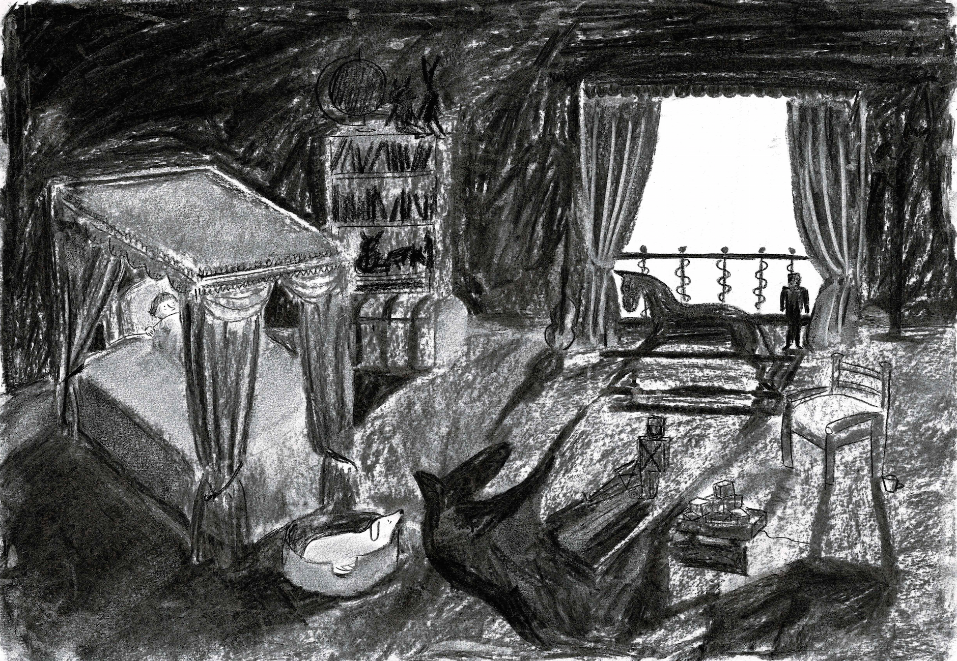
I knew that the final artwork would include some combination of ink, watercolour, charcoal, conté crayon and pencil, with the layers created on a lightbox and put together in photoshop – but I wasn’t sure yet what would create the right balance for this image. I tried it in charcoal, but saw immediately that in my unpractised hands (I don’t use charcoal very often and have never found it easy) it lost a lot of subtlety.
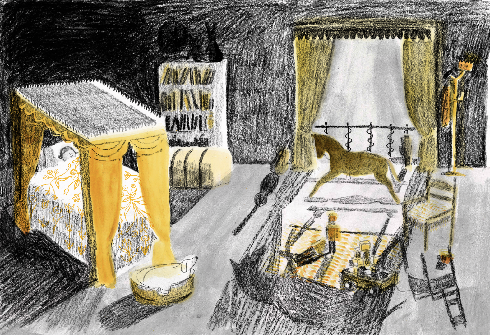
I moved back to conté, pencil and ink which was better, and added the yellows to brighten up the image a bit.
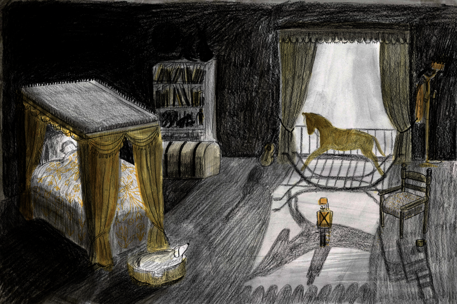
There was a lot of discussion with my editor on the theme ‘how dark is too dark?’ We wanted the child reader to be able to empathise with the young Prince by feeling the power of the darkness to frighten and overwhelm, without being so frightened that they wouldn’t want to keep reading. It also had to feel believably like a night-time scene, whereas in the image above, it feels more like early morning! It took a few more goes before I got the balance right. In the image below, for example, the darks are too dark and the lights too light.
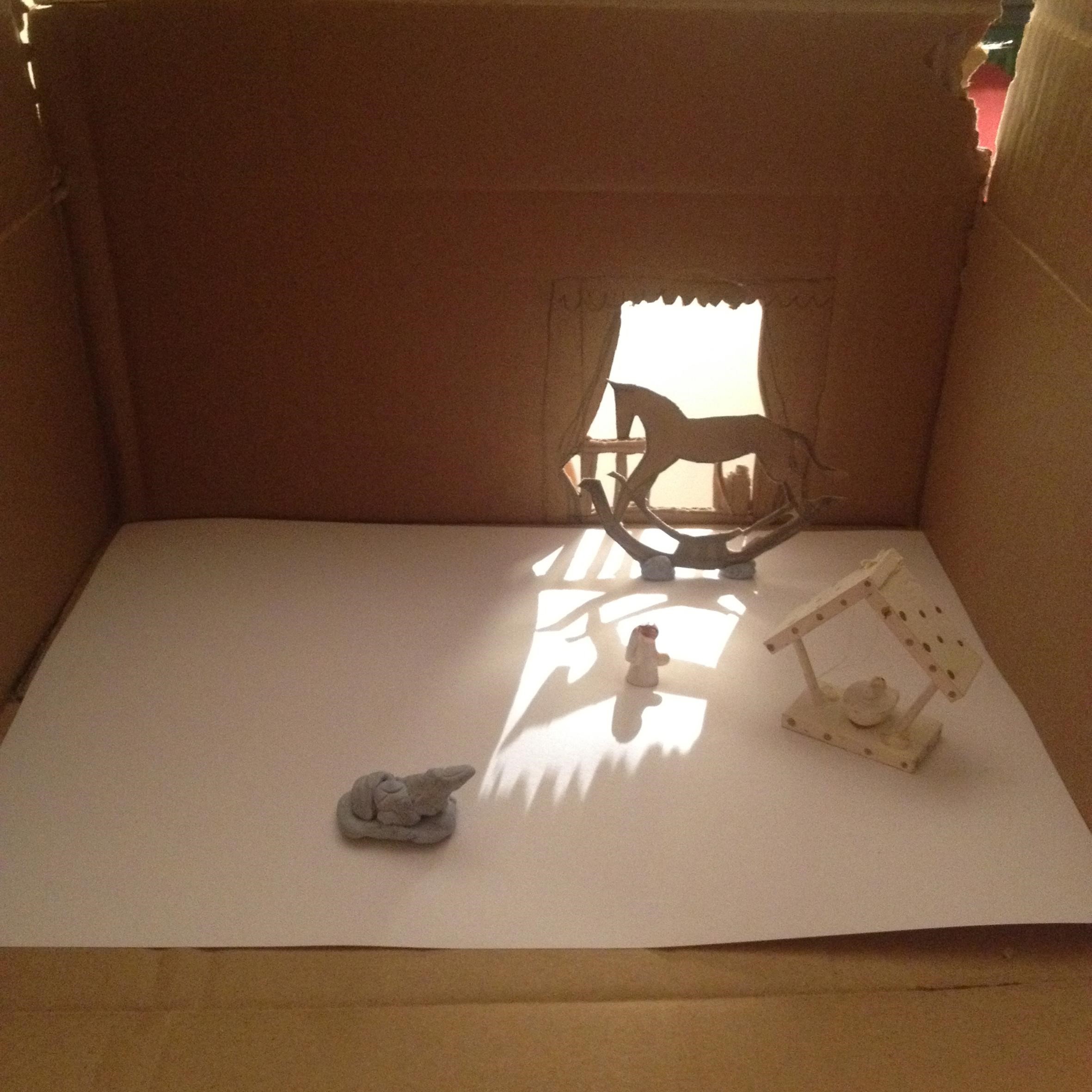
The other problem I had was with the shadows on the floor. There were too many objects and I couldn’t figure out what kind of shadow-shapes they would make. In the end I had to make a mock-up of the room out of a cardboard box, make a rocking horse out of cardboard and use some Christmas ornaments and blu tack to approximate the objects in the room – then ask my sister to shine a torch through the window while I took a photo from the other side. I then based the floor shadows on this photo. I don’t have the kind of brain that can imagine a complicated floor shadow like that in my head!
A lot of people whose work I really love, like Beatrice Alemagna and Violeta Lopiz, or Chris Ware and Marjane Satrapi, wouldn’t really come to mind from looking at this image! I have made comics for a long time and I teach graphic novels, so I suppose there is a sort of comic-book aesthetic in some of my pictures, but mixing here and there with something a bit softer and more painterly maybe. You might more readily recognise the influence of the amazing Pam Smy in this spread. She was one of my tutors on the MA in Children’s Book Illustration at Anglia Ruskin and taught me most of what I know about using tone in a composition, along with so much else!
I’m pleased with how the image turned out, although I was disappointed to realise that when a page is printed the blacks are never as black as the blacks on your screen when you’re working on an image in photoshop, and the lights are never as light. The production department did quite a few proofs to get it as close as possible to the original. I think they were quite sick of me by the end of the process, and I was a bit sick of myself! But I learned from making this book, and this image in particular, that it’s worth persevering to get an image right, because as the author you have to live with it forever – and often solutions that aren’t immediately apparent will come with a bit of experimentation.
The King Who Banned the Dark is published by Pavilion Children’s Books.
The Klaus Flugge Prize is funded personally by Klaus Flugge and run independently of Andersen Press.
Website maintenance & Copyright © 2024 Andersen Press. All Rights Reserved. Privacy & Cookie Policy.
