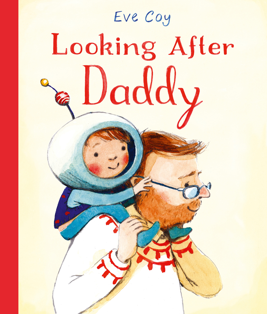
Looking After Daddy, written and illustrated by Eve Coy
Looking After Daddy written and illustrated by Eve Coy is one of the six books on the shortlist for the 2019 Klaus Flugge Prize.
The judges admired the way the images tell their own stories and the interplay between text and illustration. Eve’s book brought smiles to everyone.
Here Eve Coy describes creating the book, and that interplay between text and illustrations.
I’ve been thinking about the visual development of two spreads for Looking After Daddy; the first depicts a little girl giving her Dad a picture, the second shows her imaginative play as a chocolate maker/detective.
The story of the book is about a day through the eyes of a little girl who is role playing, ‘being Mum to her Dad’. Throughout the story the text can be interpreted as an adult looking after a child, but the visuals show the reader that actually it’s the little girl’s game. When I was developing this story, I read a theory about picture books that said how the text of a picture book is for the adults whilst the pictures are for the children. I loved the idea of sharing a secret with the children through the visuals that wasn’t in the text.
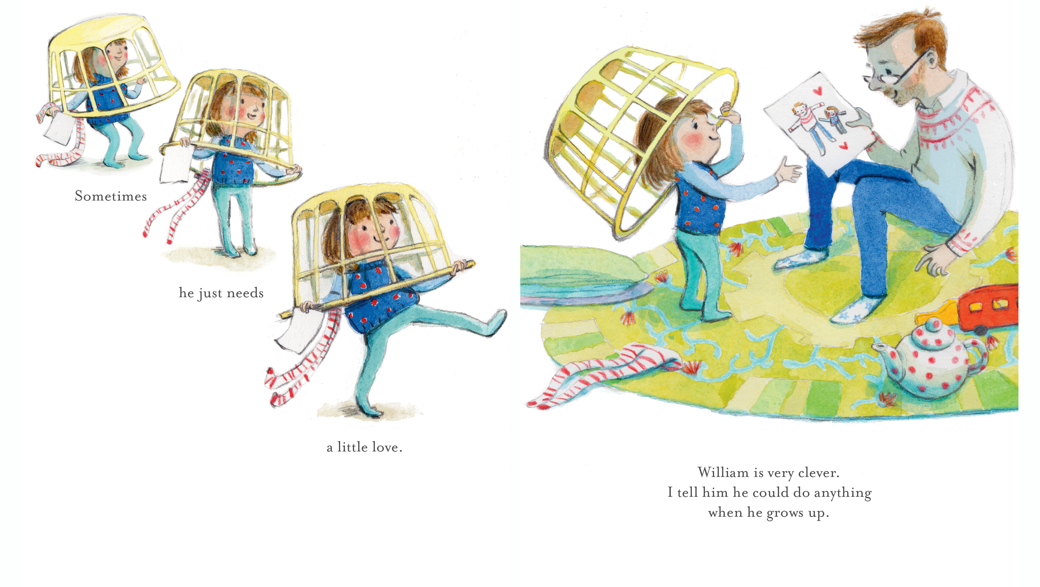
The first spread I want to share is an important spread in the book. It depicts a moment when the father, William has hurt himself and the little girl skips over to give him a picture that she has made to cheer him up. Throughout the early part of the book the little girl is waking him up and getting him ready in a somewhat unhelpful childlike manner. However, when he is hurt she realises that, “Sometimes he just needs a little Love”. This is the spread in the book where she actually behaves most like a parent, by showing compassion for her father and hopefully it makes it clear that their relationship is a very loving one, and that she has learnt to relate in this manner from her father. Following this spread the images change and are set less in the domestic real world and more in her imagination as though both father and daughter are now playing along together.
For the spread of the little girl skipping over to her dad, I’ve depicted her wearing a laundry basket with tights hanging out the back. Throughout the early pages I put in visual clues to show that Dad is interested in space travel. Here I’m showing the little girl has dressed herself up as an astronaut carrying the card to cheer up her dad and maybe even engage him in play.
This is my first book and previously I had worked as a story artist in animation. This is one of the reasons I like to depict my characters mid-movement which I think makes them feel more alive, at least this is my intention. However, this animation background meant I had only really ever drawn in black and white, so colour was something entirely new to me. I wanted to keep the colour palette bright and childlike to represent that the narrative is that of the little girl. I have been inspired by so many artists and illustrators whilst developing the artwork for this book including Rebecca Cobb who I admire greatly for her use of colour, Emily Gravett for her beautiful character studies and Carson Ellis who paints stunningly without much use of line. I noticed that many of the artists that I admired worked traditionally. Thus I felt I wanted to explore traditional painting for this book. I ended up using Windsor and Newton watercolour paints with pencil crayons to add detail. Being new to watercolours I became anxious/obsessed about working out different pigment qualities and even ended up dreaming about granulating blues!
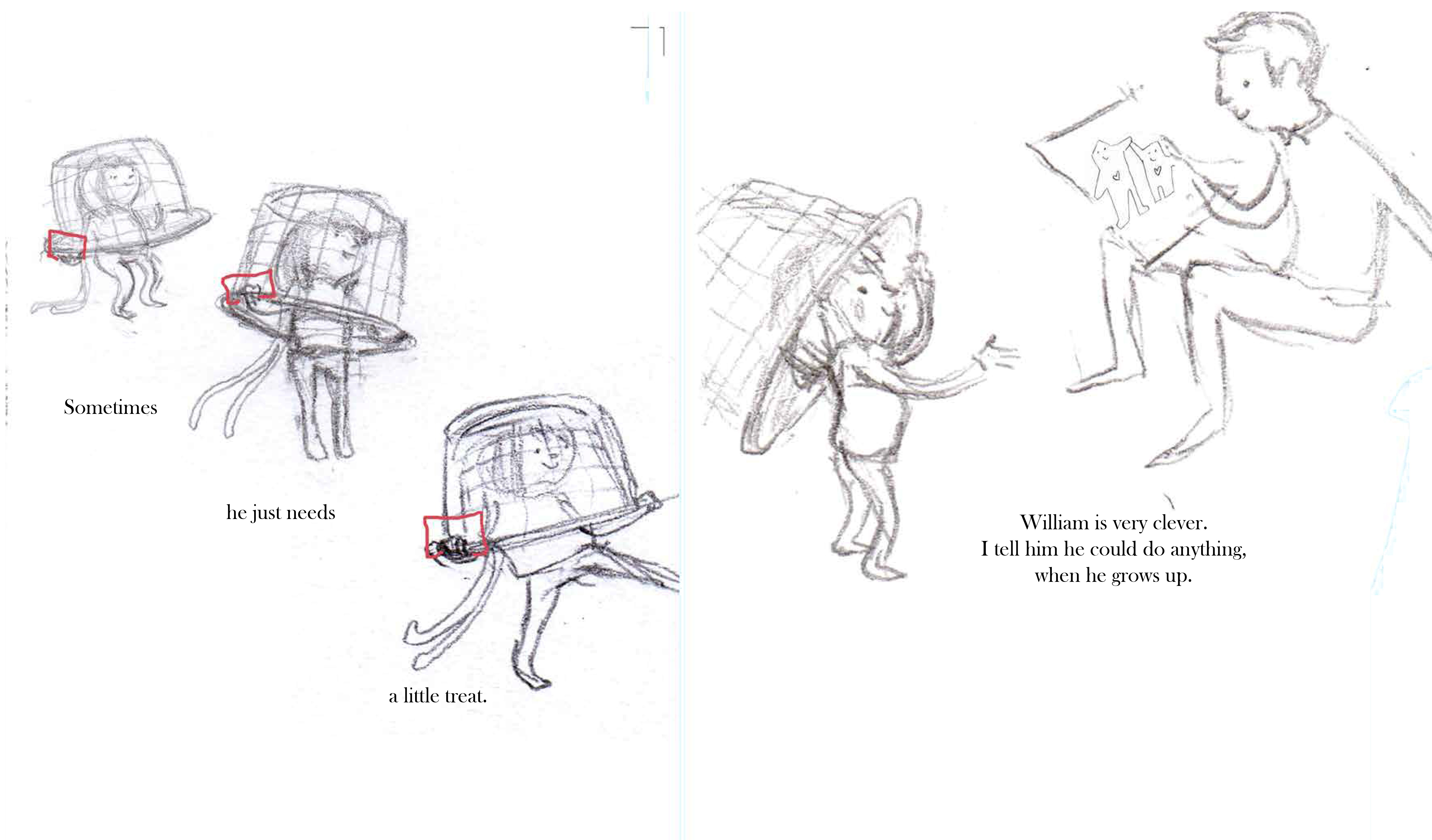
My early rough drawings are always tiny because I’m nervous about getting them wrong - the smaller they are, the less I worry, and because they’re small I can draw lots of poses quickly until I find a pose that I am happy with. Drawing small also means I don’t get too hung up on anatomy as I can simplify characters into rough shapes. I enlarge them when I’m working out the layout and paint them at the size that they will be reproduced at.
The second spread I’ve chosen is in the sweet shop, a scene where the little girl is imagining William as a famous chocolate maker or a detective. This was my favourite spread to work on ……… because of all the SWEETS!!!
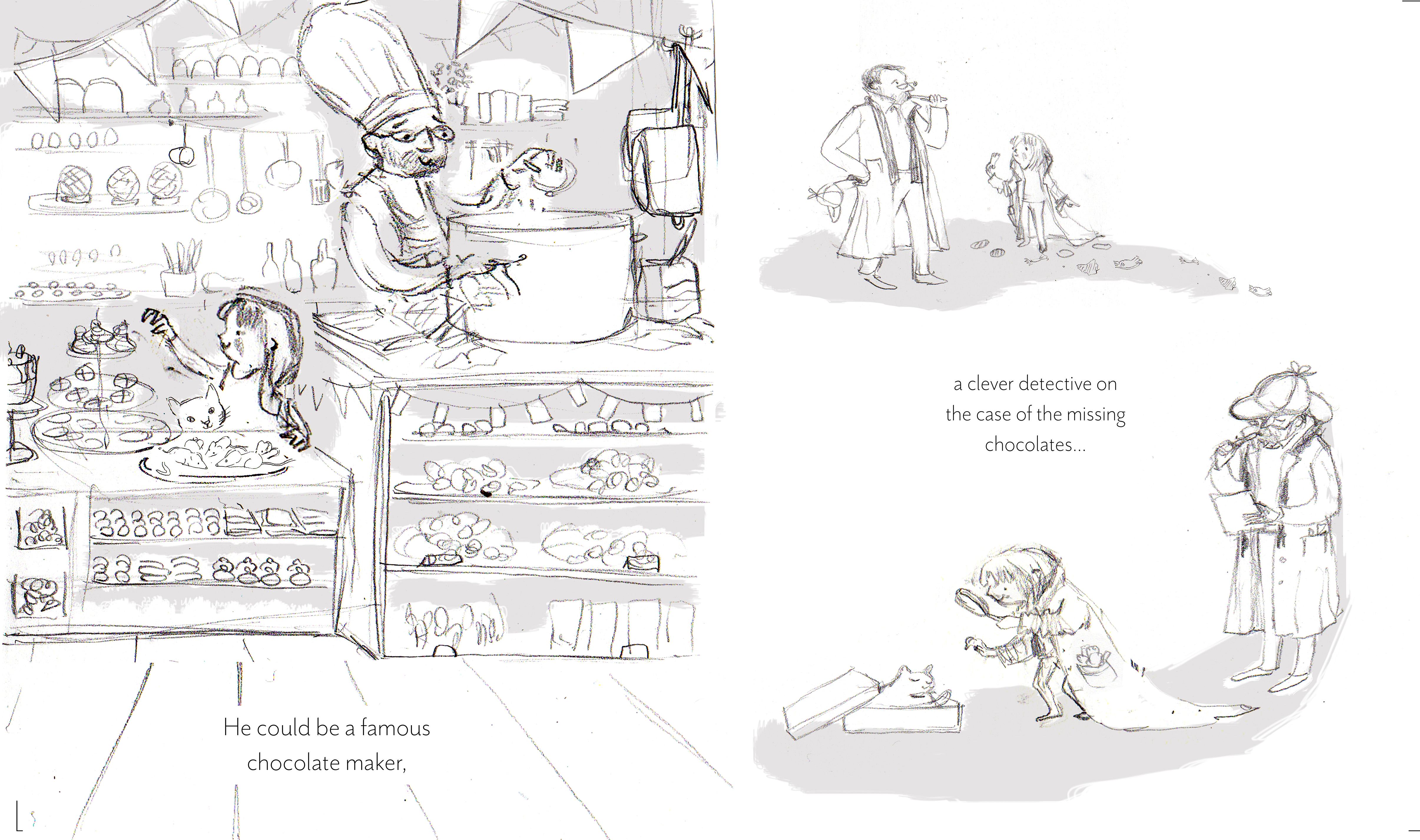
I remembered books as a child where food, particularly sweets, were depicted in the illustrations, like the marvelous Elephant and the Bad Baby, or the Brambly Hedge series, or Don’t Forget The Bacon all of which had been firm childhood favourites. I think that the charm of food in illustrations is partly because it engages our other senses of taste and smell. I particularly enjoyed creating sugared mice for the cat to eat! As a child I loved finding details like that in the illustrations and now I have the joy of putting them in, especially if they are the clever suggestion of my lovely Editor, Libby Hamilton and Art Director, Beccy Garrill. It was a joy to create this spread and it was a joy to make this book.
Looking After Daddy is published by Andersen Press.

The Klaus Flugge Prize is funded personally by Klaus Flugge and run independently of Andersen Press.
Website maintenance & Copyright © 2024 Andersen Press. All Rights Reserved. Privacy & Cookie Policy.