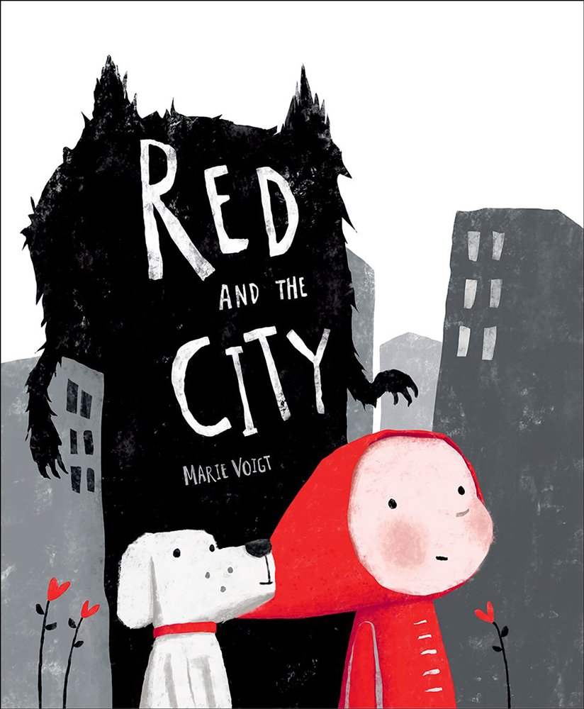
Red and the City, written and illustrated by Marie Voigt
Red and the City written and illustrated by Marie Voigt is one of the six books on the shortlist for the 2019 Klaus Flugge Prize.
The judges described the book as a clever, multi-layered retelling of a well-known story. They admired the way that the characters, though simply drawn, have real personality and enjoyed the European feel to the artwork.
Here Marie Voigt talks about her technique and the creation of a pivotal scene in the book.
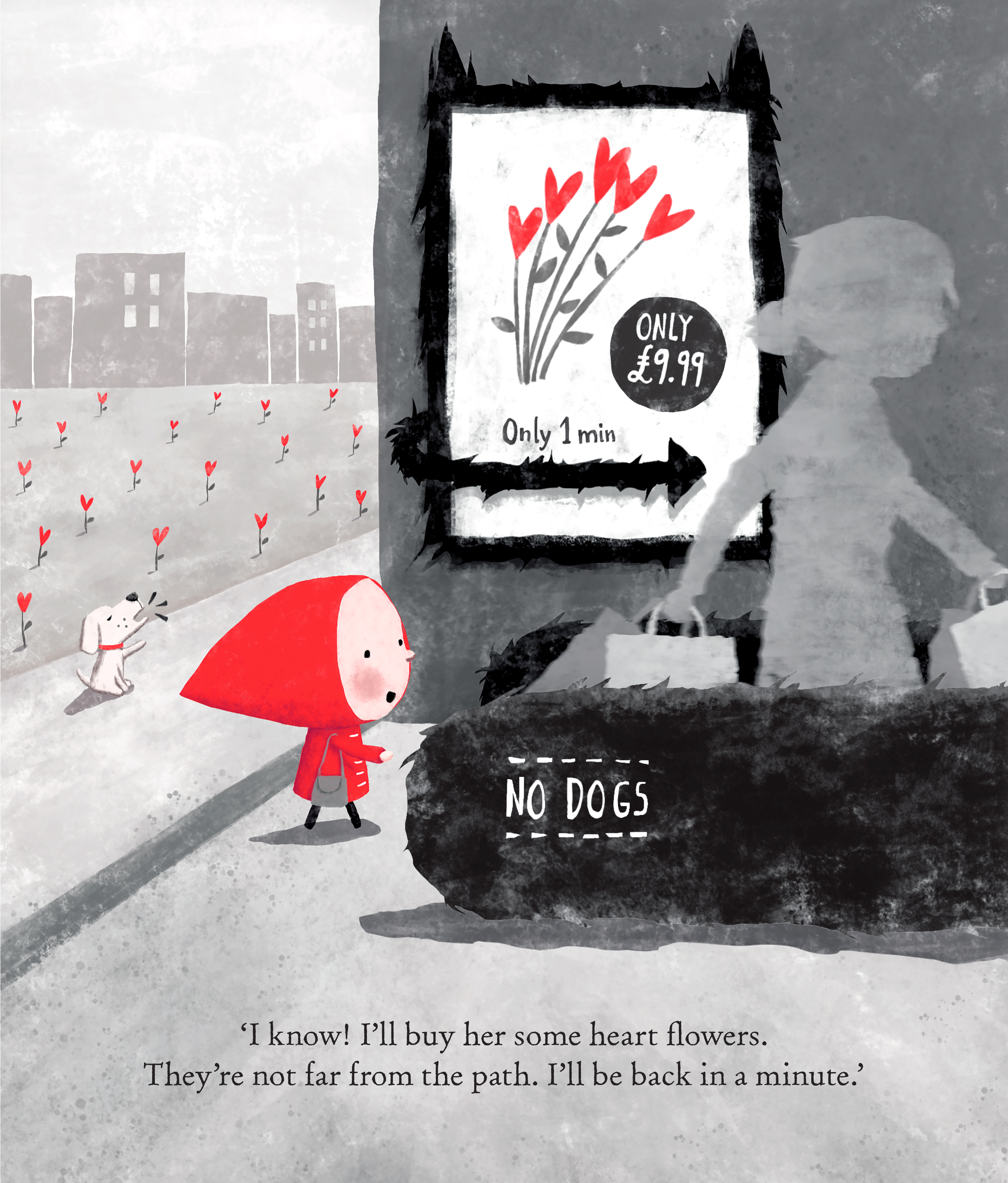
When viewed purely from an aesthetic point of view, I don’t think the image I’ve chosen is the strongest in the book. However, it’s a pivotal scene and contains a lot of the visual elements found throughout the story, which is why I thought I’d use it to try and explain a little bit about my approach, techniques and influences.
This scene shows the moment the ‘wolf’ – representing potential dangers of our modern world and depicted through the black fur texture and other ‘wolf parts’ – has finally managed to weaken Red enough to literally steer her off her path.
The scene was inspired in contrast to the original fairy tale, in which the wolf persuaded Little Red Riding Hood to pick flowers for Grandma in the forest, whereas nowadays he coaxes her into buying them.
The text seems to imply that Red herself comes up with the idea to go off her path in order to buy heart flowers for Grandma, when really we can see through the artwork that it’s the ‘wolf advert’ influencing her. I chose this composition for this scene so that the reader can look straight at the advert – almost like Red did – and realise for him/herself that this is what makes Red step onto the wolf’s moving walkway, ultimately getting her lost.
On this ‘conveyer belt’ ahead of Red, I’ve included a woman with lots of shopping bags representing one of the many ‘blind consumers’ the wolf already has ‘in his claw’ who also constitutes a role model Red has no choice but to follow. This woman may also represent the kind of person Red might turn into one day. Like all the grown-ups in the book, I have kept this woman stylised and ‘ghost-like’ in grey to symbolise that she may have lost some of her true, individual spirit. As in other images, I’ve drawn her somewhat blurred, so we can focus more easily on Red, but even more importantly, to convey our modern-world sense of rushing and disconnect.
I’ve also chosen the main movement of this scene, including Red, to go to the right and away from Red’s ‘protector’, her dog Woody – through the arrow of the advert and the flower image therein pointing right, along with the direction of travel of the moving walkway with the woman going right. This encourages page-turn, but even more importantly, works against Red turning around and noticing Woody who’s trying to keep her on her path. With the pavement, I’ve created a line of separation between Red and Woody and their very different sides of the image. Whereas I kept Woody’s background lighter, slightly warmer, more open and harmonic, Red’s side of the image feels much darker, more busy and claustrophobic, hinting at the conflict ahead. This separation line, along with the ‘NO DOGS’ sign, also underlines that, from now on, Red will be on her own.
I’ve drawn Red’s mouth open in this image to further emphasise that she is talking and not listening to Woody. Her stare is fixated on the moving walkway and the woman’s shopping bags ahead of her, almost in trance and as if she had blinkers on. As a result, Red – unlike the reader hopefully – also doesn’t notice that the heart flowers are in fact much closer to her path than she’s made to believe. If she turned around, she’d also see that they are even trying to help her by pointing their leaves in the direction she should be going!
In this image, as throughout the book, I used a limited colour palette to help guide the child’s eye and focus it more on the many symbols and deeper messages abundant throughout the book. The red highlights also help draw in on Red and the heart flowers who represent love in contrast to the black and grey modern world full of temptation and misguided purpose. I chose Woody to be a little, white dog as a direct, more innocent contrast to the wolf. I also gave him a red band around his neck to visually link him to Red and portray the love within him.
Even though I mainly work digitally these days – as I like to extensively experiment with different approaches for the best results within the given timelines – I like to include the textures and feel of traditional media that are best suited to the story. I love working in Procreate on my iPadPro as it provides me with a comprehensive set of natural media and useful tools whilst giving me the immediate feel of working traditionally on paper.
I admire and get influenced by many different artists and styles, and generally like to develop an artwork finish specific to each story to support it in just the right way. This is probably why I came up with this fairly minimalist style for Red and the City despite the fact that I naturally tend to work in more colour and with more realistic rendering, whilst trying to convey as much atmosphere, emotion and meaning as possible. Therefore, though it may not be apparent here, I admire the work of artists such as Jim Kay, The Fan Brothers, Anthony Browne, Rébecca Dautremer, Torben Kuhlmann and Shaun Tan. I’ve also always loved the arty/stylish work of Oliver Jeffers.
Planning Red and the City though, I remember looking, amongst others, at Jon Klassen’s artwork for inspiration.
Whilst the style I came up with in the end may make the book look like easy work, this definitely wasn’t the case. Trying lots of different approaches over the course of six intense months, I literally made several, quite different-looking Red and the City books, before being able to make this finished, more minimalist version, which was informed by all the many things I learned throughout the process of making the other versions.
Also, I learned that black and grey artwork is notoriously hard to reproduce well on uncoated paper whilst maintaining textures and contrasts. So, after seeing a proof of the book in which a lot of the details had been lost, I went back and changed the technical set-up of each image substantially. This was particularly mind-boggling work, as artwork with reversed-out text, of which I included lots, needs setting up in specific ways to allow the book to be printed in different languages at the same time.
However, above all I learnt, that when you have a goal but stay open-minded about your approach and take on board what your editor, art director, agent and other trusted sources have to say, you can create something that hopefully isn’t just visually satisfying but that holds even more layered meaning and opportunity for discussion than you originally thought. And seeing children and grown-ups alike engaged in your work makes it all worthwhile!
Red and the City is published by Oxford Children’s Books.

The Klaus Flugge Prize is funded personally by Klaus Flugge and run independently of Andersen Press.
Website maintenance & Copyright © 2024 Andersen Press. All Rights Reserved. Privacy & Cookie Policy.

