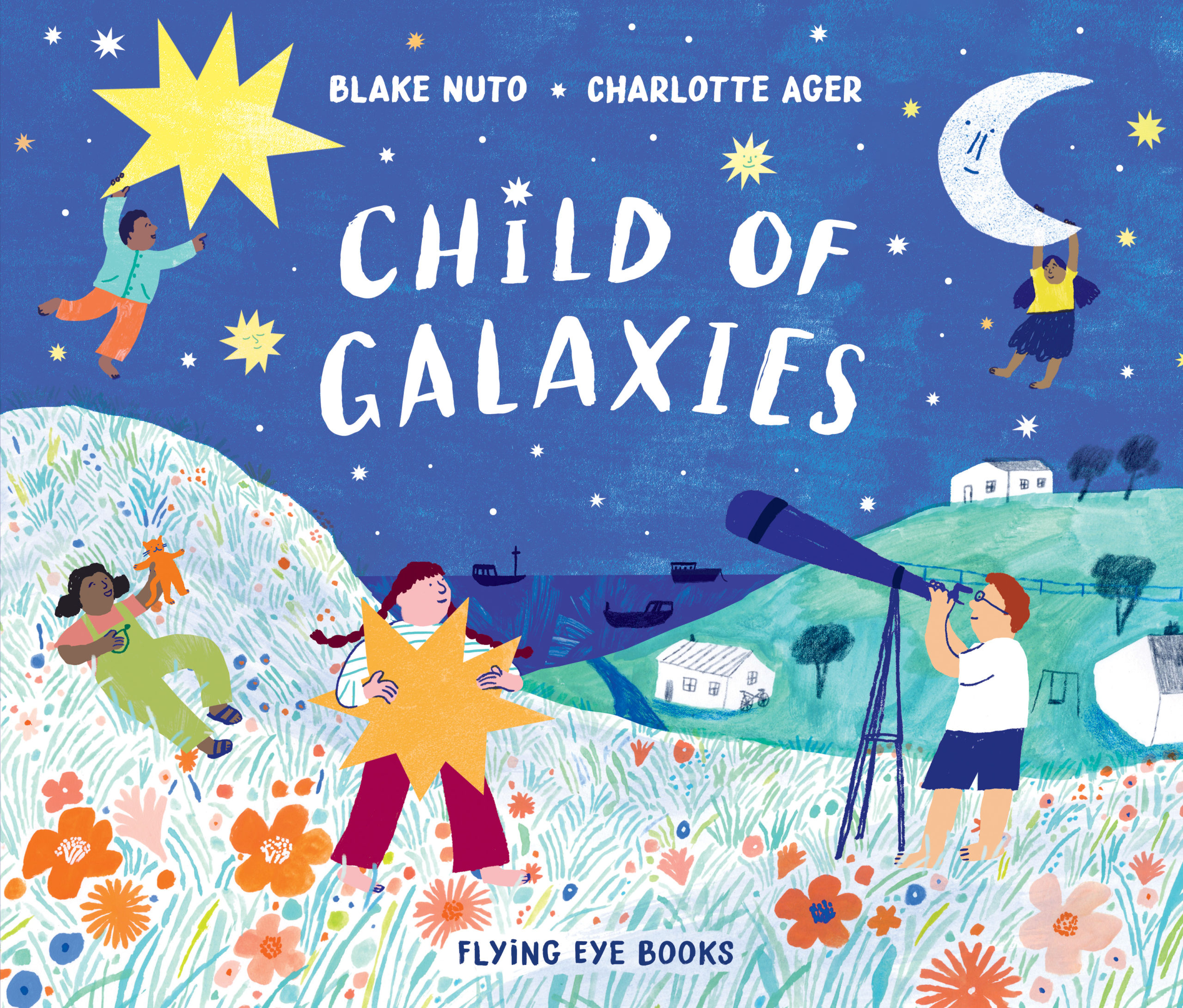
Child of Galaxies, illustrated by Charlotte Ager, written by Blake Nuto
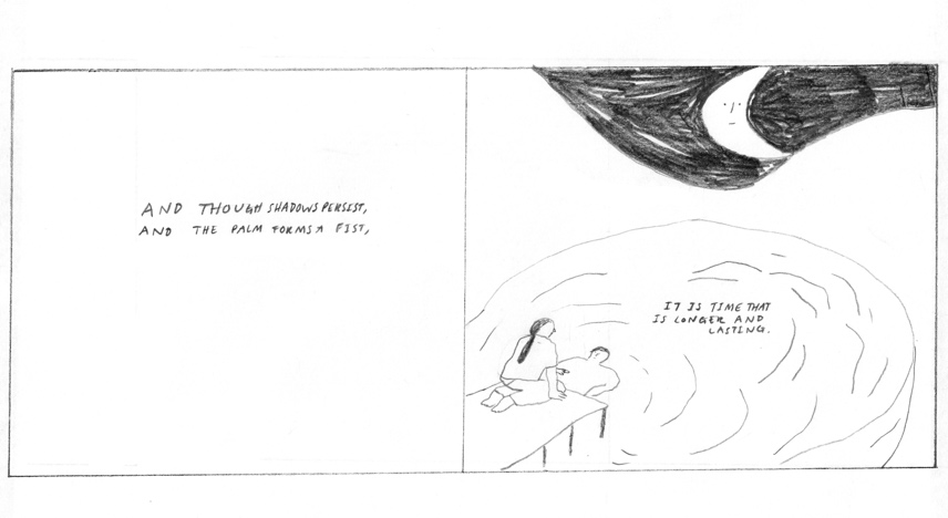
Child of Galaxies, illustrated by Charlotte Ager and written by Blake Nuto, is one of the five books on the shortlist for the 2021 Klaus Flugge Prize.
The judges admired the way the images leap off the page to stimulate young imaginations and Charlotte’s beautiful use of colour and space.
Judge Mat Tobin interviewed Charlotte about her book.
Mat: I want to open up with your wonderful little bio. At the back of the picturebook where you say that ‘drawing has the ability to be moving and soft but also utterly silly.’ Did you find moments in Blake’s text where you were drawn to be moving and soft and other moments that lent themselves to a more light-hearted nature?
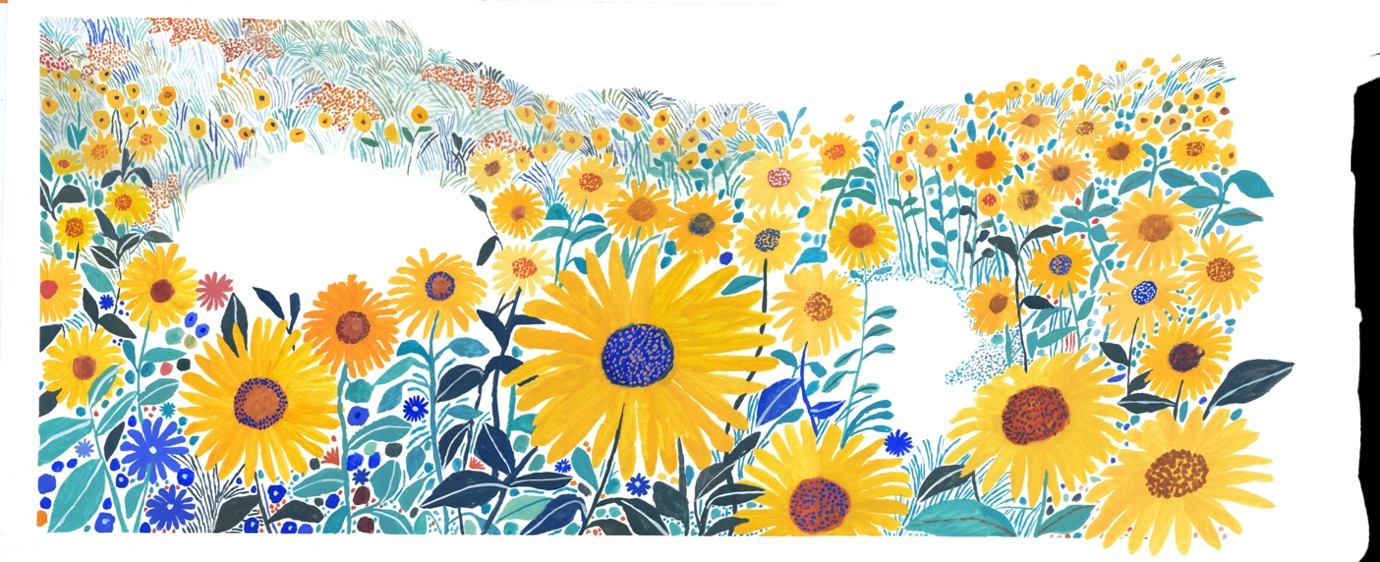
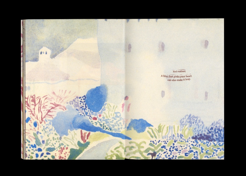
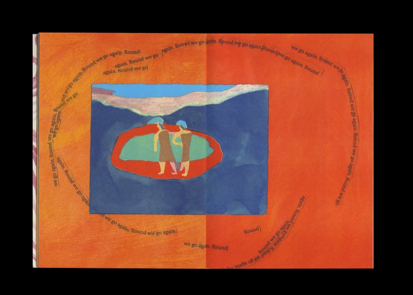
Charlotte: Oh absolutely, I think that’s what drew me to the text, it’s playful and full of joy but it doesn’t shy away from harder feelings. For example, there’s a sequence of spreads, first with 3 children chasing after frogs in the rain which felt playful and light, then to an abstract spread where hands meet in the middle as a celebration of friendship and closeness, onto a more blue contemplative spread of a child looking at her reflection in the water. I think it’s important to show the range of emotions, and that we can experience them close together and sometimes all at once. It’s acknowledging these emotions sit side by side, that we can’t be happy all the time but that moments of darkness pass. Sometimes there’s a tendency not to acknowledge these hard emotions with children, to rush to cheer them up and create distractions but I think it’s important to address them, not pretend they aren’t important. After the blue lake scene, there’s a page full of sunflowers, a piece of joy coming round the corner.
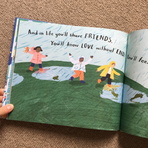
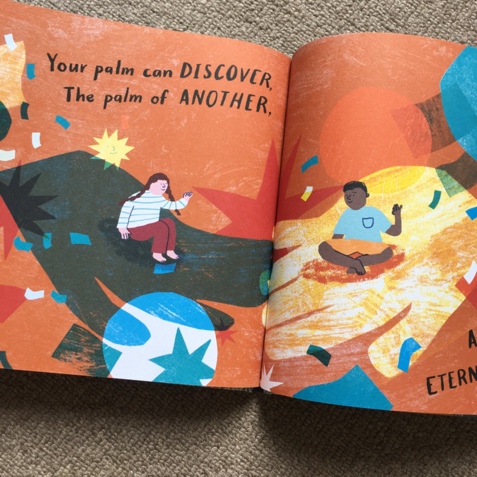
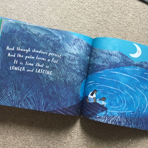
Mat: Blake’s words present are some big, abstract thoughts and we judges thought you did a fantastic job of realising these. Can you talk us through a spread that was particularly challenging and how it went from initial idea to completion
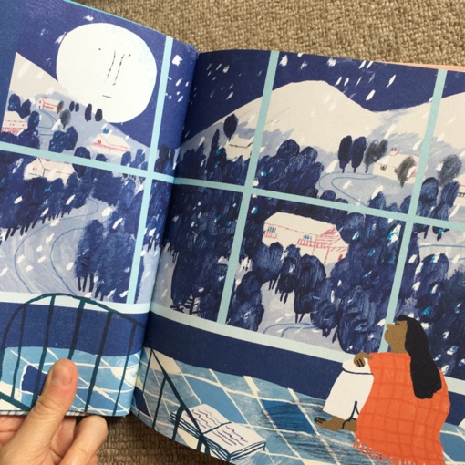
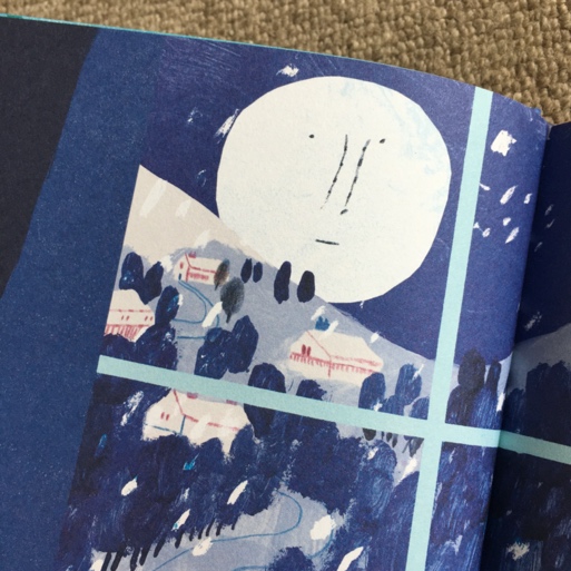
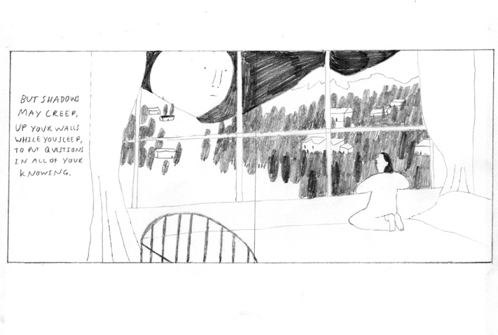
Charlotte: Thank you, I really loved this challenge when creating the illustrations. The spreads that were more reflective had to be handled sensitively - I didn’t want them to feel too dark or scary, but at the same time didn’t want to skate over moments when we feel unsure and sad. I did a few roughs for these scenes and found this tricky to navigate however at some point I started including the moon with a face in, so in each spread even if a child was alone, there was this thoughtful moon looking back, looking over you. I felt like this was a nod to the people looking after you, always close by and there to help. Reminding us we’re part of something larger. These scenes I wanted to feel magic but in a quieter way, The blues and textures do a lot of the work so that they are calming, a moment to pause. It felt important that the natural world was always present, something we live alongside and a reminder of how things change and grow.
Mat: Building upon this, was there a particular spread that you particularly love? Could you talk us through the process from concept to completion and the stages you go through before the words and calligraphy are added?
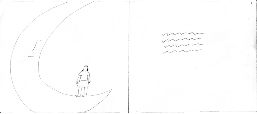
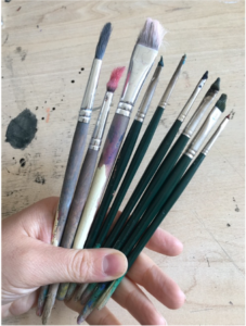
Charlotte: I loved working on the sunflower spread because it felt so joyful. I think it’s one of the later roughs we added in, I think initially I tried to come up with spreads that would match the text a bit too much. But for this one, I just wanted it to be a moment of magic, all the sunflowers were painted as one layer and that just felt very joyous. The rough felt too simple in pencil but came alive with paint, there’s only so much you can plan, you just have to start in paint and work it up. I think when I work on a picture book again I would like to do this more, working completely by hand. It seems to suit the way I work, the illustration comes to me through the process rather than having it too decided in my head. I used Gouache for this spread which is what I mostly use, I love how bright the colours are and yet retain so much texture.
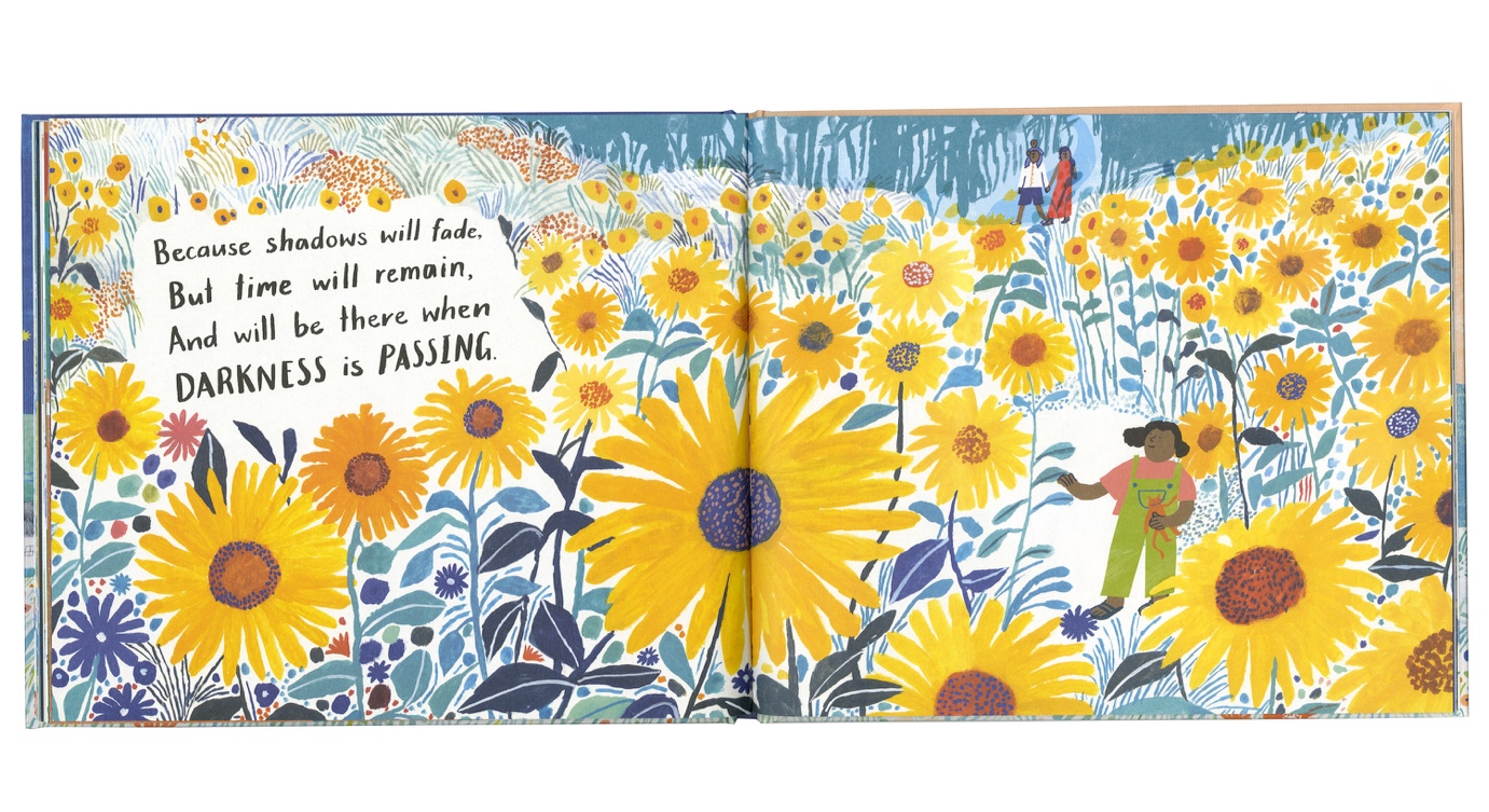
Mat: In a recent interview, you mentioned that you’re still ‘figuring a lot out’ with regards to the illustrative process. In working through your first picture book, can you tell us a little about what you learned about this process and how this journey might have been different to previous projects
Charlotte: I learnt an enormous amount with this book, it gave me the opportunity to work on a world and I’m used to working on images that live alone or in a small series but with this I got to work on a body of spreads that transitioned through feelings and thoughts. It was exciting to be able to have so much room to play with. I found I really loved thinking about the pace of the book which isn’t something I usually get to do. I naturally love the idea generation of the project, coming up with lots of ideas and roughs. I’m always a little sad to cut things down and just choose one image to illustrate a whole article or story. I was initially quite nervous about how to go about realizing the roughs into final illustrations, I work in quite a few ways and am drawn to working by hand. I didn’t feel like I could do all the spreads as complete illustrations by hand because I was learning as I went and needed the confidence to make changes easily, therefore I used hand rendered details layered up on photoshop. This was a slightly different process than usual and meant I could play a round more.
Mat: During the book there are times when we’re positioned in-line with the children in the book and sometimes we’re above them looking down on them. Was there a conscious decision about positioning the characters in the story and how aware are you of the position of the reader/viewer when you’re telling the story?
Charlotte: I think I wanted the book to have a real variety and to slip between the real and imagined, therefore in some spreads the children feel rooted to the real world and in some the scale is exaggerates and is more dreamlike. I hope this makes it feel playful. I love books where scale changes throughout so that each spread is a surprise and it felt needed in this book where the tone often shifts. There are moments it felt important to focus on individuals, on relationships but also a step back to show our place within a world. Because the narrative doesn’t follow just one child I like the idea that it’s easy to place ourselves in the spreads.
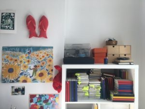
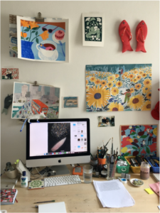
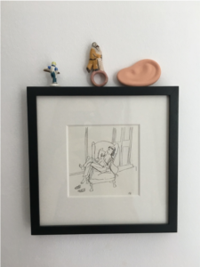
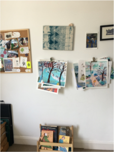
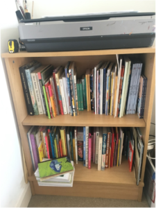
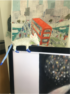
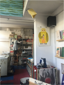
Mat: Can I be cheeky and ask for a tour of your workspace? It’d be great to see some of the materials that you work with or spaces that are important to you.
Charlotte: Of course! I moved into a home studio last year and have recently had a reshuffle and tidy so now is a good time to ask!
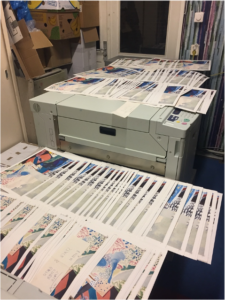
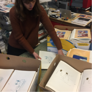
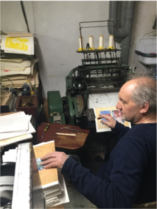
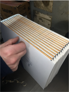
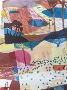
Mat: I read that you spent time with the stencil printers Knust in Nijmegen (the Netherlands’ oldest city) as part of a residency. How was that experience for you and what did you take away from it? Is it possible to see some of the work that you did there?
Charlotte: This was one of the best projects I’ve worked on, I feel immensely lucky to have been invited there. The residency was to produce a book which gave me the opportunity to bring together some drawings that had been stacked in a pile from a strange trip, It gave me a chance to curate these images together which I loved doing. When I got to Knust the focus was on how to translate my book into Stencil print. I was in awe of Knust and the team, Astrid, Jan Dirkand Joyce, they were so knowledgeable about their craft and excited about its possibilities. I’d graduated from university the year before and felt very chaotic in what I was doing, jumping from one thing to the next, but observing this team working so thoughtfully made me realise the value in really spending time learning and exploring a medium or process. I felt like I rushed a lot of things and often worried about what else I could be doing, the residency made me realise what I was missing by doing that. Knust are pioneers of Stencil printing in the way we use it now, I loved hearing about the history of their progress and felt inspired by the ways they’d adapted and pushed forward.
Mat: Can we look forward to more picturebook work from you? Would you like to work on something alone or do you enjoy collaborating?
Charlotte: I’m desperate to work on another picture book but I find it hard to envision a whole story for myself. I have lots of small ideas but committing to one is scary to me… that’s why I loved working on Child of Galaxies, it was collaborative, and I was bouncing off someone else’s words. Ideas come to me slowly, so I’m sitting on things and mulling them over. I’d love to do more of both – working on books collaboratively and having the faith in myself to push forward alone with these ideas. I’m working on a collection of illustrations with a friend illustrating a selection of writings which I’m really enjoying because it’s a body of work but split into all these little stories.
Mat: Were there any picture books that had an impact on you when you were growing up?
Charlotte: I had a huge range of picture books growing up, I often liked the quieter ones, Nobody Rides the Unicorn written by Adrian Mitchell and illustrated by Stephen Lambert was a favourite, it’s a very soft book about a girl who’s tricked into trapping a unicorn. She’s quiet and thoughtful and I like that this quality is celebrated in a book. I think I was unknowingly drawn to sadder moments, and I think they are so important in children’s books, acknowledging that bad things happen, teaching us about others emotions and encouraging empathy. I also loved the Brambly Hedge stories, the invention in them is so magic, to this day I still look at trees hoping there are lavish palaces inside full of mice.
Mat: Are there are any contemporary artists/illustrators whose work you admire so much that you think everyone should encounter them?
Charlotte: So many, I am constantly inspired by other people. Mary Herbert’s work I adore, we studied at the Royal Drawing School together and shared a studio for a bit after. I’ve seen her work evolve to such a spellbinding place, it’s dreamlike and comforting whilst being slightly unsettling, beautiful pastel worlds that seem to seep emotion. I’ve told her before that her work gives me the same feeling I used to get when I was younger reading Nobody Rides the Unicorn. Ben Hickey’s paper cut illustrations are also a constant delight, they are so clever and playful – it’s seemingly such a simple medium but his work always feels fresh. I’d love to see his work in a book. I could go on and on but I’ll also mention Jiye Kim who I’ve known since studying together at Kingston University – I have long been in utter awe of her work. Her drawings give me that shaky feeling they are so good. Looking at her drawings you’d think it’s as easy as breathing for her. Her series of hair/ hairdresser drawings are particularly brilliant, the mark making and invention in them is so exciting.
Mat: Thank you so much for answering these questions, Charlotte.
Child of Galaxies is published by Flying Eye Books, 978-1912497423, £11.99 hbk.
The Klaus Flugge Prize is funded personally by Klaus Flugge and run independently of Andersen Press.
Website maintenance & Copyright © 2024 Andersen Press. All Rights Reserved. Privacy & Cookie Policy.
