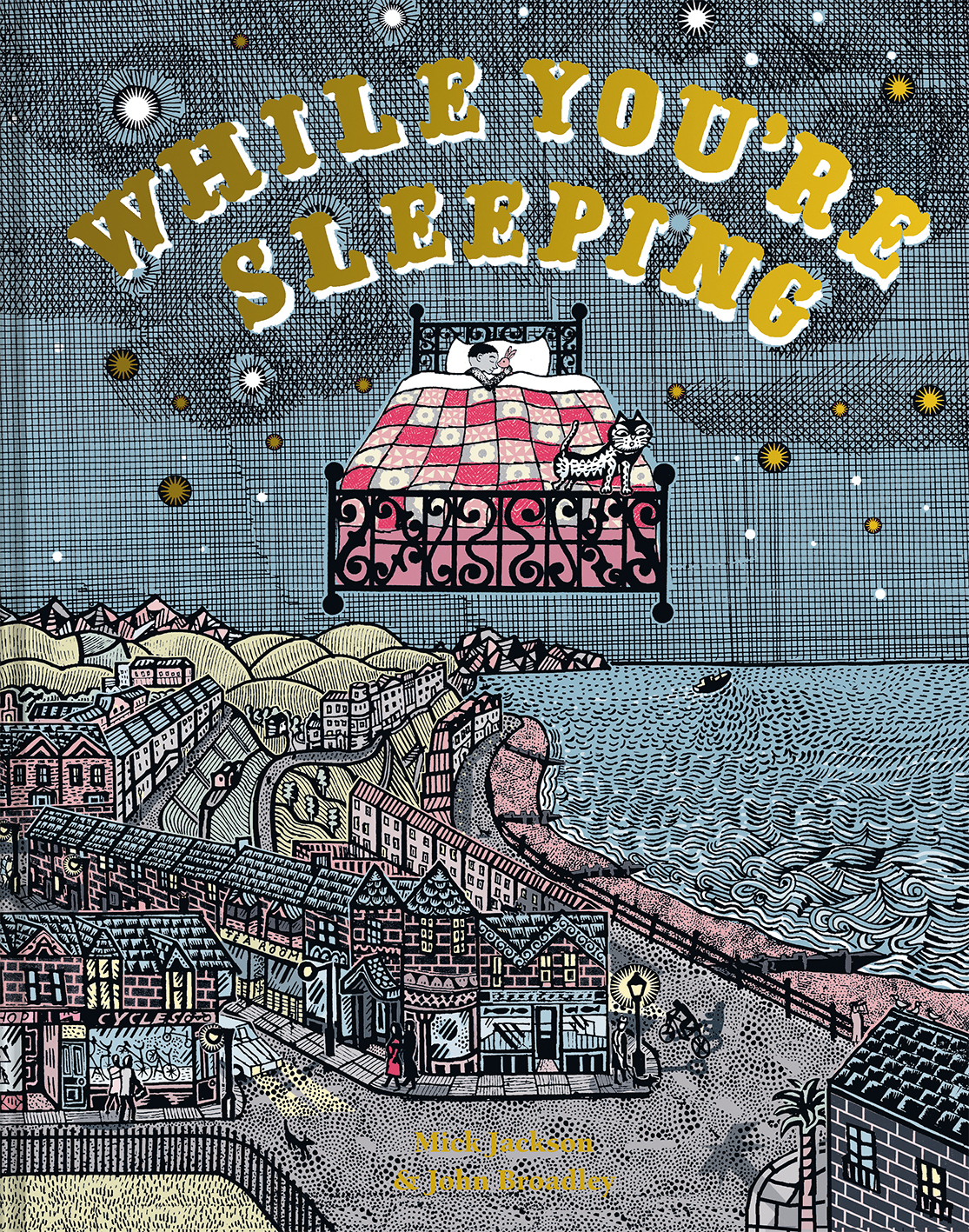
While You’re Sleeping, illustrated by John Broadley, written by Mick Jackson
While You’re Sleeping, illustrated by John Broadley and written by Mick Jackson, is one of the five books on the shortlist for the 2021 Klaus Flugge Prize.
The judges described John’s work as ‘very muscular’ and loved the theatrics of his illustrations.
Judge Mat Tobin interviewed John about his book.
A gallery of images is included at the end of this blog post.
Mat: This was your first foray into picture book illustration. Can you tell us a little about how you were approached and some of the hurdles you had to overcome in working with and through this story?
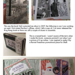
John: I was first contacted by Neil (Dunnicliffe) from Pavilion books in 2017. One of my hand made books was mentioned and also the prospect of me working on a children’s book if that would be something I might be interested in. He obviously saw something in my work which could go that way, as most people probably wouldn’t have made the association.
A couple of years later I was contacted again by Neil, who said he had a manuscript for a book I might like to illustrate. When I started reading the story and saw it was about night shift workers I was amazed – I’d just that week given up working on a night shift myself for 22 years and was a little daunted at the thought of trying to make a living an artist.
The prose reminded me of the WH Auden narration to the Night Mail film and all of the GPO documentaries of the 30s and 40s, which I love, and the words instantly began conjuring up the scenes I remembered from those old documentaries.
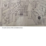
Because I had no experience of illustrating for children, I was asked to produce a couple of drawings to show how I would approach the book.
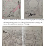
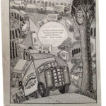
Mat: Building upon this, I know that one of the first spreads you completed for the book was the one featuring the delivery trucks (which I adore). Could you talk us through the process from concept to completion and the stages you go through before the words are added?
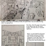
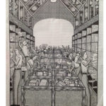
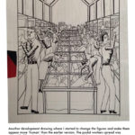
John: I selected the segments concerning the trucks and the postal workers because they both instantly sparked ideas in my head of the lorries lighting up the night with their headlights and, for the sorting office, a stark perspective of people busily putting all these different shaped packages into rows of shelves.
The published book is 40 pages long, but initially it was going to be quite a bit shorter and the illustrations were going to occupy single pages, so the demonstration pages were done in portrait format.
I did struggle initially, partly because I was worried about ‘blowing’ my chance to illustrate the book. In the end, I decided to just do the drawings in the way I liked rather than try to adapt to any kind of pre-conceived idea I had about how a children’s book should look. I was a bit worried that my work might be seen as too ‘harsh’ but it turned out to be well received and I got the commission.
Mat: In a lovely interview for Book By Its Cover, you mention that you’re fascinated ‘by folk-lore and ‘olde’ language; fairs being called ‘feasts’, the temperance movement, as well as traditions’. There’s certainly a lovely homage throughout the picture book to times gone by, tempered with a slice of modernity. Are there particular spreads in the book which you feel really celebrate these cultural motifs?
John: I’d given up on illustrating sometime in the mid 90s and gone on to work at a press cutting company. This was quite an important moment as I’d spent about five years trying to make it as a freelance and over that time had ended up compromising it so much that I hated the artwork I was producing and didn’t know how to get out of the rut.
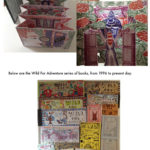
My night shift job meant I worked alternate weeks only, and I spent the weeks off drawing again, but with the kind of free abandon you had when you were a child, not having to worry about pleasing anyone else, and I kept travelling back in my mind through old memories and I started connecting to old rhymes and sayings I used to hear iin family circles. This is all old broad Yorkshire dialect, old relations who still lived in farmhouses dating back centuries etc. I started finding books about old customs, and also (pre-internet days so not as easy as now) TV programmes which had scared me as a child I discovered to be either influenced by British legends, like Arthur (“The Changes”), or paganism (“Children of the Stones”). These, and many other influences, went into a series of books I made (mostly known under the ‘Wild For Adventure’ titles) which had no purpose other than to keep me sane while working this incredibly mundane office job. I initially used to make these using photocopiers in newsagents, and eventually started making them more elaborate by getting my own copier and printing in two colours, while nowadays I used bookram to bind them etc. I’m not sure how this collection of really odd work propelled me back into the commercial world, but somehow it did, and most of the work I produce commercially now has a basis in the rougher work I was making in the 1990s and early 2000s.
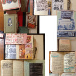
I have piles of books of notes containing strange sayings, snatches of dialogue from books/tv/plays and scrap books of cuttings culled from the days when I used to be armed with a scalpel extracting things of interest from the weekend supplements while on my night shift job.
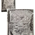
Some of my original, unused, sketches for WYS have quite modern vehicles and boats in them, but the team at Pavilion were very much of the opinion that I should choose to make things look more old fashioned. I didn’t attempt to sneak any Pagan references into the book, but the chalk horse on the truck picture in the background is a nod to the past, as well as Eric Ravilious. In the Postal workers picture, one of the packages is addressed to Chigley (as in the 1970s animated series created by Gordon Murray) and another is to my wife’s address from when we first met in the 1980s.
Mat: I love the opening spread of the book with the boy in bed asleep. I feel there’s a sense of nostalgia and tradition here with the toys in his bedroom and the omission of modern technological gadgetry. Can you talk us through this spread and how it’s the anchor to all the other images in the book? Did this page come first/last etc?
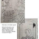
John: Yes, this page, the nurse returning home, and the final page of her going to bed, were the last things I did. As a way of creating a thread through the book, I created the idea that the boy who is going to sleep at the start of the book is the son of the nurse working overnight in the hospital and she comes home at the end of the book to the boy waiting for her at the window and then finally goes to sleep with the sun rays coming through the blinds.
Neil at Pavilion suggested to get as many references in the room as possible, which to me reminded me of the end of Bagpuss (“the mice were ornaments on the mouse organ...Professor Yaffle was just an old wooden bookend in the shape of a woodpecker”).
In the room, the bat and the cuddly fox echo the countryside picture, there’s the ambulance, fire engine and delivery truck, an atlas suggests the children on the other side of the world, and the boy is reading WYS.
Mat: You make use of double-page spreads throughout the story as well as soft, rounded vignettes. Can you talk us through some of your thinking here about presentation and pace?
John: Initially, the delivery truck and the postal workers were going to be side by side on opposite pages, but this didn’t work as a composition, so this led to a decision to expand the page count and include more double page spreads. A book with no breather between this amount of intensity might have been too much, plus, in the passages where several things are mentioned (buses, cleaning the streets, trains etc) I thought it would add variety to have these as shaped vignettes.
Mat: Can I be cheeky and ask for a tour of your workspace. It’d be great to see some of the materials that you work with or spaces that are important to you.
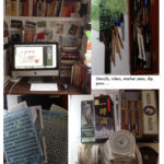
John: I work in the living space of our house – it’s mostly open plan downstairs and there’s a convenient alcove where the computers go, and a big table is folded out when I’m drawing. I have a lot of my reference books on the shelves and all my records and dvds are here too, so it’s very comfortable and plenty to keep me entertained. Some days I have records on non-stop and others I’ll have dvds or netflix running.
A lot of my art materials are found on antique stalls or ebay. I use images from letraset transfer sheets and I also make my own sheets of pattern from ‘samples’ I take from the graphic parts of adverts from vintage magazines. The dots pattern which features everywhere in the book comes from the logo of an energy company which I scanned from the post mark of the envelope of a bill and repeated the dots across a page of A4. These are all then used in combination with hand-drawn lines to create a variety of marks on the page.
Mat: I love the story behind the cover design and your incorporation of the ISBN and Pavilion logo into it. Can you talk a little about working with Pavilion and the Editor and Designer? What was this experience like and how did it support your work?
John: The team at Pavilion were great – I mean really excellent! This was a massive learning curve for me. There are so many things which I wasn’t aware of when I started. Things like not having important details where the page folds, leaving enough space for the words (sounds obvious, but you also have to think about the possibility of the book being translated into a language which might have more characters once it is translated etc.)
When I did the original drawing for the cover I had it the opposite way around, with the sea on the back, and simple things like knowing that it would be more appealing to have the sea on the front were just things I’d never considered.
Mat: Can we look forward to more picture book work from you in the future? I know you’ve created your own books in the past and wondered whether you would be interested in creating something on your own?
John: The follow up to this book is complete and is published in September. It’s written by Mick again and is about the journeys in life starting with a toddler learning to walk across the living room, attempting the staircase, before heading out into the wider world, and eventually heads off in lots of directions.
I do still make my own books, but those are a lot different in style and probably most people who liked WYS wouldn’t like my other work. I haven’t had an idea for a book myself as yet. I don’t think it’s something I can set out to do, I think an idea would have to pop into my head.
I would love to do a book of fairy tales or a book which is set purely in a wildlife setting – a bit like the fox page in WYS, but across a whole book.
Mat: There’s a lovely nod to some children’s literature in your book but were there any picture book illustrators that had an impact on you when you were growing up or you’ve noted when sharing books with your own children?
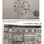
John: A fair few of them are in the bookshop window which is being cleaned in WYS!
I absolutely love Tolkein’s drawing of Hobbiton. I can remember it being it being one of the first books I read and I used to literally travel down that road into that picture in my mind – I’m sure that picture has had a big influence in this book. I love all of the pre-Quentin Blake illustrated Roald Dahl books too. I do search out old Puffin books nowadays; there are so many lovely pen drawings contained inside those paperbacks.
In the new book, We’re Going Places I have included some references to books that we enjoyed reading with our children. These are Peepo by Allan and Janet Ahlberg, Rosie’s Walk by Pat Hutchins and The Giant Jam Sandwich by John Vernon Lord. There was talk about removing these images from the book over copyright issues, but Pavilion got permission for their use. As I write this I now realise that no one brought up John’s book, so I hope that’s ok!
Mat: Are there are any contemporary artists/illustrators whose work you admire and think more of us should be aware of them?
John: I’m going to say one person, because I bet no one will know him. He goes under the name ATAK Georg Barber and lives and works in Berlin. He interviewed me for a magazine once and sent me some of his childrens books, exhibition catalogues and mini books, and they are really something to see....His instagram is @atak.georgbarber
I’m sure everyone knows all about Beatrice Alemagna...
While You’re Sleeping is published by Pavilion Children’s Books, 978-1843654650, £12.99 hbk
Please click on the gallery below to view annotated pictures of John Broadley's artwork and workspace.
The Klaus Flugge Prize is funded personally by Klaus Flugge and run independently of Andersen Press.
Website maintenance & Copyright © 2024 Andersen Press. All Rights Reserved. Privacy & Cookie Policy.
