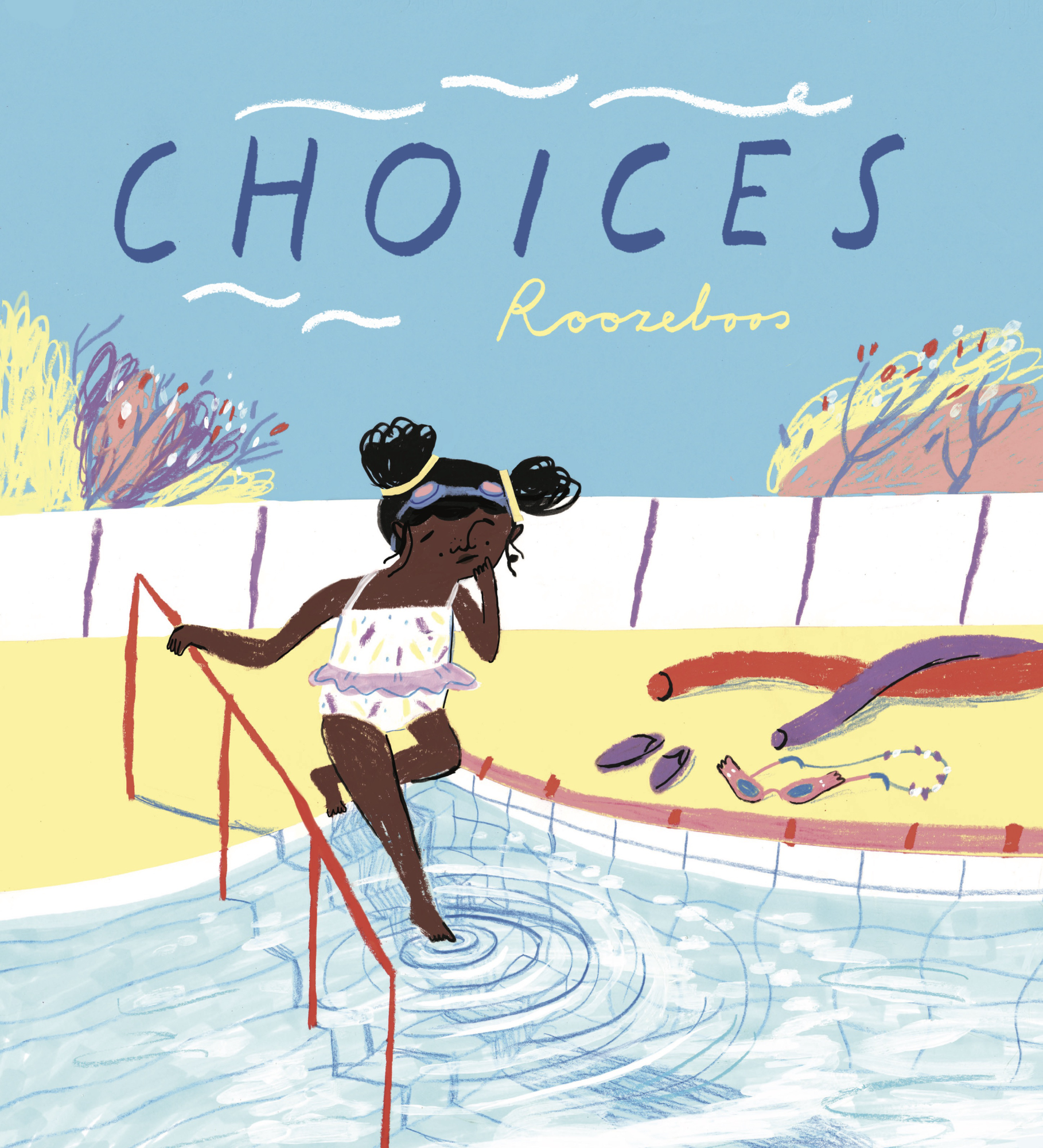
Choices, by Roozeboos
Choices by Roozeboos is one of the six books on the shortlist for the 2022 Klaus Flugge Prize.
The judges describe it as full of energy, with an unruly chaos that feels completely genuine. Its message about the importance of making choices is subtly delivered.
Former Klaus Flugge Prize judge, Senior Lecturer in Education: Primary English and Children's Literature, Mat Tobin interviewed Roozeboos about her book.
Mat: Choices follows the story of a little girl as she spends her day at the pool surrounded by people who are all making Choices. Can you share a little on how you think stories can open doors to these kinds of conversations?
Roozeboos: I think that for children to be aware of the fact that they can make choices, and have the freedom to do so, can feel empowering! Maybe sometimes a child might think there is only one way to do something but actually, there are several different ones. And I think being aware of this early on helps you to be more confident in finding your own path if that makes sense. It can also be overwhelming if you have lots of different choices to make and you keep thinking ‘am I doing it right, am I making the right choice?’. This worry can cause a lot of stress but I think that if you look deep down there is always something in your heart that has your preference, and I just want children to listen to this little voice and be aware of it.
Mat: Part of your journey into illustration and design led you to complete a Bachelors Degree in your home of Rotterdam and then an MA in Children's Book Illustration at Cambridge School of Art. Can you tell us a little about some of the modules you took there and the lecturers who impacted your work and thinking?
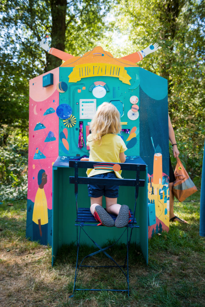
Roozeboos: Yes I did both these courses and for me, the combination of the two worked really well! In my Bachelor in Illustration, the focus was more on the concept. The idea of the art school, Willem de Kooning, where I did this course, is to push the students to think outside the box. For my graduation there, I made an interactive festival installation for example. Teachers that were very important for my development there are Han Hoogerbrugge and Angelique Viester.
The MA was more focussed on drawing and storytelling, which I absolutely loved! Here I really dived into the print room, found my love for observational drawing and just experimented a lot with different ways of image making. Pam Smy, Viola Wang and Elys Dolan were some of the teachers that really inspired me but to be honest the whole staff on the MA is just amazing!
Mat: What is it about the sketching and thinking process that you find rewarding?
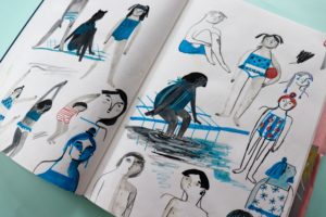
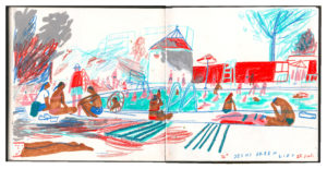
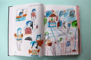
Roozeboos: It’s so wonderful sometimes how ideas come to mind. For me, seeing a little boy feeling the water to see if he could jump in really inspired me. I was drawing him whilst talking to my sister at the pool, who was visiting me in Cambridge. She was making some big life decisions at the time and the combination of my drawings there and our conversations that day sparked something in my mind. This is also why I dedicated the book to her. She is my sister but also my best friend and we can really share everything together.
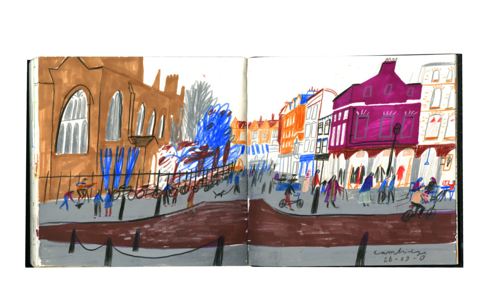
I think drawing from observation just makes you look closely at what’s happening in the world around you, it makes you see things that you couldn’t come up with in your mind just sitting behind a desk! Also, because of the uncomfortable positions you sometimes sit in or the limited amount of materials at hand, it makes the drawings more energetic and experimental. I advise every illustrator to go out into the world with their sketchbook and just draw the things they see.
Mat: Can you talk us through your relationship with Child’s Play and Sarah Dellow as Designer & how they worked alongside you to help reach the final piece?
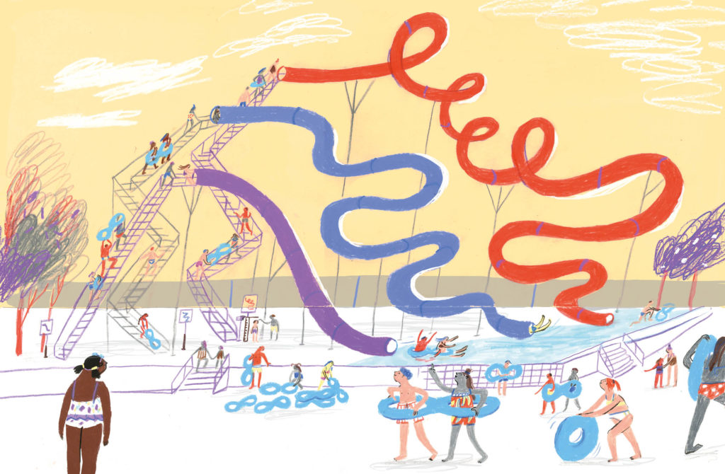
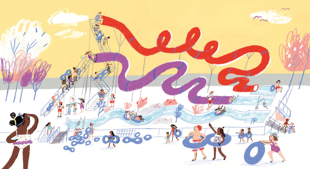
Roozeboos: Working with Sarah was just really great! Her attention to detail is extraordinary. Something that was really important in the process was to make the book as inclusive as possible. Sarah gave me a lot of images and ideas to call upon; for example making the pool in the book accessible for people in wheelchairs. In the two images, you can see that we changed the bottom tube into a little ‘wild river stream’ style pool. So there was also an option in the choice shown on the illustration for people who may have difficulty walking up stairs or cannot.
Mat: It’s clear you’ve spent time watching people at a local outdoor pool because the characters have this sense of energy and movement whilst the words seem to travel at a slower, more contemplative pace. Was the pace of reading and the importance of looking closely something you wanted to focus on?
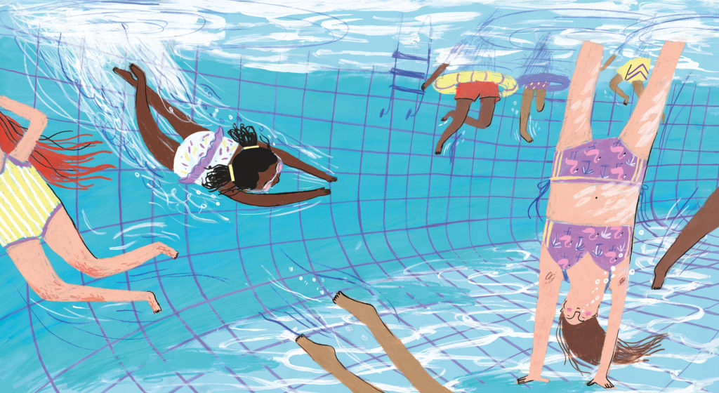
Roozeboos: I love it when an image shows something different from the text; in this way, a visual conversation between both can really happen. For me, that truly is the power of illustration. So quite early on in the process, I decided to not have any reference to ‘the pool’ in the text, but only let this be shown in the illustrations. There is one page in the book that doesn’t have any text, which is the underwater spread. I liked this because it is almost like you are entering into a new (underwater) world that doesn’t require any text. I think the pause in the text makes the impact of the little girl's dive and her decision even stronger.
Mat: Choices is a picturebook that invites readers to keep coming back in order to find new meanings and messages. Could you choose a hidden gem in the book that you would hope every reader notices eventually?
Roozeboos: I do really love details and as a child, I really enjoyed those big search and find images where you can look at for hours, so adding so many little elements comes quite naturally to me! Also as there is very little text in the book it makes you indeed have another look at the book.
Mat: There are so many fantastic spreads throughout Choices but do you have one that you are particularly happy with?
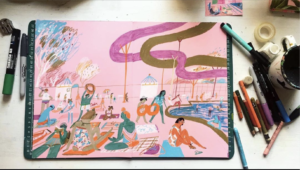
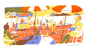
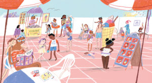
Roozeboos: It’s hard to choose my favourite, but one of the spreads that I tried in several different ways is the ‘little choices’ spread with the ice cream stand.
It was one of the first images I came up with and I drew it several times to see what materials would work best. I made some sketchbook versions and also a screen-printed version. Then when I signed the book deal with Child’s Play we changed a few more things. We added lots of extra little choices to find in the image. For example, a boy and girl choosing to pay with a card or cash; two different options of games on the table; and people looking at menus to see what ice cream to choose. But also choices about bigger themes such as being helpful.
Mat: Please can we have a tour of your workspace in Rotterdam and some of the materials you work with?
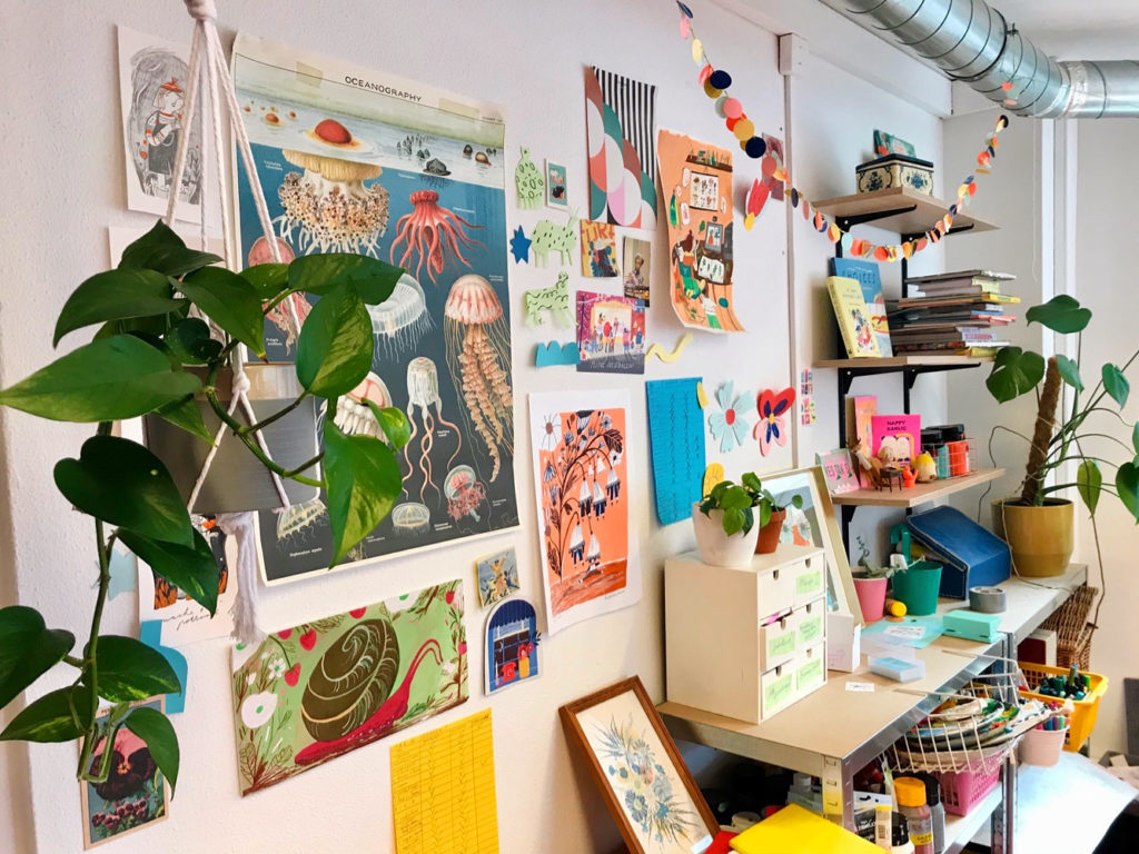
Roozeboos: Yes of course! It’s a studio I share with graphic artist Teuntje Fleur, who is very talented and also one of my best friends. We share the floor with 8 artists from different disciplines, including photographers to jewellery makers. From our window, we look out on the Cube houses, which are very iconic pieces of Dutch architecture and it’s next to an art supplies shop. I recently built a little screen-printing studio there with the help of my friend, Swaan. So this summer has been all about screen printing for me! A lot of trial and error in this little DIY-improvised studio but I love finding out all about this process. I did it a lot on the MA and I haven’t had a chance to do a lot of printmaking since, so it feels like a real playground to me! Especially since I love it so much.
Mat: In the video, you talk about working to achieve an 80’s vibe. Can you talk us a little through those initial stages of playing around with different materials and colour combinations?
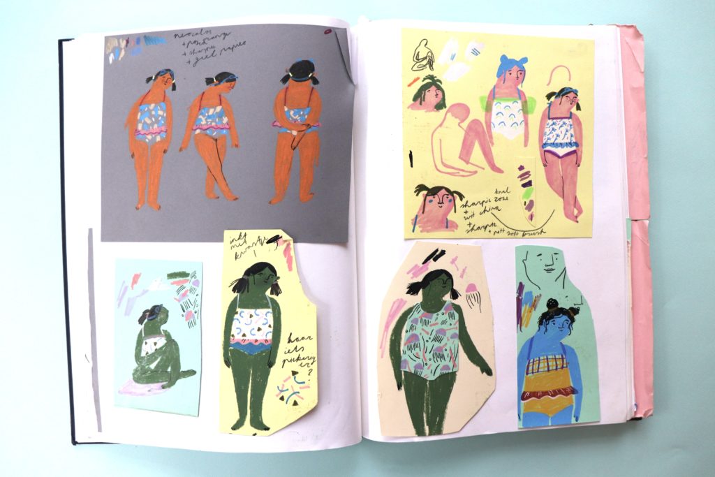
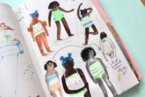
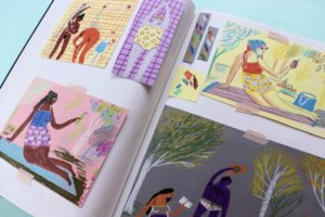
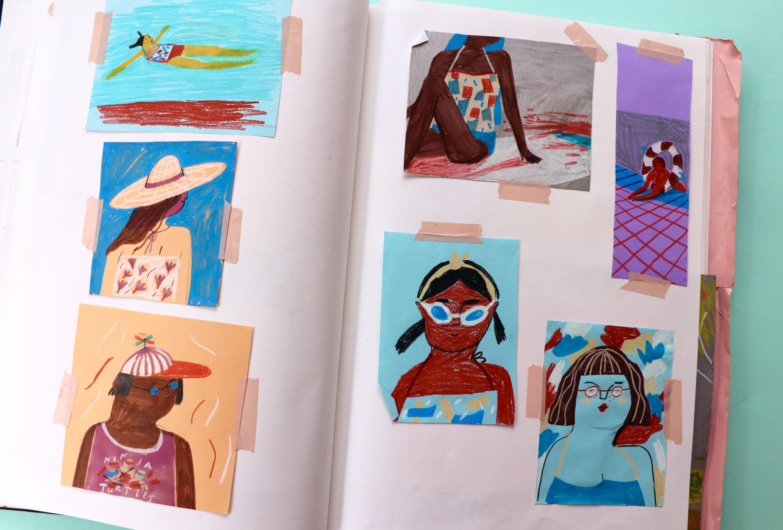
Roozeboos: What I loved in the pool is how people tend to wear these pretty funky bathing suits, with bright pink dots or blue palm trees for example, and a lot of colour blocking. Which, to me, feels very 80’s, an era that I very much love! So inspired by this aesthetic I wanted to have the whole book feel that way. That’s why I started working on coloured paper, as it gives you an instant block of brightness. This paper works really well with crayons as they tend to not change colour so much if put on a coloured background.The energy this material gives also works well with the happy summer vibes of the book. This was kind of the thinking process I was going through in my sketchbook.
Mat: Are there any contemporary artists/illustrators whose work you admire so much that you think everyone should encounter them?
Roozeboos: I really admire a lot of more modern illustrators, like Carson Ellis for her beautiful details and Christopher Cor for his sense of colour and naive paintings. Another important influence for me is Fiep Westendorp, a very famous Dutch children’s illustrator, who makes the wonderful busy scenes full of amazing characters. Also some things that inspire me are movies or books like my all-time favorite Le Fabuleux Destin d’Amélie Poulain, everything from Wes Anderson, writers Toon Tellegen and Raynor Winn, music from Spinvis or Andrew Bird. But to be honest, inspiration can come from everywhere!
Mat: Can you share a little with us about what you’re currently working on and what we can look forward to reading from you in the future?
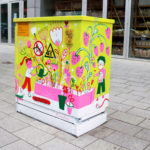
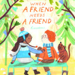
Roozeboos: I am in the very first steps of the process of my first author illustrated book with a Dutch publisher, which is really wonderful. I haven’t written any books in Dutch and as this is my mother language it feels just very special! It will be a book about food, cycling and some of my favourite spots in Rotterdam, that’s all I can tell you haha. Also, in the last months I’ve been working on some different non-children’s book projects, like some editorial illustrations and painting an electric box in the centre of Rotterdam. Something else that is exciting is a new author-illustrated picture book from my hand that’s coming out in April 2023 with Scholastic! It’s called When A Friend Needs A Friend.
Choices is published by Child’s Play, 978-1786285645, £7.99 pbk.
The Klaus Flugge Prize is funded personally by Klaus Flugge and run independently of Andersen Press.
Website maintenance & Copyright © 2024 Andersen Press. All Rights Reserved. Privacy & Cookie Policy.
