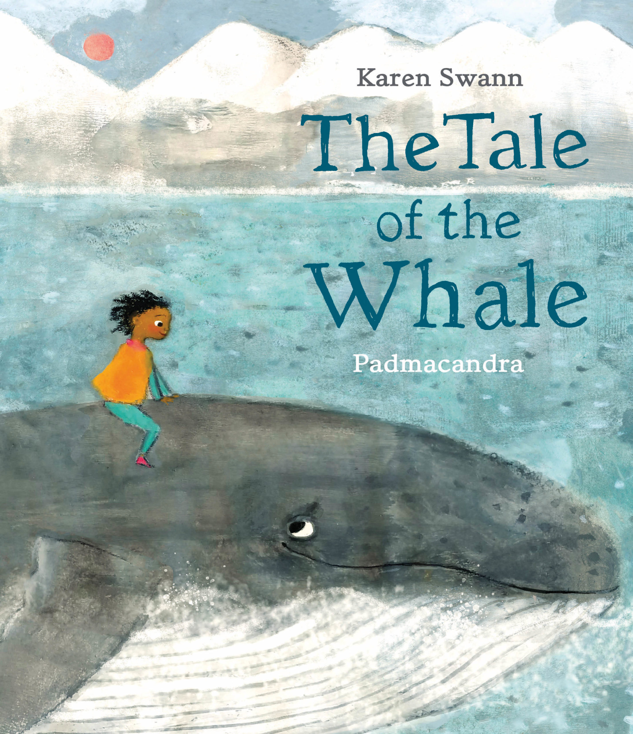
The Tale of the Whale, illustrated by Padmacandra, written by Karen Swann
The Tale of the Whale, illustrated by Padmacandra, and written by Karen Swann, is one of the six books on the shortlist for the 2022 Klaus Flugge Prize.
The judges felt the illustrations make you feel as though you are swimming alongside the whale.
Former Klaus Flugge Prize judge, Senior Lecturer in Education: Primary English and Children's Literature, Mat Tobin interviewed Padmacandra about the book.
Mat: The Tale of the Whale is one of the few picturebooks shortlisted in which the writer and artist are different people. Can you tell us a little about you came to work with Karen’s words and the joys and challenges that come with bringing visual life to them (and how it was important to tell your part of the story too)?
Padmacandra: When I was training to be a children’s book illustrator at the Cambridge School of Art, I experimented a lot with different materials, as I mentioned in my Klaus Flugge Prize video. One of my interests was creating images with different textures and I ended up making quite a few watery images of whales (mostly sperm whales). Then one of the projects for my masters (“The Usual Story”) was a book about different types of transport that children might use to get to school, the main characters in the book being residents of a remote island, who travelled by whale.
At the same time, a fellow student Rose Robbins who had graduated before me and been picked up by Scallywag Press (with her charming books of growing up with an autistic sibling – Me and my Sister, Talking Is Not My Thing and more), very kindly pointed Sarah of Scallywag in my direction, and we met to discuss ideas.
Initially Scallywag was considering another book of mine (Don’t Be Silly! now coming out next year), but soon after I graduated, they were sent the prize-winning text for The Tale of the Whale by Karen Swann - and loved it. I was sent the text and found it beautiful and moving: the clever and lulling rhythm, the echoing phrases, the rich language. And of course, I loved the environmental message of the book; the fact that it was an invitation to children, rather than being preachy.
So, I was signed to do both books, the Whale book being first.
It was in many ways simpler to focus on the illustrations without the editing aspects of the words, and I could play around with many of the techniques I’d already been experimenting with. Having said that I often felt “out of my depth” (pun intended), but I’m now beginning to think that may simply be part of the creative process – especially at the start of a project when making decisions about how best to render the illustrations. And moving from “vision” to actual images on paper.
The book evokes both the beauty and wonder of the sea, and simply trying to evoke that beauty – through texture and colour – was one of the joys of the book. Connection – the connection between the child and the whale in particular – was also an important theme and helped keep me engaged on a heart level while making the images.
One of the challenges of the book was to work with the relative sizes of the child and the whale – to keep them both visible and on the page – while varying the perspective.
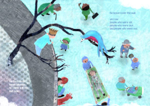
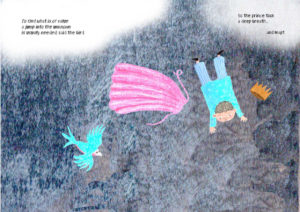
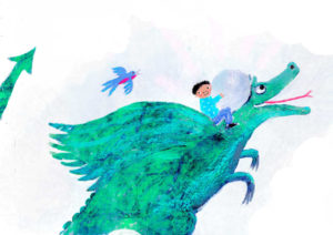
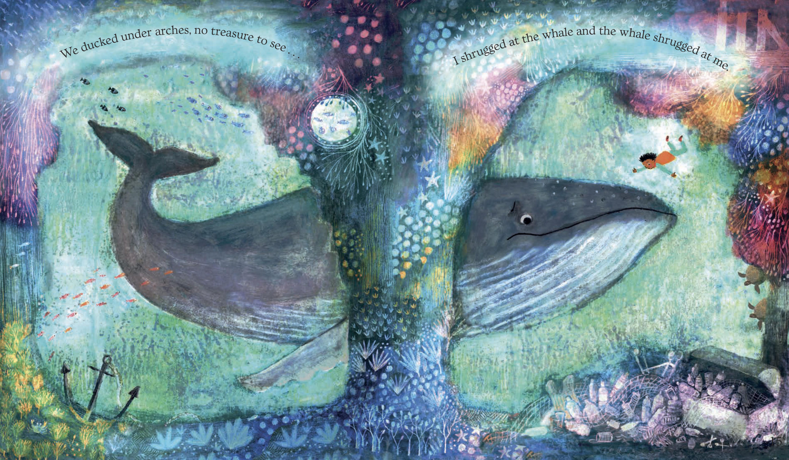
In terms of the visual story, it seemed natural to add an accompanying seagull to most of the spreads. The seagull, like the reader, witnesses the drama unfold, and responds with compassion, accompanying the reader emotionally. I also wanted to add details that were not obvious, and that perceptive readers might pick up on, such as the cliff in the title spread, or the plastic rubbish gradually creeping in. Where the whale is taking in a huge gulp of the plastic soup sea, children can count the different types of rubbish listed in a following spread’s text. The treasure chest of plastic rubbish links us back to the title spread’s supermarket.
Finally, I have spoken before about wanting the pictures to echo and counterpoint with the lovely rhythm of the words. Hopefully this works throughout the book, and with the page turns. Words like “rocking horse sea” from Karen were gifts, with seagulls rocking along with the words on top of the waves.
Mat: Part of your journey into illustration and design led you to complete an MA in Children's Book Illustration at Cambridge School of Art. Can you tell us a little about some of the modules you took there and the lecturers who had an impact on your work?
Padmacandra: The Cambridge School of Art have, as you may know, developed a very unique and effective module & teaching structure, aimed at helping students to find their own individual voice and visual language, as well as pushing us out of our comfort zones at regular intervals!
The first module is completely based on observational drawing i.e. getting used to going out with a sketchbook and drawing from life. We were advised to spend a maximum of 10 percent time looking at the page and minimum 90 percent looking at what we were trying to sketch. Inspiration came from shared tales of great illustrators such as Ronald Searle (an alumni of the Cambridge School of Art) who took sketchbooks with him on a long sea journey to Singapore in the second world war and had already developed his mature style by the time they landed.
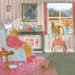
We each took on a theme for this module. Because I do care work with the elderly, I chose the theme of “Young and Old”. I was lucky enough to be working with the mother of a friend – a tiny Scottish woman full of character - who suffered from dementia, and both mother and daughter gave me permission to sketch at work. I also had one or two other clients. (Finding children to draw was trickier, and it was hard not to feel slightly surreptitious – we were advised to ask permission from an institution or organisation. Also, children are harder to draw as they move a lot more quickly!)
One of the points of this module was to return to the bedrock of our own unique ways of mark making. I often reflect that just as our handwriting is unique to us, without our having contrived it in any way (unless we were taught writing in a rigid Victorian manner!), so is our mark making. Continually getting marks down on paper in response to what we saw weaned us away from trying to imitate any kind of “style” (in fact the word “style” was almost a swear word within the course), and to find/trust our own authenticity.
One interesting thing we discovered during the whole course was that there seemed to be two distinct groups of illustrators on two ends of a continuum: people who draw more on observational drawing for their inspiration, and those who draw more from inner imagination. Both seem to be needed for a final authentic image, even in terms of including relatable visual details in an image. I would certainly say that I tend to draw more from an inner landscape, but at the same time, I feel I need to do more observational drawing, so that the work stays fresh and doesn’t get cliched.
Another module was the sequential image, in which we looked at how to make a story work over a series of spreads. The excitement and different uses of page turns, and how pictures have to work in rhythm with the words, while telling their own story, I found fascinating. Having an interest in poetry, I love the fact that everything in a picture book has to work hard to earn its place. We also looked at comics and how they worked to speed up or slow down time, and to transition from one spread to another.
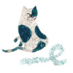
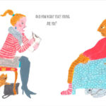
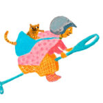
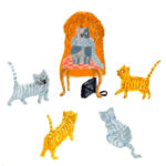
For my sequential image module, I used my care and social work experience to create a story about an old woman who turned various patronising visiting social workers into cats! I also made a book based on a gnostic hymn – the hymn of the Pearl.
There were two large written assignments on the course too, including a 6000-word essay in the final year. Now that I’m “out in the world” as an illustrator, I can see the point of that essay even more, because as illustrators we are often asked to talk about our work (as indeed I am doing here). My chosen topic was rhythm in picture books, and this certainly continues to be a particular interest of mine.
Finally, the thing that made the course particularly effective I think was the enthusiasm, energy and expertise of the tutors, plus the combination of one-to-one short tutorials, and regular feedback groups with these tutors. Like many people, I found Pam Smy a huge influence and an outstanding teacher. She seemed able very quickly to be able to know what was needed to develop an individual’s work and was one of the people to nudge us out of our habits, and into new scary but ultimately rewarding ground. For me it is her own work – and her enthusiasm - which is the greatest inspiration. Seeing into her sketchbooks alone is mind blowing!
Ness Wood the designer was a visiting tutor who taught at the Summer School, and was the first person to be really encouraging to me. She liked the story I bought to the school when I was deciding whether to attend the course and asked me to send her some “colour work”. I had never heard the term “colour work” but sent her my first attempts at illustrations for the story. She said kindly that she didn’t think it was “there yet” - and that was the final deciding factor to me attending the course. It was lovely that Ness became the designer for the Tale of The Whale too!
There were also a wonderful and diverse group of visiting tutors. Charles Shearer, the great printmaker was one who left a lasting impression with his magical mark making and textures, Hannah Webb gave great advice on drawing from life and perspective (and how to avoid being pestered while drawing by dressing up eccentrically!), Paula Metcalf talked with huge charm about how she worked on pictures and words together in notebooks, and Maisie Paradise Shearing was also a wonderfully direct and intelligent tutor. Alexis Deacon of Beegu fame gave some passionate and very inspiring lectures (his draftsman ship!)- and also made us laugh.
Mat: In your lovely video for the Klaus Flugge Prize, you touch on ‘experimentation’ and it struck me that this is a delightfully important concept to share with young illustrators too. Why do you think it’s an important part of the illustrative process for you and can you talk us through an ‘experiment’ for the story that worked out really well.
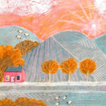
Padmacandra: One way of looking at experimentation is to think of your desk or work area as a laboratory. Or a test site! All you need is a bunch of materials and tools, and a willingness to make marks on paper – and maybe a bit of a mess - and see what happens. Using materials that resist each other such as wax and ink, using unusual tools to make marks with such as nail or toothbrushes, or layering different materials on top of each other and scraping away layers, are all fun techniques to play with. I personally love getting close and hands on to the paper - smudging things like soft wax or oil pastel onto the paper - and seeing what happens…
Chares Shearer one of our visiting tutors at the Cambridge School of Art was a great exemplar of this!
Often, when looking up art materials and how to use them on the internet there will be advice about what materials to use with what other materials. But I’ve found through experimenting that some materials that aren’t supposed to go together make interesting marks on paper. And the most expensive materials aren’t always the best (although sometimes they are! I feel sad for children where they have to use inferior art materials such as poor-quality crayons at school due to cost or health/ safety/practicality). Usually I use a mixture of materials – some cheap as chips, and some of which cost a bit more (Of course if you want to sell your work, you do have to make sure it is “archival” quality, which means it won’t fade with time).
Colour is also something important to experiment with. To play with palettes, and to see what colours go together, is helpful, and can be a starting point for work. We had a wonderful couple of colour sessions with Juliet Docherty on the MA who teaches all about colour and colour theory. www.colourtutor.com
I’ve found experiment important as a way of moving into making images and freeing up the natural latent image making “intelligence” that is within us all. Most of us aspiring (hopefully the aspiring ever stops!) illustrators and artists of different persuasions have to find ways of letting go of the mental narratives that get in the way of simple mark making. Thoughts of the past (what I’ve produced in the past/ will I ever be able to do it again/ failures from the past), thoughts of the present (this isn’t going very well) and thoughts of the future (this won’t amount to anything/ I will never be able to make an image again/ I’ve forgotten how to draw). These thoughts – although ever present while making an image - are really irrelevant to what actually happens when pen or pencil hits paper (except that they get in the way). To get deep about it, there isn’t really an “I” involved in the actual making of an image. Most of us have no idea how the image gets created. There is something natural that can simply unfold if we get out of the way. I find it always a surprise. And the experimental approach helps with this, as “play” takes us into less conscious and more spontaneous ground. Also, it often means for me that I am not starting with a blank piece of paper, so there is already something there to work with or work against.
I’m including an example of an experiment that worked well, that I did when preparing for the book. There were probably quite a few that didn’t work out that happened before this, and that is part of the spirit of experimentation (“learn to fail or fail to learn”- Tal Ben-Shahar). Here – having seen how light often falls through water, I put some patches of colour at the bottom of a white post it note, and some white wax and Vaseline at the top of the note. I then rubbed a very soft blue crayon (manley crayons – a fellow student from Spain told me about them – or sennelier) on top. I then used both a rough cloth (or kitchen roll) to rub a bit off the top of the picture to look like light coming through water, and I scratched into the bottom of the image to make seaweed shapes. I liked the image to I then added a texture and a image of a boy separately (texture made by rolling green ink onto paper – and scanned into the computer).
Mat: Can you talk us through your relationship with Janice Thomson and Ness Wood as Editor and Designer & how they worked alongside you to help reach the incredible final draft?
Padmacandra: I feel very lucky to be working for Scallywag Press which is both small, but also has a very expert and experienced team. This means that there is quite a bit of spontaneity and flexibility about the communication, and quite a few debates about small points happen in email dialogues or phone/zoom calls. Sarah the publisher has quite a bit of involvement at the beginning and end of the process, but also often has a point to add, or comment to make, at different stages, so it feels very collaborative. Its an interesting process receiving feedback and responding to it. Most of the time I really trust the experience of the team, but occasionally one or two of us will stick to their guns on something. I think this collaboration results in a better book in the end, something I’m really finding with the current book too.
From Ness and Janice I received a rough idea of how they saw the words being divided between the spreads, and also a few notes that Karen had discussed with Janice (for example the idea that the character could be non-gender specific) I then drew thumbnails of how I saw the illustrations for each of the spreads including the title page. Ness Janice and Sarah all came back with comments, and after a few rounds of this it was time to transform the thumbnails into bigger more detailed roughs (where more detailed decisions about what goes where go – bearing in mind parameters such as gutters, trim and text placement). The rounds of feedback and redrawing continue until there is a draft that everyone agrees with.
At the same time Ness (and the team) wanted to see some colour work, and ideas of how the characters would be rendered. At some point I created the image that eventually became the book’s cover. This was meant as an example of how the character would look. The image hit the spot for everyone, so we were from then on clear about the kind of character and scenic artwork that we wanted. I also spent a lot of time on the spread where the child is on the jetty and reaching out to the whale. There were some failed attempts before I sent anything to Ness. Ness also encouraged me to keep going with the character. So once I was clear about those two images (the one that ended up on the cover, and the jetty image) it was easier to start producing the rest of the artwork.
One contribution from Janice during the book that I found very helpful was her enthusiasm and encouragement! Especially for my first book that was very refreshing. Janice worked with Karen the writer where text changes were felt to be needed (usually for rights reasons i.e., to adapt to the mores of overseas markets), and then worked closely with Ness and myself, on making sure the pictures communicated well and made sense with the words. I felt that I was given a lot of free rein with the images, for which I’m grateful.
Designers are often the unsung heroes of picture books. Ness did a wonderful job with finding the perfect font and making sure it showed up properly in all those highly textured coloured backgrounds. There is a lot that goes on behind the scenes in making sure the pages and images are aligned so that nothing gets lost. Ness was wonderful at keeping us all on schedule too, which we very much needed.
Mat: I loved how much work you put into the peritextual elements of the picturebook. Seeing an illustrator play with the WHOLE book and use it to help tell the story is a real delight. You know I am a huge fan of that title page spread. In what ways were illustrating the cover/endpapers/title pages different and how are they still important to you?
Padmacandra: I do love the opportunity that double title pages give to provide some extra background information to the story, or to set the scene a bit. In this case I was able to subtly introduce all the child characters (as well as intimate the whale), and to put them in context of their world, including the commercial world, in which plastic plays such an integral part. The scene is also a snapshot of what is happening just before the child spots the whale - before the story proper starts. I made the double title in a similar way to the other spreads in the book.
In terms of the end pages, they are often thought of afterwards, and are an opportunity to embellish or add to the mood or tone or motifs of the book. In this case, we decided at the front to simply show the beach as it might perhaps be first thing in the morning. There are a few pieces of plastic starting to creep in if you really look, but there is also a sense of calm waiting for the story to begin or the people to arrive. At the back it’s the same beach, but there are people, and a beach clear up is in process. Sort of “before and after” snapshots in time.
The end pages could only be in monotone, but I actually made the image in coloured layers and then switched the image to monotone.
In terms of the cover, the team seemed to think the image I’d made at the start to show the main child and whale characters might work well. So, I worked this into a suggested cover, which was then sent to Ness. She came back with some comments on adjustments, as well as comments from Sarah and Janice.
In general, I love the sense of drama these aspects of the book can add. A bit like going to the theatre and seeing first the curtains open, and then the stage set before the drama starts.
Mat: The Tale of the Whale brings attention to readers of the increasing problems of climate change and pollution. This is something that both you and Karen are passionate about. What are your thoughts on art as a way of expressing and sharing these stories with young readers and is there a spread that you felt captured this plight powerfully?
Padmacandra: One of my favourite spreads is the one where the whale and the child are swimming through two arches covered in colourful sea flora and fauna. The spread happens at a time when the friendship between the whale and the child is secure, but it shows the beginning of uncertainty after quite a bit of adventuring together. We can see the majesty and beauty of the sea world, but we can also see something unsettling that shouldn’t be there (the treasure chest that is filled with plastic, not treasure: I enjoyed playing with the words in the text here “no treasure to see”)
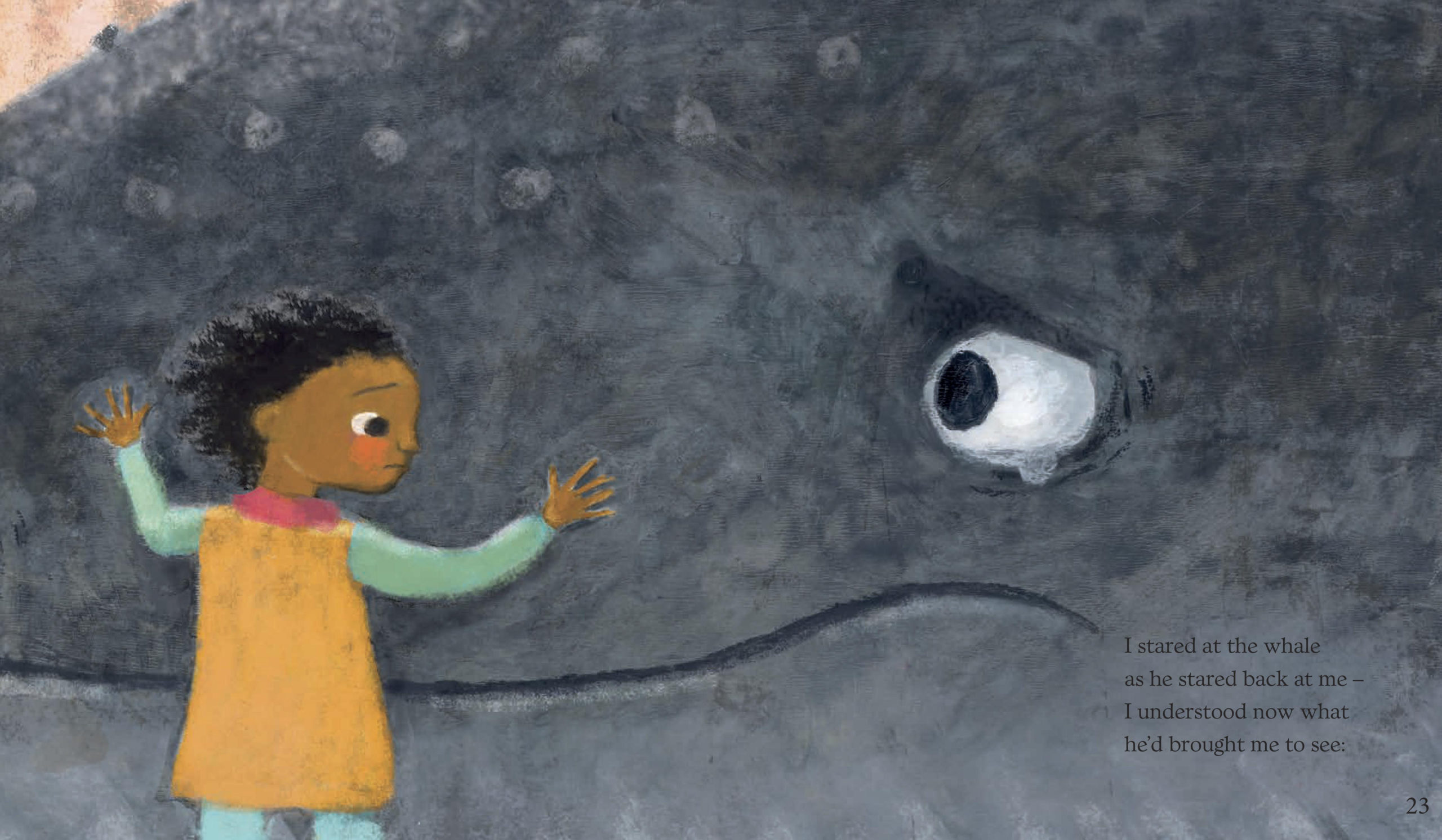
Another spread that is a favourite of mine and of Karen’s is the close up of the child and whale’s faces when the child realises what the whale is trying to tell them. Recently I did an event at Hastings Library and read the book. At this point in the story, the room went very quiet, and I looked round to see lots of round eyed, attentive children.
Mat: One of the comments you made in the video was about ‘finding’ the character. I would love to hear more on this, the process you went through and why both you and Ness found this so important. Did you spend a lot of time on the periphery characters and their stories too?
Padmacandra: I found it took a bit of practice to get the character of the child looking right. We had decided on a non-gendered child (although it’s fascinating that different commentators on the book have seen them as either a boy or a girl – about half and half either way!). My first drawings of the child were of a girl, and of too young an age. Ness was great at keeping me going trying to get the character right.
Age, gender and authentic ethnicity were all important for the main child character. But also that the character be relatable and believable; someone children could relate to and empathise with/ project positively onto. I did quite a bit of sketching children in movement, running and swimming for example – from life or film (many illustrators draw the character loads of times from different angles to get to know them).
I think too there may also be something for me of finding the right balance between realistic, and imaginative/symbolic drawing. I’m attracted more I think to the latter but needed to move a bit towards the former for this book (if that makes sense). I found it a little hard to be objective, so sending samples to Ness and getting feedback was helpful.
On the simple level of consistency through the pages, getting the character right is also important!
In terms of the peripheral characters, they did all have a bit of a background story too, which can be seen in the pictures.
Mat: Can you talk us through your journey to becoming an illustrator? Were there any picture book illustrators who had an impact on you (inspired you) when you were younger and as a budding illustrator?
Padmacandra: I was always interested in alternative worlds as a child. I used to take my younger brother on “exploring” expeditions, where we looked for a place called “duggiland” (I realised later this probably came from a Lewis Carroll book called Sylvie and Bruno where two children visit Doggiland while searching for their lost father). I had a sense that we had been some sort of royalty in fairyland…I also made my poor brother make potions and fairy clothes with me, made of leaves and petals to leave out for the little people. Strangely, my faith was not dimmed by the fact that these had not been disturbed in the morning!
My mum used to read and share books with us, and I particularly liked the magical ones such as Joan Aitken, C.S. Lewis, and George MacDonald. I terms of pictures, I particularly remember being fascinated by the pictures in a Raymond Briggs illustrated nursery rhymes, and wonderful illustrations in a book of fairy stories by illustrators Janet and Anne Graham Johnston. My great grandmother Mabel Chadburn was an illustrator of children’s books in the art and crafts style, and she and her painter husband used to collect old children’s books, so I was always aware of the possibility.
When I was in my early teens I found a large roll of white paper and I drew my first conscious illustration, inspired by a sweet shop near where my grandparents lived in the west country, and a story from Joan Aitken about the Armitage family.
My grandmother was Hungarian, and there was always something a bit magical – and occasionally witchy – about her. I love naive art and folk illustrators from eastern Europe and Siberia – the colours and atmosphere. Illustrators such as Stepan Zavrel and Josef Palacek. Roger Duvoisin, the Provensens and Emanuele Luzzati are also favourites.
I always did well at art in school, but as a dreamy child, I felt I needed to wake myself up a bit, and also had a social conscience, so went and trained to be a social worker instead of going to art school. Soon after getting my first job as a social worker, I discovered Buddhism – and found that I could re-enter the magic and wisdom of imagination through meditation. Meditation led to a period of creativity – but mostly in terms of writing poetry. I was Ordained in 1999 and given the name Padmacandra (Lotus Moon). Some years later, I was on retreat, when I realised that I now felt confident enough to pursue my interest in children’s literature and illustration (The Buddhist movement I am part of encourages the arts and imagination)
I attended a couple of short courses – one of which was the Anglia Ruskin CSA Children’s Illustration Summer School – which confirmed this interest.
Mat: You mentioned in the video that you are working on something. Can you share a little with us about current and future projects and what we can look forward to reading from you in the future?
Padmacandra: This week I received the proofs for Don’t Be Silly, my second project with Scallywag Press. It is a completely different book and for a younger age group (2-6).
It’s a rhyming text featuring two children who are slightly bemused at their rather serious adults continually telling them not to be silly. The action mostly takes place in a castle with quite a few stern looking portraits – and plenty of mice – but takes an unusual turn towards the end. I’m already seeing plenty of scope for art and writing activities around the book!
I hope it will be a kind of drama that children and their adults can enter into together & enjoy reading aloud. The book will be out either end of this year or beginning of next year.
For future projects I’d love to do something about poetry and the kind of listening stance that is needed for hearing what the world is trying to say to us. When I was in school, I vividly remember a supply teacher bringing something in about haiku. Out of the general fog of school, something in me really pricked up her ears!
I’d also like to continue exploring texture and materials. People tell me that my work is distinctive, but I’m seldom completely happy with what I produce. Not having had a conventional foundational art training has its advantages and disadvantages. I feel very much a beginner: there is far to travel and much to be discovered!
The Tale of the Whale is published by Scallywag Press, 978-1912650910, £7.99 pbk.
The Klaus Flugge Prize is funded personally by Klaus Flugge and run independently of Andersen Press.
Website maintenance & Copyright © 2024 Andersen Press. All Rights Reserved. Privacy & Cookie Policy.
