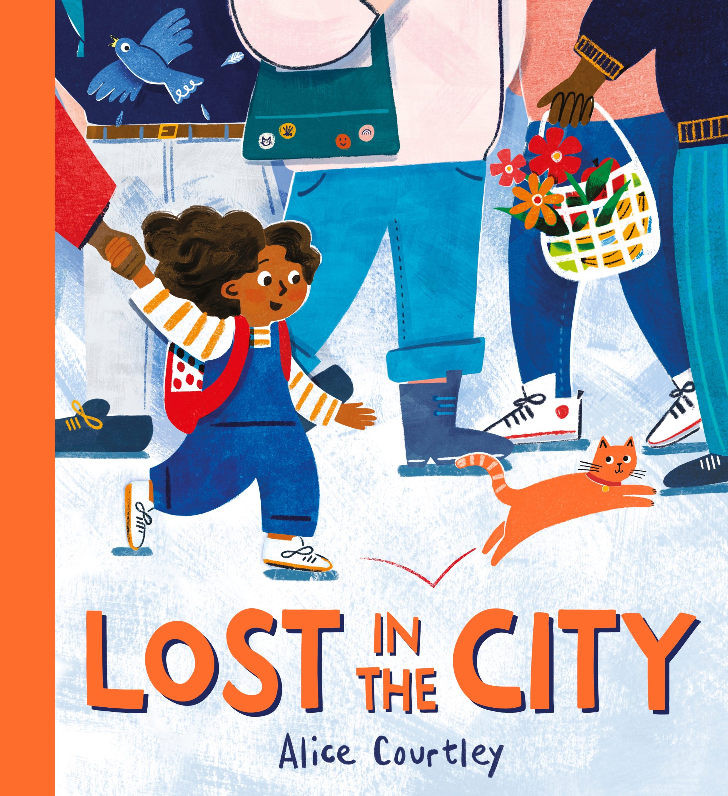
Lost in the City, by Alice Courtley
Lost in the City by Alice Courtley is one of the five books on the shortlist for the 2023 Klaus Flugge Prize.
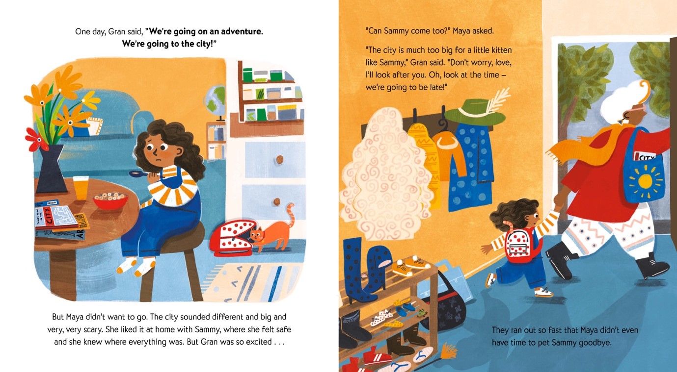
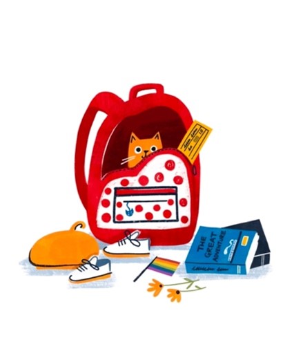
Maya is a bit nervous about a trip to the big city, but little kitten Sammy, who’s stowed away in her bag, has no fears. Chasing Sammy leads to fun adventures, and a spot-and-find game for readers too. The judges admired Alice Courtley’s control of the story, and her use of composition and colour. They praised the consistency of the lively world she creates.
Former Klaus Flugge Prize judge, Senior Lecturer in Education: Primary English and Children's Literature, Mat Tobin interviewed Alice about her book.
Alice, you have mentioned that you love to create ‘playful images with a blend of people, animals, and background inspired by real life," and it's safe to say that Lost in the City celebrates all these elements. Can you talk a little bit about why these elements are important to you and what they mean to you in relation to this story and beyond?
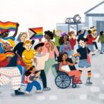
Absolutely; in relation to Lost in the City, I wanted to create a book that was a celebration of all the diverse and unique things, people and places that you encounter in a busy and vibrant city so the inspiration for the story is very much based on real life. But more generally, I’m always searching for inspiration in the day-to-day to create my illustrations and stories. I often find that I’m hit by an idea for a story and a piece of artwork when I’m not expecting it. Maybe I see a person who looks like they have an interesting story behind them, or an animal behaving in an amusing way. I think it’s hard to just come up with ideas off the top of your head but the world is absolutely full of potential ideas for you to find!
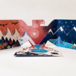
You have a beautiful portfolio that celebrates both your style and an interest in myths. I especially love the eagle with the mountains on its wings. Part of your journey into illustration and design led you to complete an MA in Children's Book Illustration at the Cambridge School of Art. Can you tell us about some of the modules you took there and the lecturers who had an impact on your work?
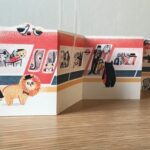
Thanks so much, I really enjoyed creating that eagle/ folding book and would love to return to playing around with unusual formats in my work. The MA in Children’s Book Illustration at Cambridge School of Art was hugely beneficial to me, although it took me a while to find my element. I personally found the first module (observational drawing) a bit hard, despite absolutely recognising the importance of doing it. I previously studied Fine Art and English Literature for my undergraduate BA, with a focus on painting and portraiture on the art side, and I think I had a preconceived idea that illustration was more about imagination and creativity, which I feared I didn’t have. This led me to make lots of very small, slightly self-conscious drawings in the beginning out of fear of being discovered as ‘not a real illustrator’ (I feel a bit silly looking back on that!). It was lucky that I was studying part-time over 2 ½ years because it took some time to shed some of my inhibitions and recognise the importance of experimentation and play. One thing that helped enormously was hearing all the different experiences and journeys into illustration from a fantastic group of lecturers and visiting tutors teaching the MA. I particularly resonated with a talk given by Anuska Allepuz, where she very generously shared her process and ways of working. It was like a light-bulb moment for me where I realised that there wasn’t just one correct way to be an illustrator. Overall the course really gave me the time to experiment (even if that meant making lots of unsuccessful experiments!) and play (which often led to lots of unusual formats, like the eagle you mentioned) – two aspects of being a creative that are so important and I now make a point of scheduling into my practice.
One of the things that makes Lost in the City work so well is the sense of playfulness between what the text is telling us and what the pictures show. Sometimes there's a playful sense of irony, with the reader knowing that Sammy has joined Gran and Maya on the trip, and there's lots to see and smile about throughout the city spreads. How important is it for you that the words and pictures play like this?
I really love books where the reader feels like they know something that the protagonist/ narrator doesn’t know (Rosie’s Walk by Pat Hutchins, or This Is Not My Hat by Jon Klassen being two excellent examples of this). I wanted Lost in the City to have a certain level of this, as I also think that children really like this element in books. It’s also quite useful for parents reading the book, as it allows them to ask questions like ‘What do you think will happen next?’ and fosters a certain type of interactivity and connection to the reading experience. I also love getting the chance to hide things in the details of the illustrations, so if my book has the honour of being read multiple times, there are lots of things to spot on second, third, or more(!) readings.
Can you talk us through your working relationship with Izzy Jones and Elaine Connelly, the Designer and Editor, respectively? How did they collaborate with you to reach the final draft?
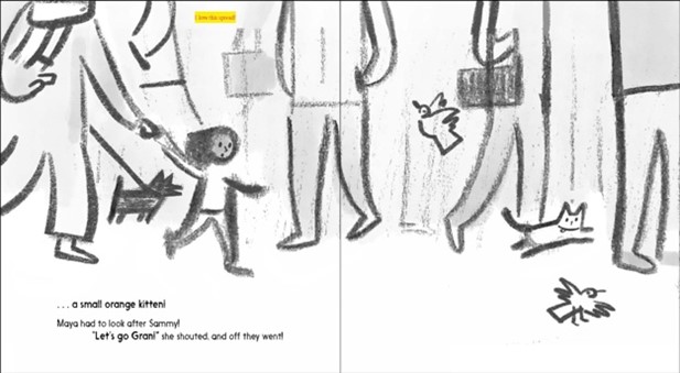
After presenting the synopsis and some initial thumbnails for the book to the team at Hachette, I worked with my editor (it was actually Ellie Brough at the time of working on this project) to get the text just right. We sent lots of drafts back and forth and one of the most fun elements was thinking of all the places they Maya, Gran and Sammy could visit in the city. In the ‘director’s cut’ version I would also love to have them visit an aquarium, a football stadium, a swimming pool and a concert hall! But 32pp is not a lot of pages, and sensibly, we paired it back to the city essentials. Once the text was ready, I worked with Izzy on the more detailed roughs and then colour artwork. It was great having Izzy’s input and expertise on what compositions worked best on each page. Together, we decided that the page where Sammy first gets lost in the city needed a really zoomed in perspective, so that we just see Maya and Sammy at eye-level and then all the legs of the adults. I really love the drama that this created and the connection between the two characters, that the other adults are seemingly unaware of!
I really enjoyed the peritextual elements in the picture book and how you utilized the cover, endpapers, and title pages to enhance the storytelling. Can you talk us through how you chose to utilize them and any moments that you're particularly happy with?
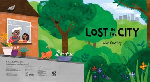
Thank you, yes I think it’s always useful to use these elements in the storytelling if at all possible, as the standard picturebook format of 32pp always feels like a slightly limiting amount of pages! I thought it would be fun to have a little map of the city in the end pages so that little readers can retrace the adventure that Sammy takes them on in the city. The suggestion for the title page opening the story with Maya, Gran and Sammy at home in the countryside, and just a hint of the city in the background actually came from my brilliant agent, Claire. It definitely helps to situate the characters in the story and create that initial separation between them and the big scary city!
You use a lot of different framing devices to control the pace of the narrative, and for me, it was a real strength of the story. In terms of getting the narrative in place within the picture book, were there any hurdles that proved a real challenge? Can you talk us through what the problem was and how you overcame it?
Apart from the initial hurdle of having to reduce the list of possible places that they could visit in the city down to what could fit into the 32pp format, there was also an initial conundrum of whether or not Maya discovers Sammy as a stray little lost kitten in the city or whether, as it ended up being, the naughty Sammy is already part of the family unit and comes with them to the city. The different possibilities really changed the tone of the story, and the pulled the focus from one character to the other. I’m so glad that we went with the version where the pet Sammy sneaks along with them, because Sammy ended up being a very useful device to lead the characters and us through the story - where Sammy goes, we all follow! - and help centre the story around Maya discovering her own confidence as the story goes on. It also neatly begins and ends with the family of three together again.
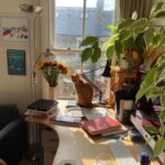
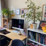
Can I be cheeky and ask for a tour of your workspace? It'd be great to see some of the materials you work with or spaces that are important to you.
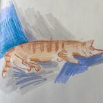
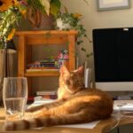
Of course! I’m happy to share my pretty messy and haphazard way of working, which I think is an insight into my brain. I tend to mainly create finished work using my iPad and procreate, because it allows me to control the workflow and make edits if necessary, but I often paint elements and textures by hand to scan in and work with digitally. I love using ink to do this. Often, I’m joined by my glamourous and studio assistant, Oskar, who likes to ‘help’ when I’m on deadline, mainly by distracting me or sitting on my work!
I am always fascinated by seeing an illustrator talk us through the process of bringing a page in their book to life. Can you talk us through a favourite spread of yours and guide us through it from the initial sketch and layout to the finished piece?
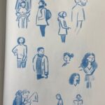
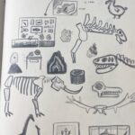
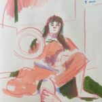
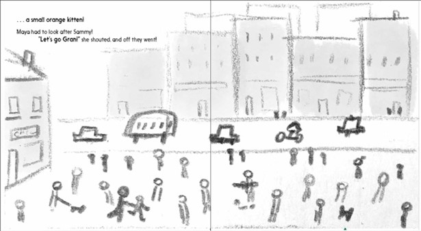
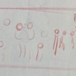
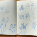
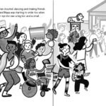
When I’m writing the text for the story, I usually create some initial thumbnails to get a sense of the overall compositions (which usually don’t look like much and only make sense to me!) It’s always interesting to revisit this after the text is finalised when moving onto the artwork stage as it feels like a little puzzle of how to make this initial very rough scribble into a believable scene. It almost always begins in my sketchbook, where I try to work out what the characters, details or environments will look like. Once I’ve done some sketches, I try to compose these together into something that resembles the initial idea, which is often referred to by illustrators and publishers as a “rough”. This needs to be approved by the designer and editor before moving on to creating the final image in colour. As mentioned before, I tend to create most of the final artwork using my iPad and any scanned-in textures made by hand. While I would love to hand paint everything, the complexity of the spreads and the possibility of having to make edits means that it makes sense for me to work digitally.
Are there any contemporary artists/illustrators whose work you admire so much that you think everyone should encounter them?
Yes, there are absolutely loads of artists and illustrators that I could list here! I’ll try to keep it short but some of them are: Viola Wang, who is endlessly creative and experimental, especially with her unusual print-making techniques, Chris Turnham for his incredible sense of composition, particularly in nonfiction books, Marta Altes for her amazing character work, humour, and how she breathes life into every image, Lizzy Stewart whose work is full of amazing textures and colours, Melissa Castrillon and her skill at crafting patterns and cover designs in particular, Yas Imamura for her use of colours, characters, compositions, Sarah Dyer and Emma Carlisle for experimentation with materials and dedication to the craft (both have excellent Patreons where you can admire their work in more detail). There are so many more, but I could be here all day!
Can you share a little with us about the stories you're currently working on and what we can look forward to reading in the future?
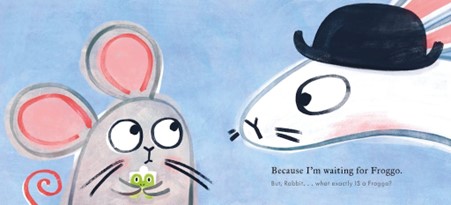
Absolutely! I’m very excited that my next author-illustrated picturebook, Waiting for Froggo, will be published this September 12th. It’s a very silly take on Waiting for Godot with some unexpected twists and turns. I first developed the idea while studying on the MA a few years ago, so I can’t believe it’s soon to be a published book out in the world that people will be able to read! Other than that, I’m working on some exciting books written by other people, which I’m not sure I can say much more about at the moment, but hopefully more soon . . .
Lost in the City is published by Orchard Books, 978-1408364208, £6.99 pbk.
The Klaus Flugge Prize is funded personally by Klaus Flugge and run independently of Andersen Press.
Website maintenance & Copyright © 2024 Andersen Press. All Rights Reserved. Privacy & Cookie Policy.
