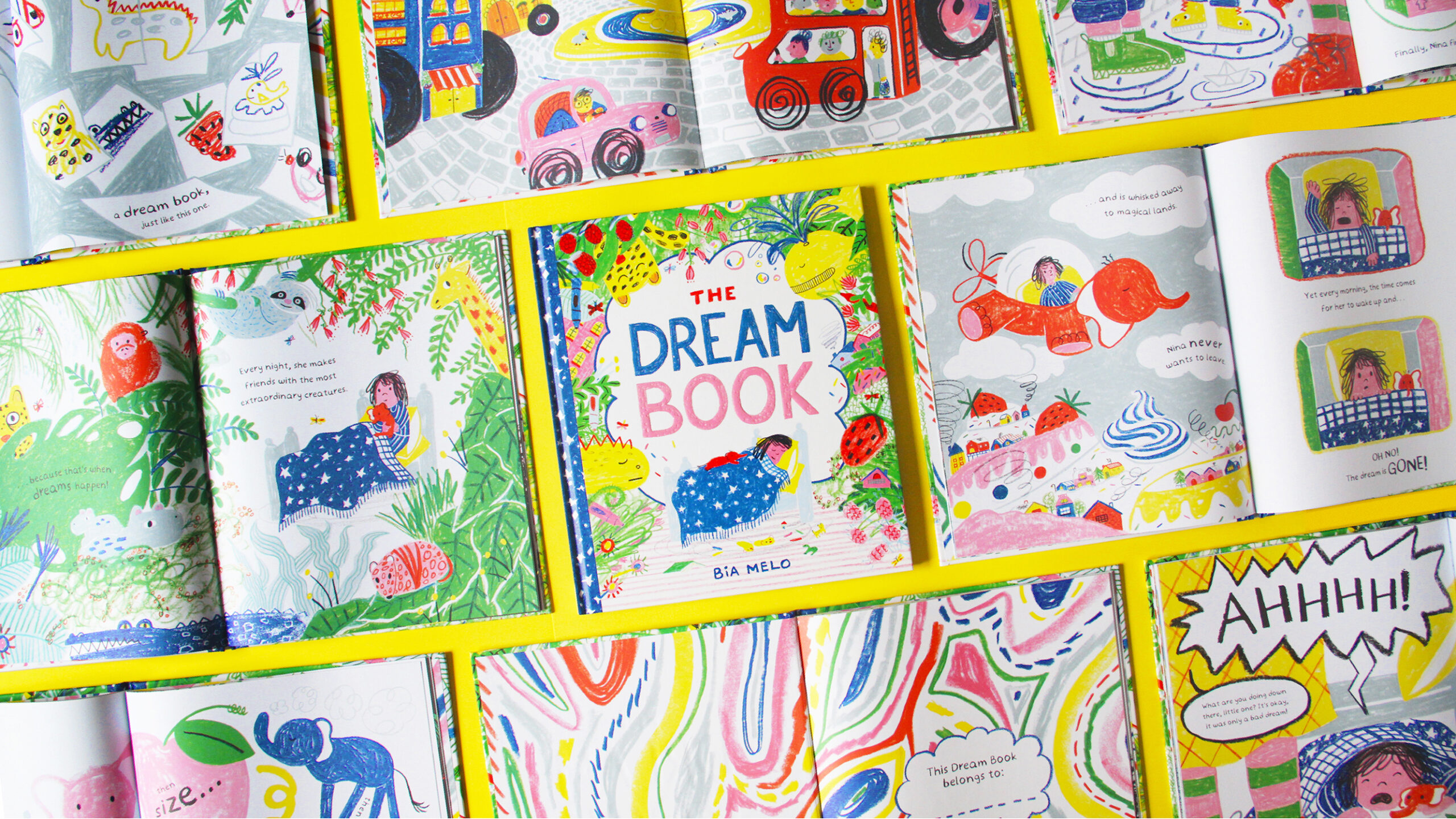
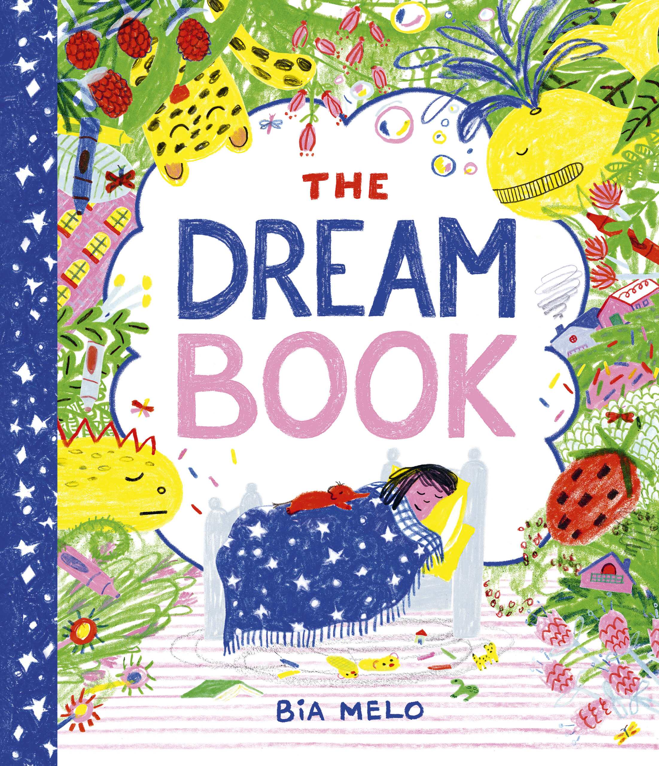
The Dream Book, by Bia Melo
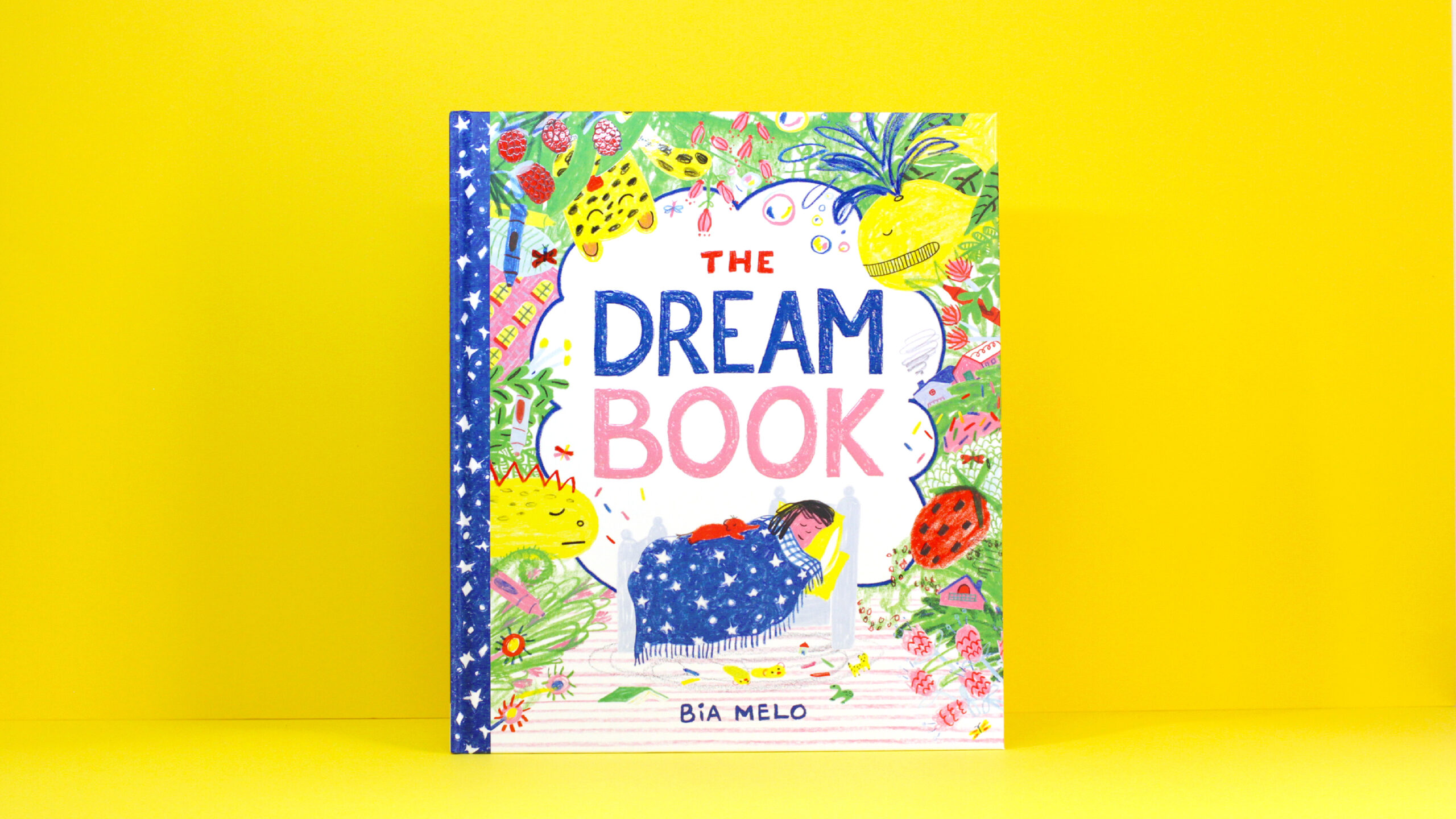
The Dream Book by Bia Melo is one of the six books on the shortlist for the 2024 Klaus Flugge Prize.
Little Nina loves being asleep because that’s when she dreams, and she has amazing dreams! She’s desperate to capture them to enjoy in the morning; a camera won’t work but drawing them will. The Klaus Flugge Prize judges loved the energy of Bia Melo’s drawings and the sense of playful chaos she creates. This is a book that feels fresh and new, they said, and there’s lots to involve young readers.
Bia, you have mentioned being inspired by the little details in everyday life. How did you incorporate these inspirations into your illustrations for The Dream Book and where do you keep your ideas stored?
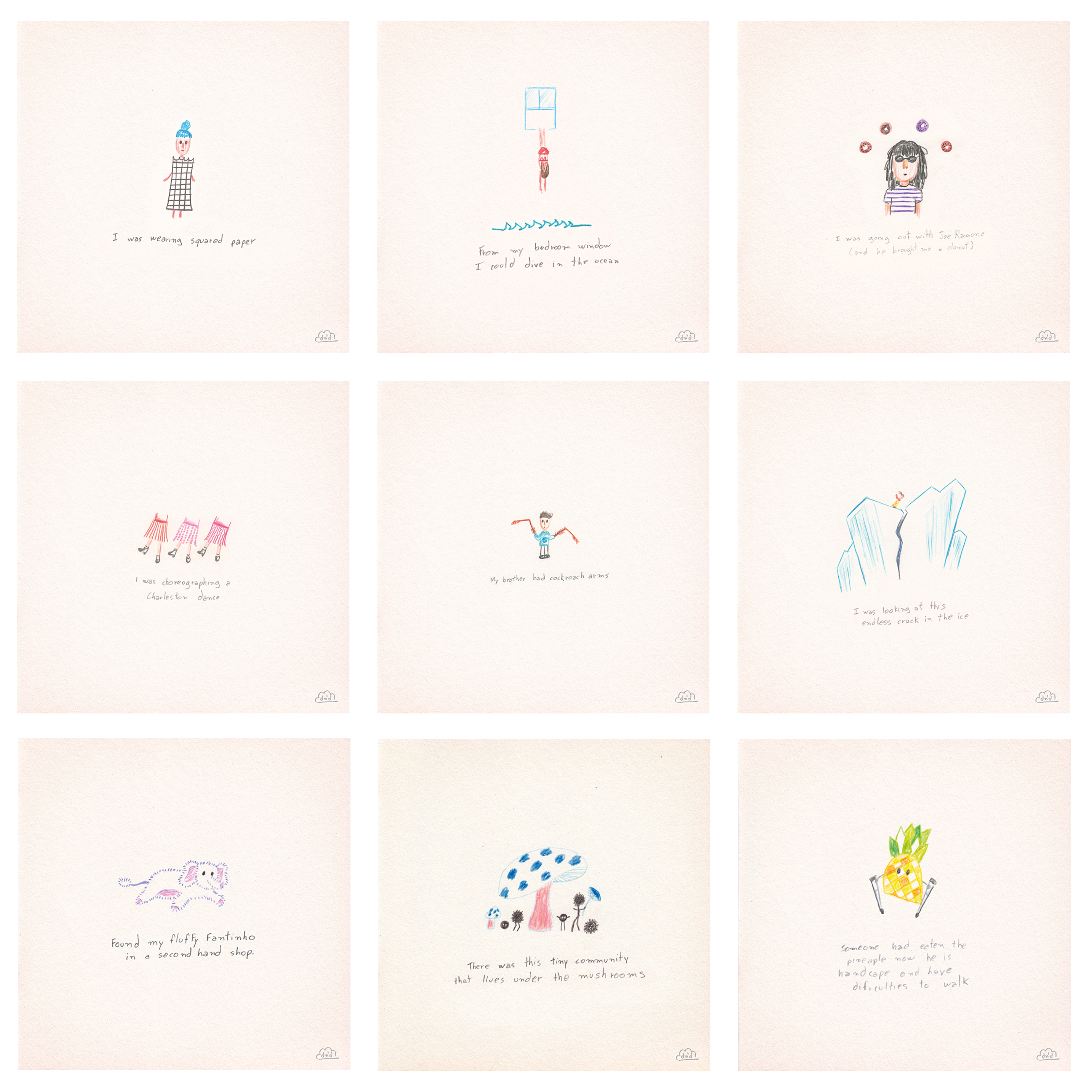
While I get inspired by the little things I see every day, the inspiration for The Dream Book actually came from my dreams at night! For a while I used to keep a Dream and Draw journal and, like Nina in the book, I’d draw right after waking up and would try not to overthink or add my own narrative to the drawing. I’d just capture a key element and write down a short sentence. It’s super simple but really effective. Here’s a peek at some pages from my dream journal.
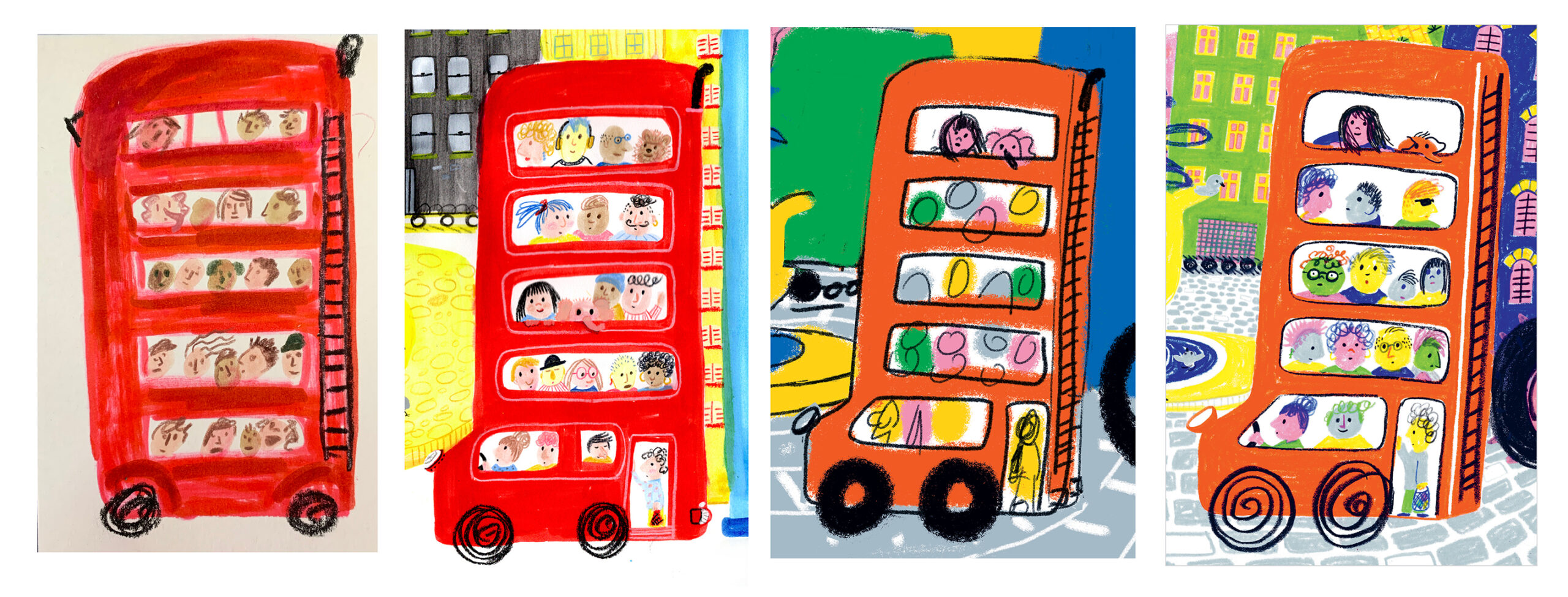
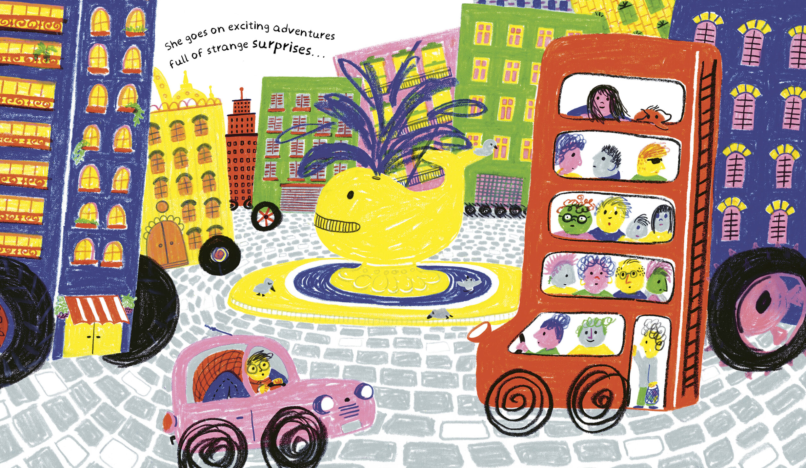
Your illustrations often feature humour and quirky characters. Can you share your process for developing these characters and how you ensure they resonate with young readers? For example, I loved the very tall red bus with a ladder on the back - something I would have drawn as a young child.
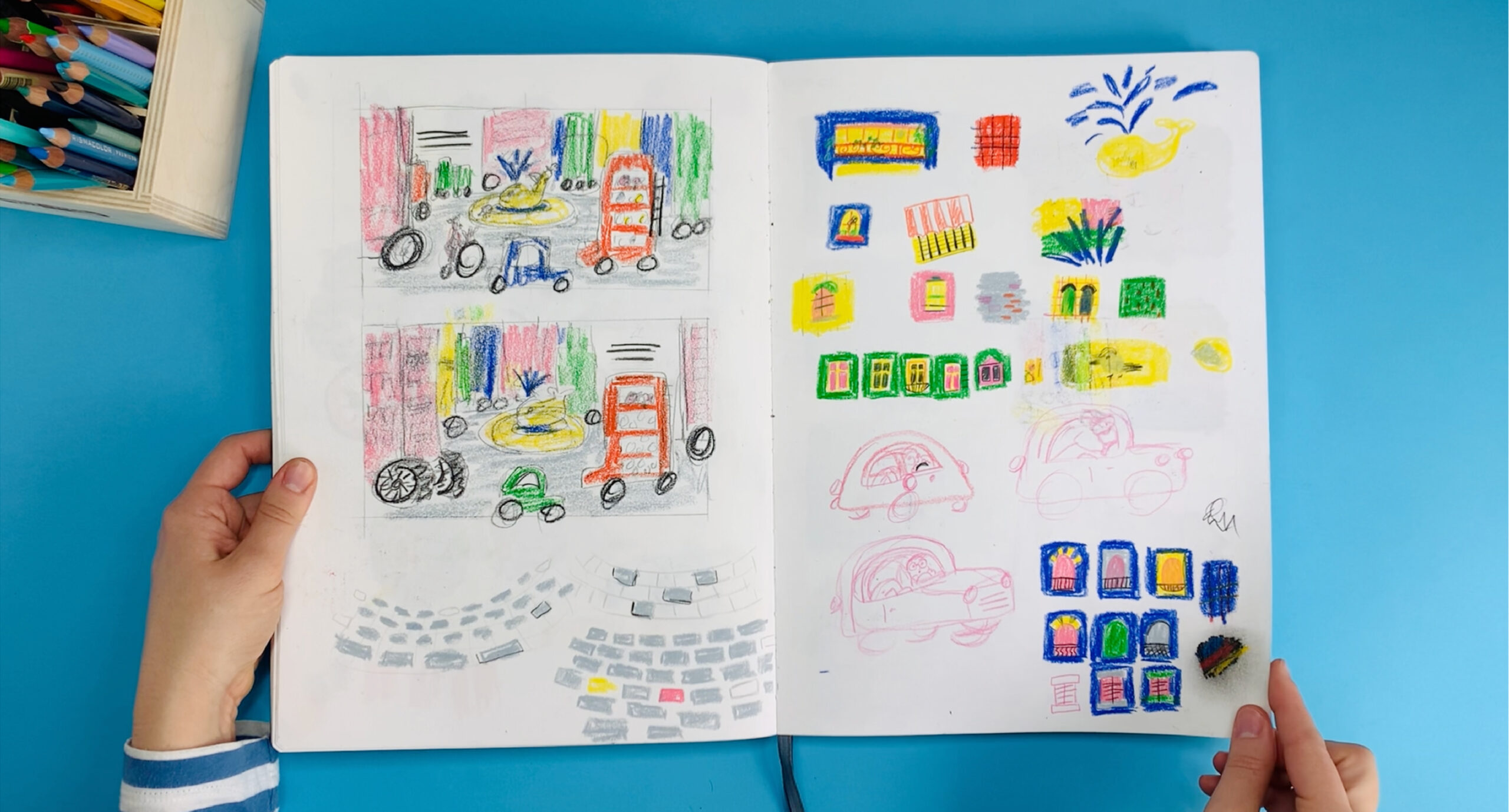
Creating funny and quirky characters is all about having fun, experimenting, and capturing that perfect idea moment - something kids are naturally great at. I’m especially interested in seeing the world through a child's perspective, including how they draw. The very tall red bus came from this approach. It started with the idea of a multi-deck bus, so I quickly sketched it on some scrap paper. From there, I played around with questions like, ‘Could it be the biggest double deck bus ever? Could it be as tall as a building?’ and ‘What if the whole city were on wheels too?’, working almost as a kid’s game, stretching the idea, and playing with it. Here is the first bus, and some early sketches.
Can you discuss the mediums you used for illustrating The Dream Book? As it’s your first published picture book, were there challenges that you faced and how did you overcome them?
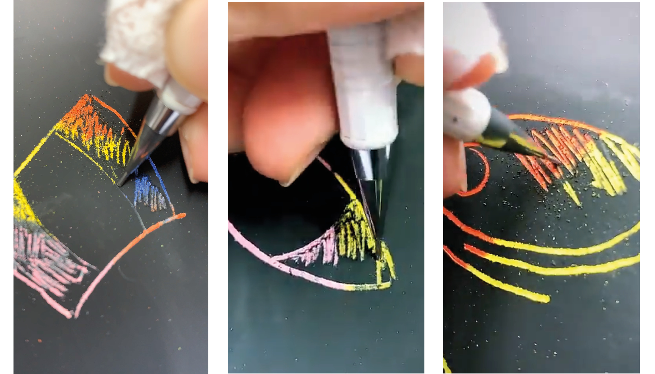
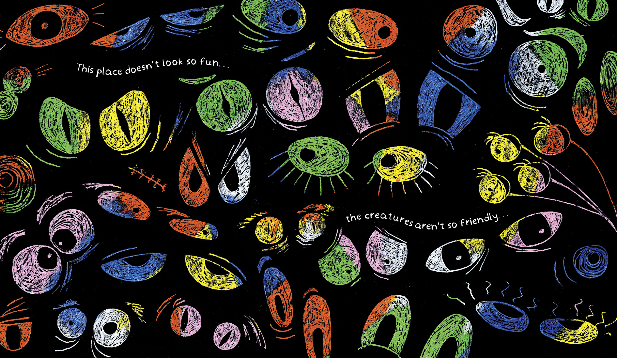
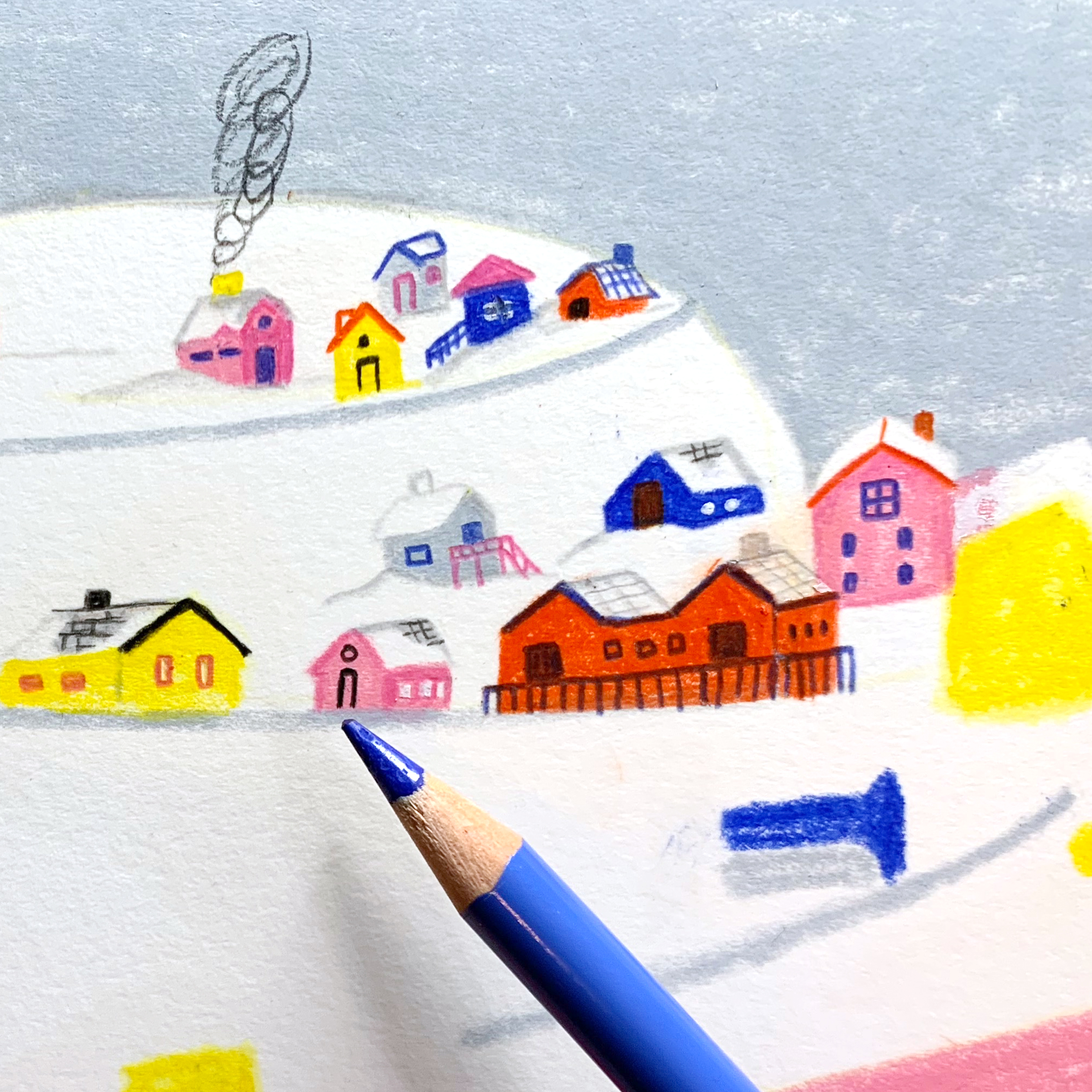
To create The Dream Book I used crayons and pencils because they're tools accessible to children, and I wanted the artwork to inspire them to create their own drawings (though the actual process for the final artwork involved applying a base layer of solvent to melt the wax from the crayons and pencils, which allowed me to add a second layer of coloured pencil on top—definitely more complex than a kid’s drawing!) Since this was my first published book, balancing these materials' constraints with the energy of the drawings was tricky. But I think it added a special layer of authenticity to the story. Here’s a video of the process and some photos showing how I used another technique - scratching the surface painted with crayons - to enhance the emotions of the nightmare scenes.
Illustration Process Video - here
You’ve used specific colour choices and patterns in The Dream Book. Can you elaborate on your choices and how they connect throughout the story?
My colour palette for The Dream Book was driven by two main ideas. First, I wanted the dreamland to be vibrant and full of energy, in contrast to the calm, neutral tones often used in dreamy aesthetics. I aimed for Nina’s dream to be a lively, wonderful place that bursts with colour and makes her want to keep coming back.
On the flip side, I also wanted the colour choices to reflect the basic tools a child might have in a pencil case, so primary colours were a big part of the palette.
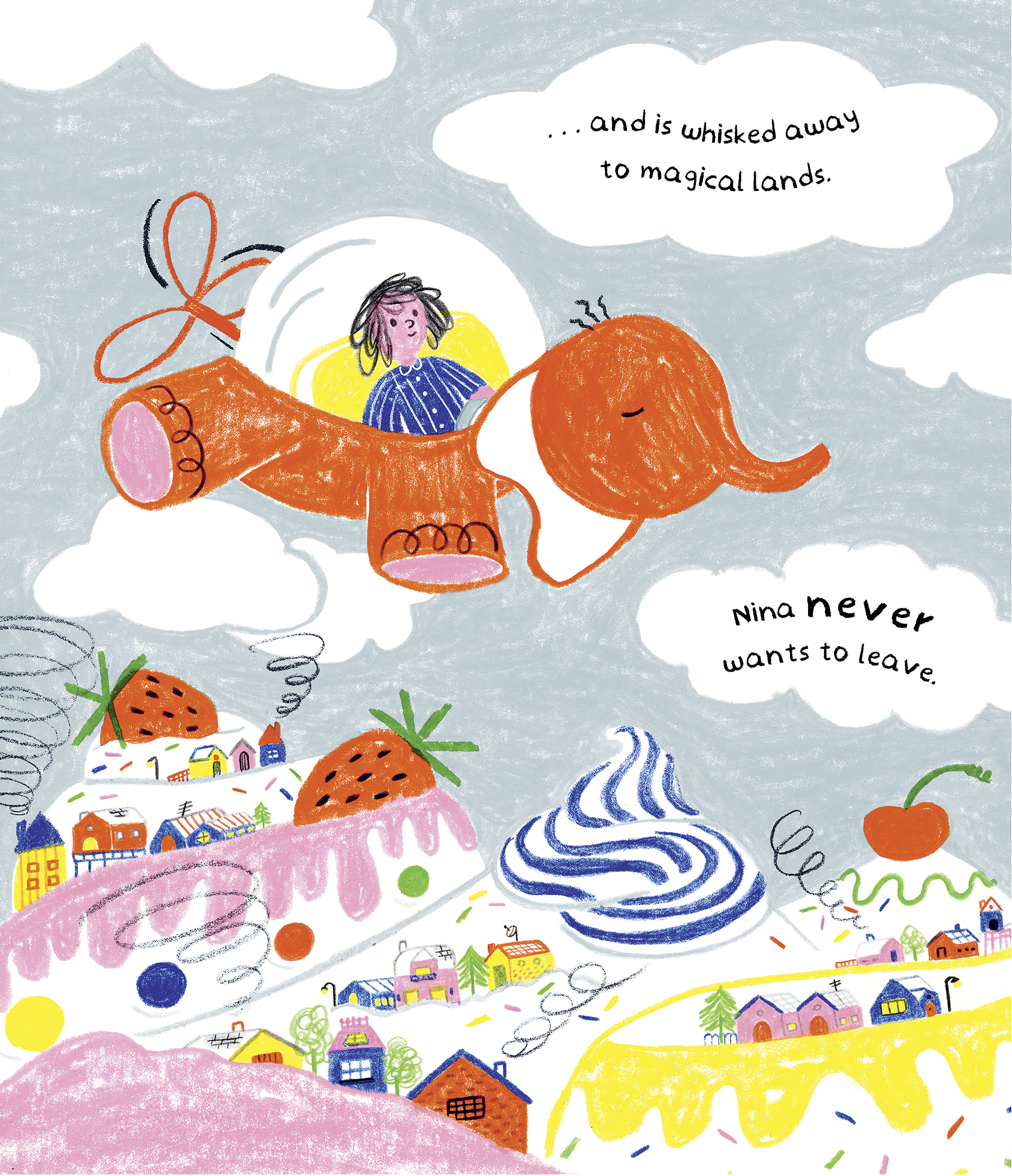
Working with these colour restrictions helped simplify the visuals and let me experiment with textures. However, it also meant that I had to carefully plan the structure of each image to maintain a good balance with the limited palette. Here are some examples of colour studies and thumbnails that show how these choices come together throughout the story.
How do you use negative space in your illustrations, and why do you think it's important for the narrative?
In The Dream Book, negative space plays a crucial role in balancing the vibrant colours and busy details. Because the book uses a lot of bright, full-colour illustrations, I needed the negative space to provide contrast and allow the colourful elements to stand out. I often work with thumbnails of the whole book to plan how the balance of white and colour flows throughout the story.
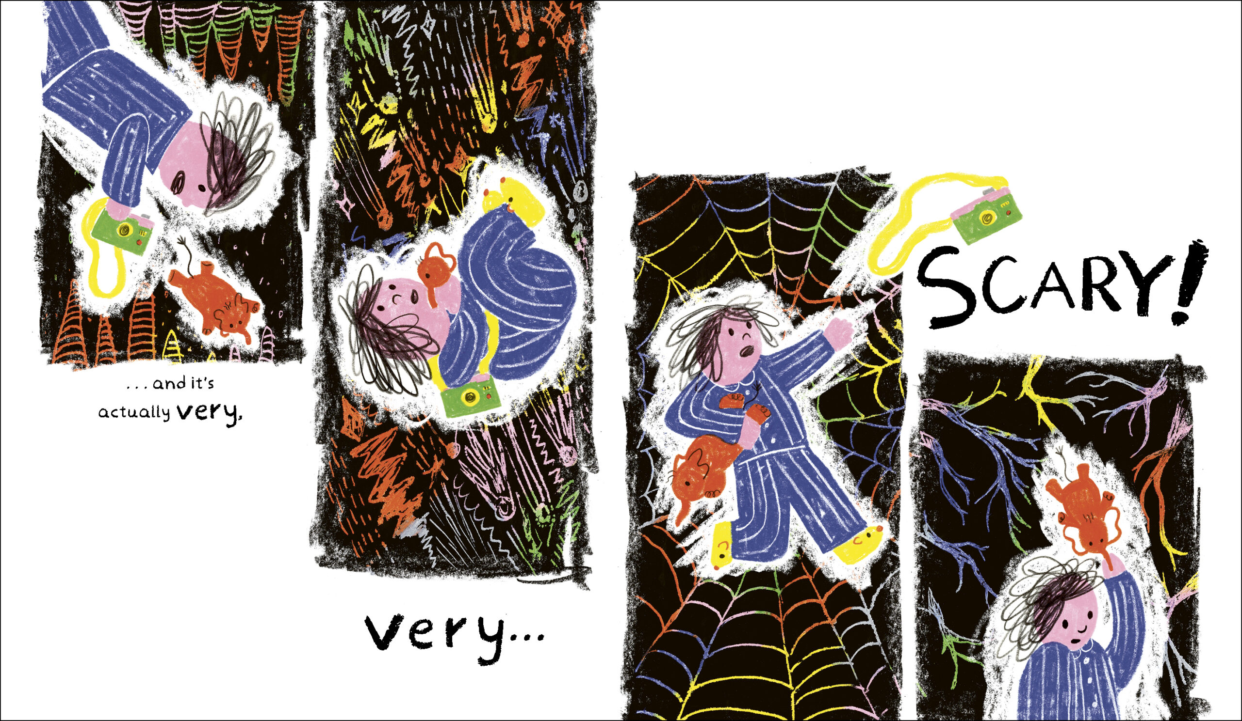
I also like to use white space as an additional colour element. For example, in the Mountain Cake spread, the white space isn’t just empty - it helps define and highlight the surrounding colours and textures. The negative space is essential for creating contrast and depth, making scenes like the 'scary' spread, where scratched-out colours contrast sharply against a black backdrop, really come to life.
What kind of research did you do for 'The Dream Book'? Can you share a favourite spread from the book and discuss what you particularly like about it?
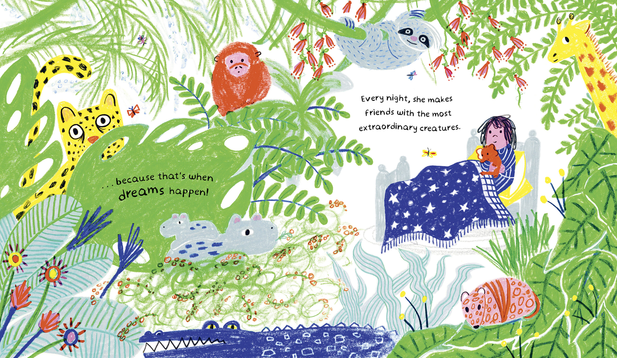
As it was my first book, I delved into my own memories of reading bedtime stories with my parents. You can find two clear references from those times in the book. One of my favourite spreads (shh, don’t tell the other pages!) is the opening sequence where Nina wakes up in the jungle. It’s a direct homage to Maurice Sendak’s Where the Wild Things Are, which has been a big influence on me with its surreal universe.
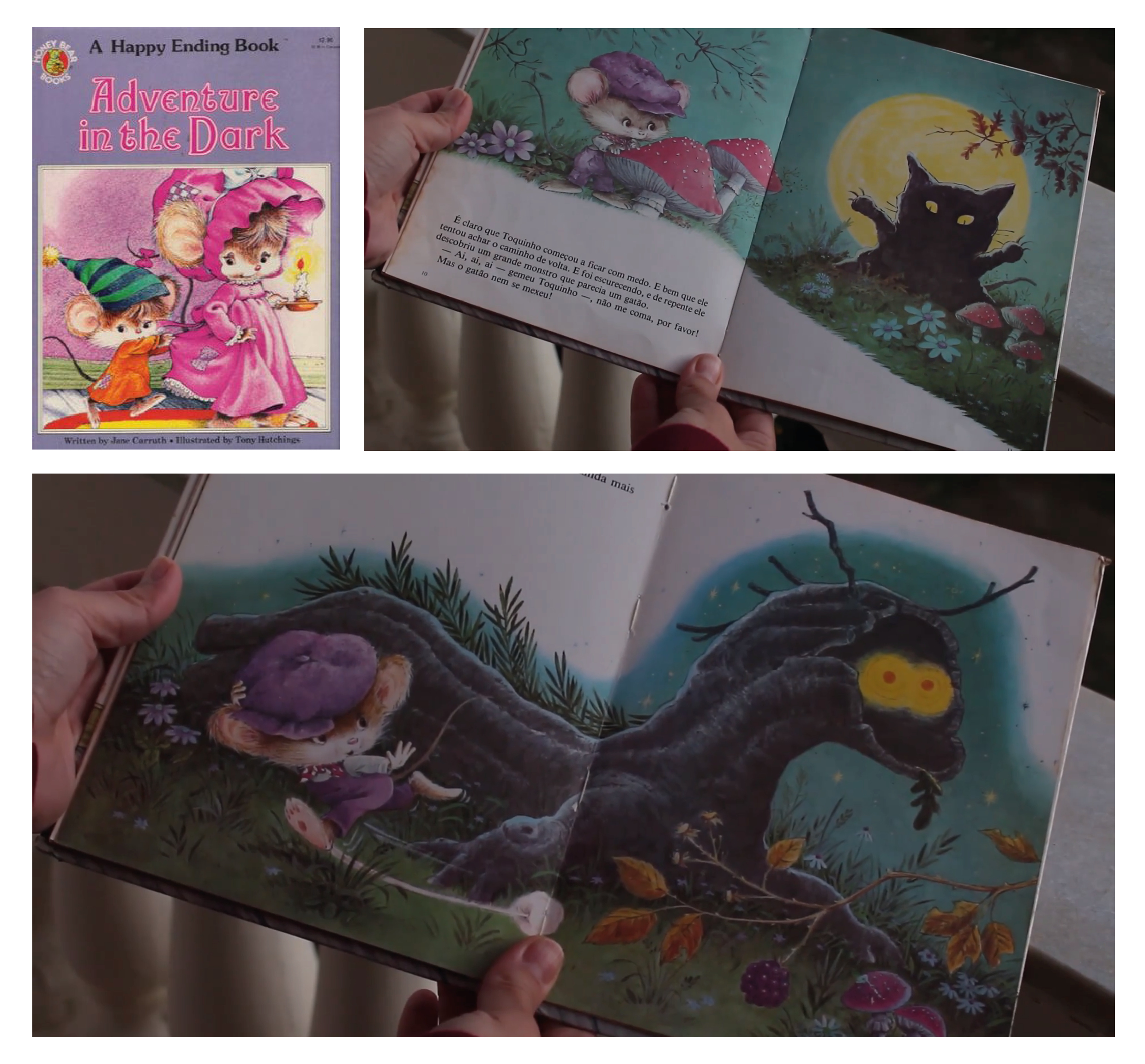
I also vividly remember reading Adventure in the Dark by Jane Carruth and Tony Hutchings, where I was particularly frightened by the glowing eyes in the dark forest. Some of those eerie eyes make an appearance in the nightmare spread of my book.
Here’s a look at that favourite spread and some related sketches and notes.
Images taken from:
Carruth, J., and Hutchings, T., 1985. Adventure in the Dark. A Happy Ending Book [Picture Book] (Cover and p. 9-12). New York: Modern Pub. Available at: <https://www.youtube.com/watch?v=YOKVsESs1lU>
How did you collaborate with the editor and designer for the book? Can you share how their input influenced the final illustrations?
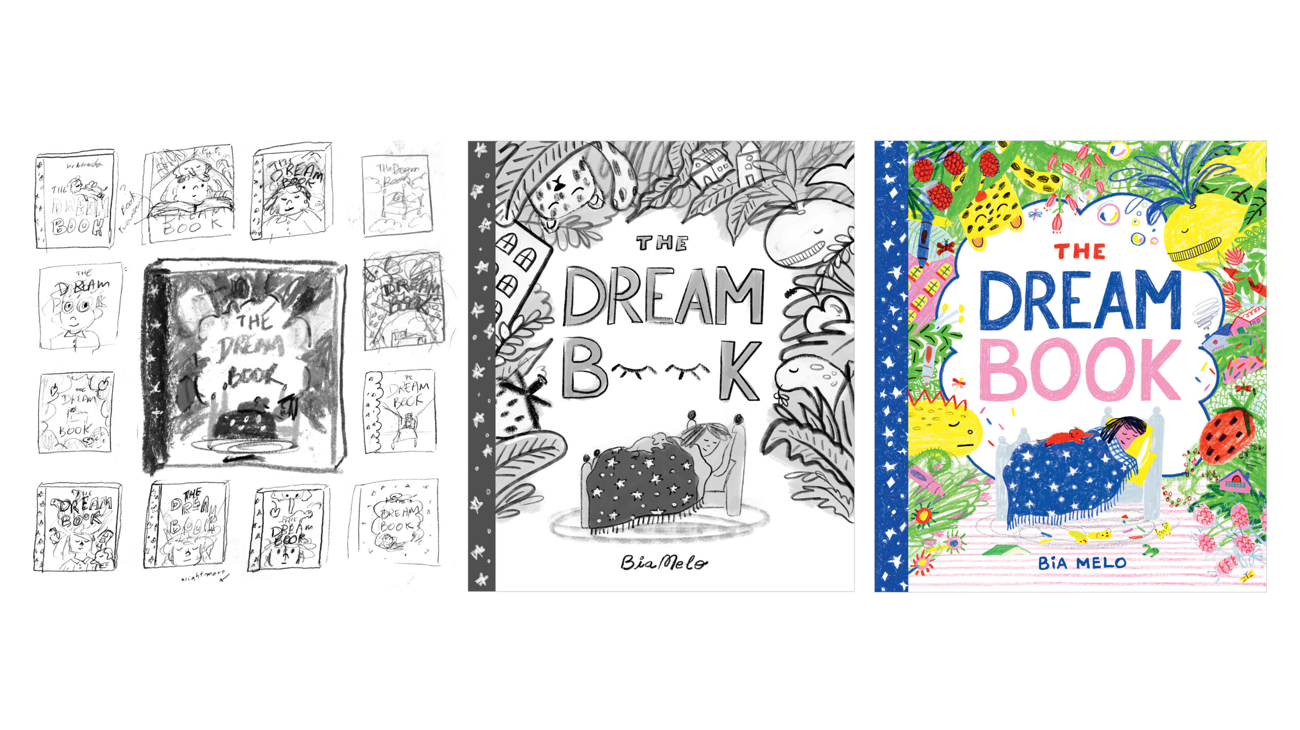
Working with Amelia Warren, my editor, Chris Stanley, my designer, and the entire team was an incredible learning experience and essential for shaping the book into what it is today. Amelia helped transform my initial dummy book from my MA project into a more polished narrative, ensuring it also serves as a useful tool for teachers and parents. Chris did a fantastic job making sure all the crayon textures and colours were printed beautifully and even collaborated with me to develop a font based on my handwriting. A great example of how the book evolved with the team’s input is the cover. Here’s a look at the initial dummy.
It’s important with picture books that the pictures do a lot of the talking. How did you balance the text and illustrations in your story? Were there any challenges?
Absolutely! Balancing text and illustrations is one of the most challenging aspects of creating a picture book. I often need to do a significant amount of editing after the roughs are ready to get the balance just right. For me, it’s all about making sure the pictures do a lot of the talking, while the text either complements or contrasts them - finding that sweet spot can be tricky.
Are there any new projects you are working on? What can readers look forward to from you in the future?
Right now, I’m working on some exciting new projects! I’m working on a new, fun, and wacky adventure story. Spoiler alert: this one features a little character! I can’t wait to share more details with you soon.
Could you give us a glimpse into your workspace and the tools you use for your illustrations?
I try to keep my studio organized, at least when I start working - though it tends to get a bit messy once I'm deep into a project! I love having a mix of media around me so I can play and experiment from the get-go. You’ll find markers, paints, pencils, collage materials, and all sorts of bits and bobs just waiting to be used.
Videos inside the studio: Here and Here
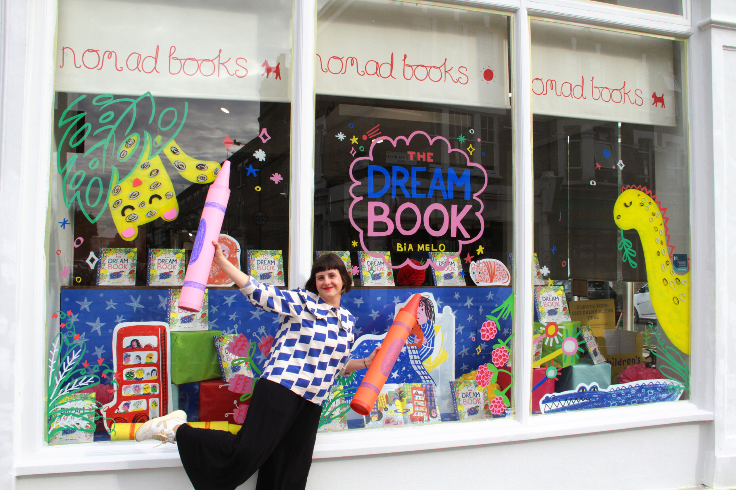
Me with giant Crayons on the book launch day at Nomad Books:
The Dream Book is published by Templar, 978-1800784598, £7.99 pbk.
Extras!
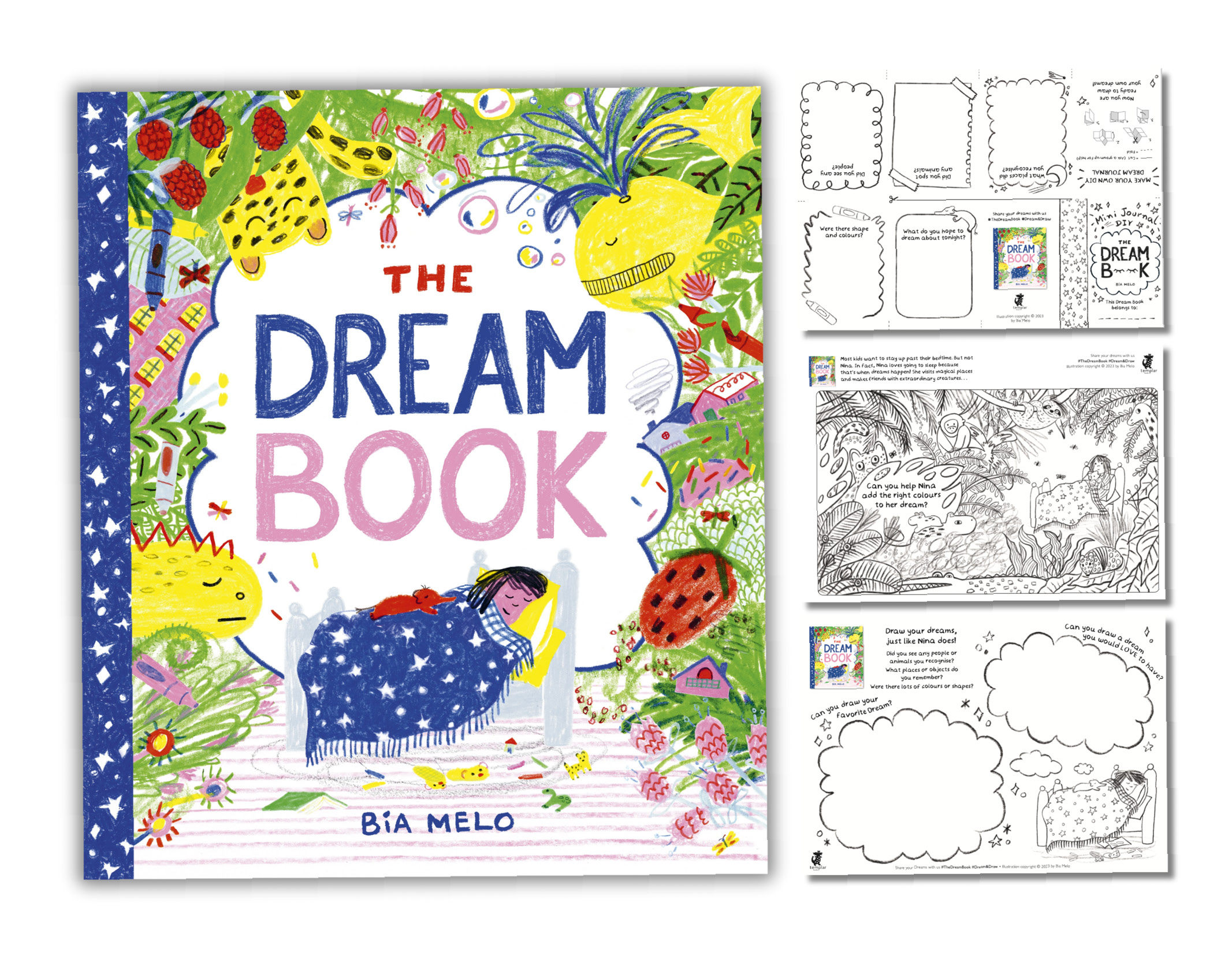
There are activity sheets for The Dream Book which can be downloaded here
- Create your own dream journal
- Colour a magical dream world
- Draw your favourite dream
The Dream Book is also published in South Korea and China.
Hear a lovely read along track that goes with the Korean book here 🎵
Follow Bia here:
Website: www.biamelo.com
Instagram: @_bybia_
Twitter: @_by_bia
The Klaus Flugge Prize is funded personally by Klaus Flugge and run independently of Andersen Press.
Website maintenance & Copyright © 2024 Andersen Press. All Rights Reserved. Privacy & Cookie Policy.
