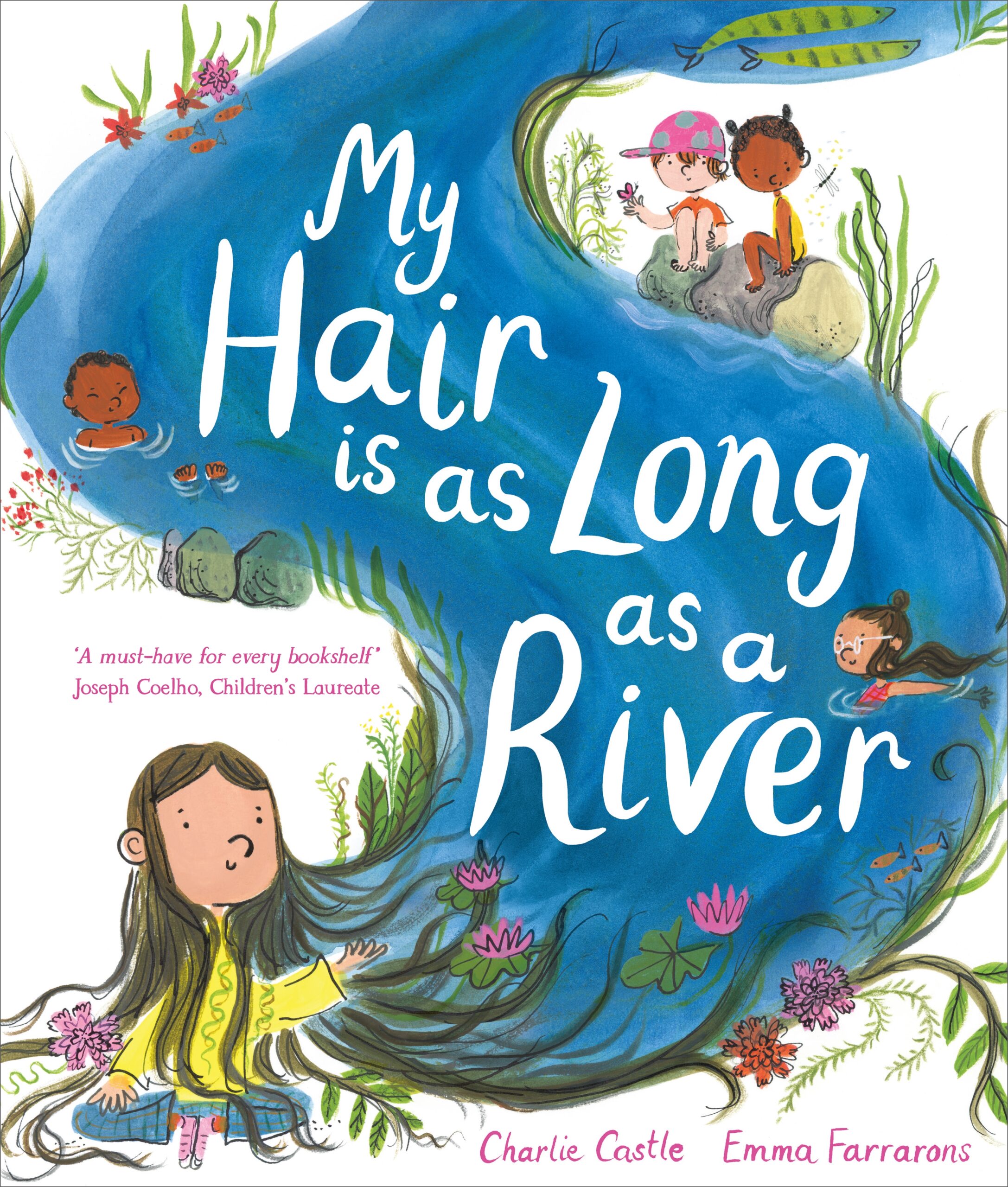
My Hair is as Long as a River, illustrated by Emma Farrarons, written by Charlie Castle
My Hair is as Long as a River is one of three books on the shortlist for the 2025 Klaus Flugge Prize. The boy in this story has long hair, and through a series of metaphors, skilfully illustrated by Farrarons, he explains why his long hair is so important, how it is part of him, even his ‘happy ever after’. The judges commend Emma’s use of colour and composition and the way she captures the story’s sense of playfulness.
Former Klaus Flugge Prize judge, Senior Lecturer in Education: Primary English and Children's Literature, Oxford Brookes University, Mat Tobin interviewed Emma about her book.
My Hair is as Long as a River is so rich in metaphor and movement. After receiving Charlie’s text (if it came first), how did you begin connecting with it? Was there an image or feeling that immediately took root (pardon the pun!) for you as an illustrator?
I was moved to tears when I first read the manuscript. Charlie’s words were so vivid and emotional — I could see every scene in my mind. I even told the editor and designer, ‘This is so beautiful, it could be published without any illustrations.’
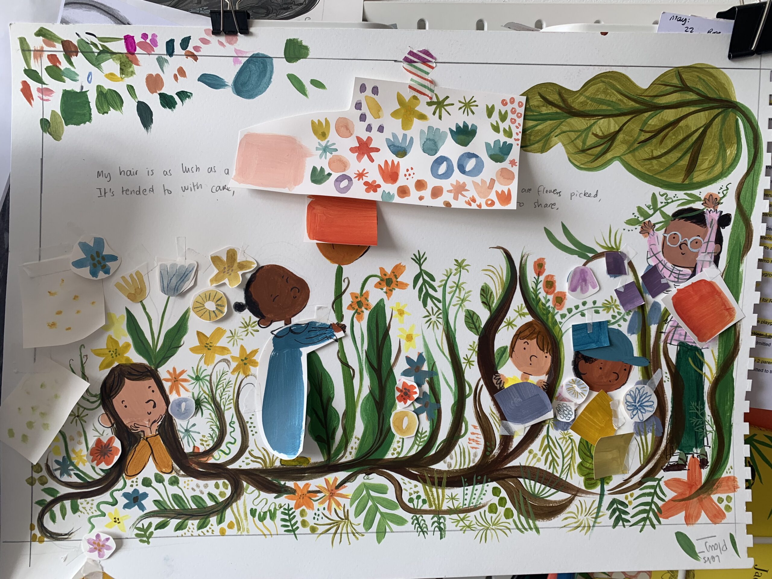
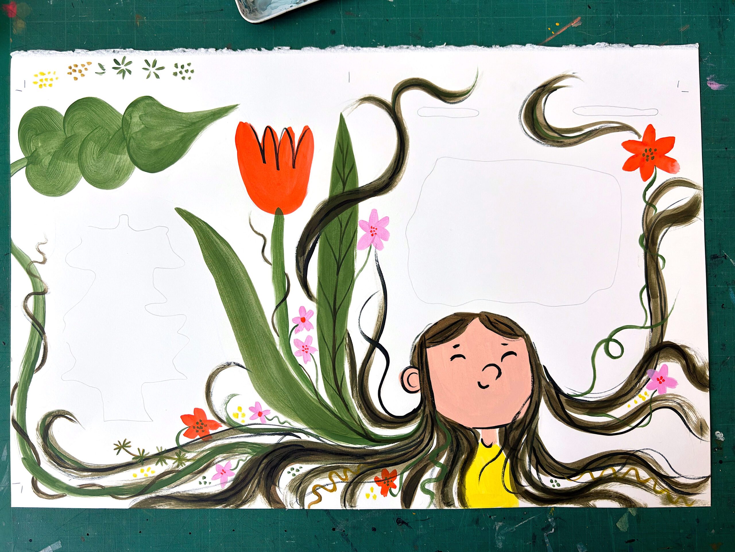
One of the first images that took root was a flower scene. The team asked me to create a colour sample of the boy with flowers and tendrils growing from his hair, inspired by the line ‘My hair is as lush as a garden…’ It took time to get it right, but the team was so patient and nurturing. That image, which has since evolved, was really important — it helped us find the tone for the whole book.
You’ve previously worked as a children’s book designer, and this marks your return to illustration. Did that background shape how you approached My Hair is as Long as a River?
Being a book designer has been a huge advantage in shaping this book. I know the process - how to set up files, leave space around the gutter and text, and keep email communication open if I’m ever stuck or feel under pressure. I especially know how much care and hard work goes into making a book, and I truly value and trust the design and editorial team behind it.
At the same time, this was my first time illustrating a picture book. It involved character building, world building, and expressing deep emotion - using art materials I’d never worked with before, in full colour. In that sense, I felt completely new to it all. But because I understood how skilled and experienced the team was, I felt totally comfortable putting myself in their hands. I welcomed their feedback and felt supported every step of the way. It was a real collaboration, and I was grateful to be learning as I went.
That mix of knowing the process inside out - but being new to the art-making - shaped everything about how I approached the book, with deep respect, a beginner’s mindset, and a real sense of trust in the team around me.
Charlie’s text leaves generous space for visual storytelling — how important was that freedom, and how did you find your own rhythm and pacing within it?
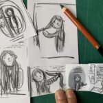
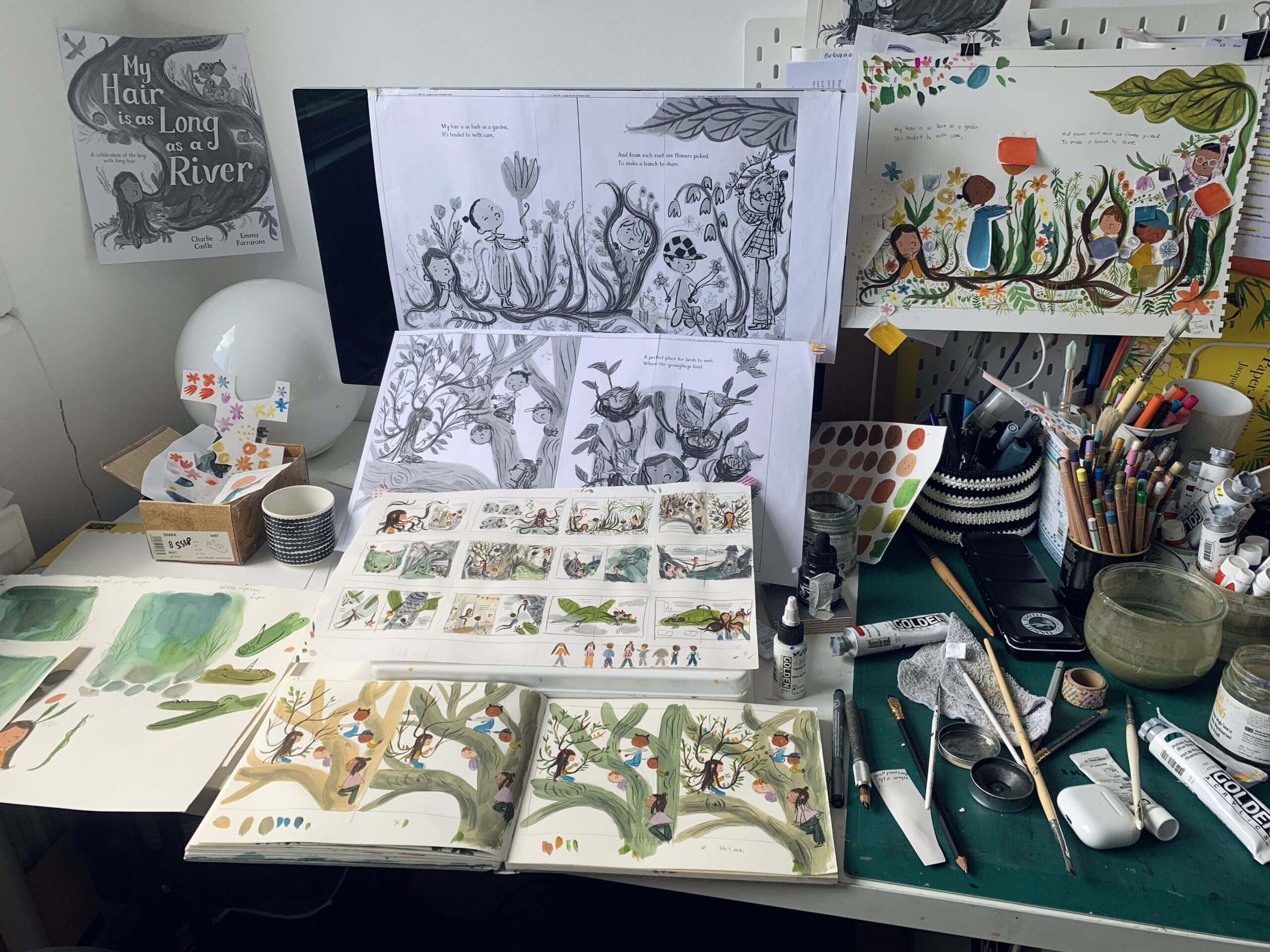
Charlie’s text leaves so much space for visual storytelling, and that freedom was incredibly valuable. Early on, the team set up a coffee with Charlie so we could chat, brainstorm, and make sure we were on the same wavelength. I had two weeks before that meeting, so I filled loads of A2 layout sheets with loose pencil sketches — really pushing and pulling at the text, exploring different ways to interpret it. The more ideas I brought, the more we could play with rhythm and pacing. We picked our favourites and used those as the basis for the thumbnails.
The central metaphor — hair as a river — is so beautifully sustained. How did you go about visualising and shaping that flow across each spread?
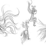
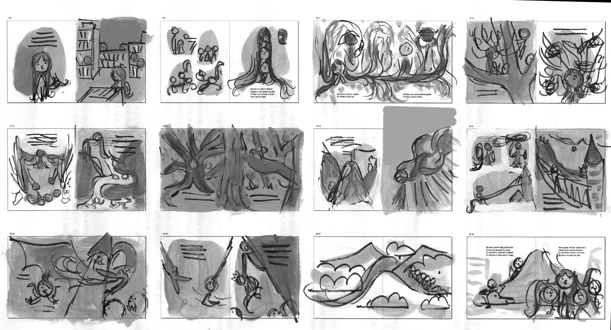
At the thumbnail stage, the team broke down the 12 spreads and labelled each with a different emotion—pride and shyness, imagination, wonder, adventure, fierceness, fear, and danger. This emotional roadmap was incredibly helpful for shaping the visual flow of the book. We then wove nature and the movement of the hair through each scene, using the shifting landscape to carry both emotion and narrative from one spread to the next.
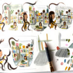
Alongside this, I spent a lot of time developing the colour palette. I really wanted to reflect the emotional pacing of the story through colour—so I painted mini thumbnail versions of each spread to explore how colour could take part in the storytelling.
Were there moments where holding onto the metaphor was particularly challenging — and how did you find your way through?
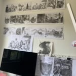
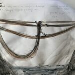
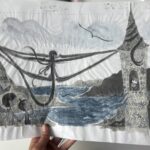
There’s a spread where the boy makes a drawbridge out of his hair. I had just returned from Cornwall and visited Tintagel Castle, which inspired me. I wondered how to create a bridge made of hair, so I took some wool (to represent the boy’s hair), taped it onto a paint tube (to represent the boy’s body), and hung the wool between my wall organizer to mimic a drawbridge. That’s how I solved the problem!
Can you tell us a bit about your materials and process?
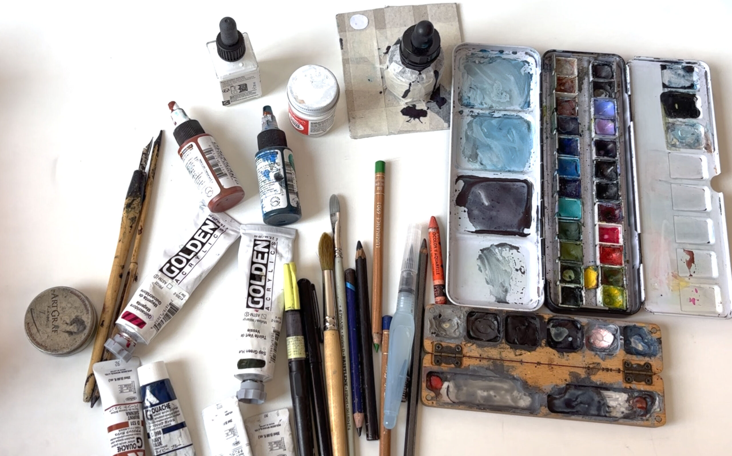
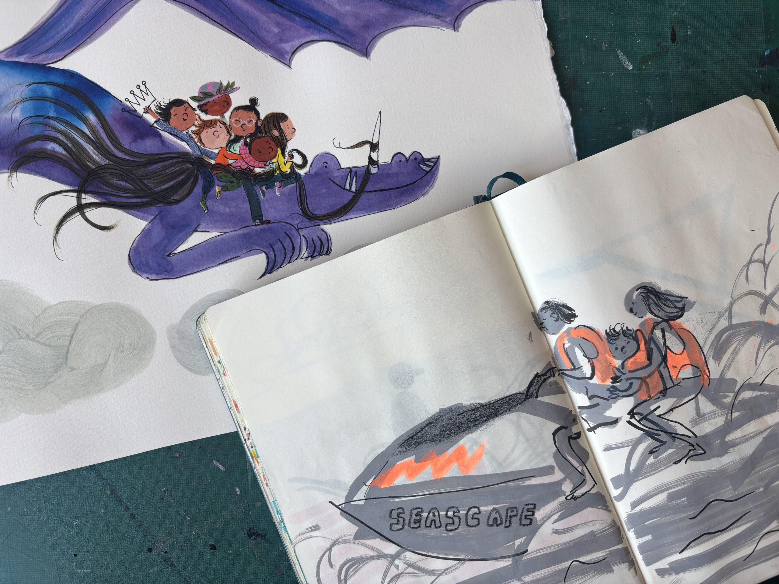
I’ve built up quite a collection of art materials over the last eight years through my practice of observational drawing from marker pens to nibs, ink and pastels. My children love to raid it! One piece of advice that’s stuck with me came from a drawing tutor who encouraged me to always play and experiment and keep trying new tools and materials. I often pair that experimentation with observational drawing, where there’s no pressure to master the material or on the final drawing. You just discover how it behaves while drawing from life. Happy accidents often lead to interesting results.
My process is rooted in observation. I don’t use photographs for reference. Instead, I draw from life or from moving images to capture energy and movement. For example, if I want to draw something I can’t access - like a coconut tree - I’ll find a video and sketch it without pausing. That forces me to focus on the most immediate, essential details, and helps the drawing feel alive.
What did you work with for this book, and how do you create that sense of quiet tactility?
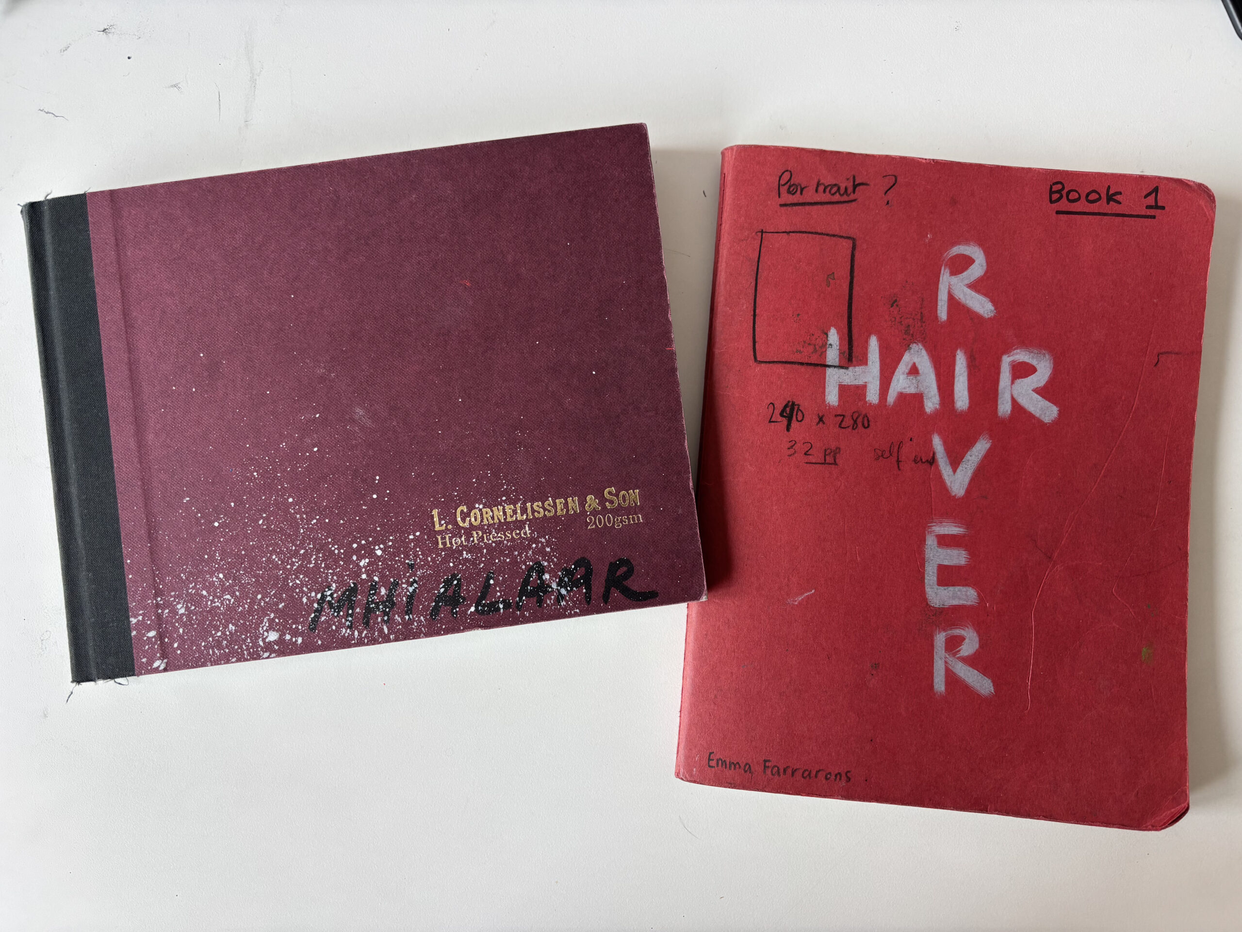
For this book, I spent a lot of time playing with colour. I bought a high-quality watercolour sketchbook with hot-pressed paper and set aside an hour every morning to experiment—layering watercolour and acrylics, watching how they bled together, creating texture, and learning how the materials behaved.
Working on final art with expensive paints and premium paper was intimidating and often made me tighten up. Full colour was a completely new and scary challenge. Having that dedicated sketchbook for testing and play became a total game changer - it helped me overcome fear, loosen my work, and understand the materials better.
My top tip: get a fancy sketchbook and play freely on good paper. It’s the best way to unblock fear and build confidence.
For the final artwork, I used premium materials: Daniel Smith watercolours, Golden fluid and heavy body acrylics, Acryla Gouache, dip pen and ink, pastels, a variety of brushes - and even a toothbrush for the angry sea spray. Everything was painted on hot-pressed watercolour paper.
I was especially focused on mixing the perfect paint for the boy’s hair - a blend of burnt sienna and phthalo green, which when layered just right created subtle highlights that mimic natural sheen and texture.
A brilliant illustrator friend once told me to choose materials that match what you’re drawing. That advice stuck with me, so I pair texture and medium intentionally. For example, transparent watercolour washes for the waterfall, liquid acrylic with energetic dip pen strokes for hair, and liquid graphite for the bark of trees.
Do you begin traditionally or digitally, and how do you start building a book visually — thumbnails, character studies, textures?
I work entirely traditionally, from thumbnails right through to the final artwork.
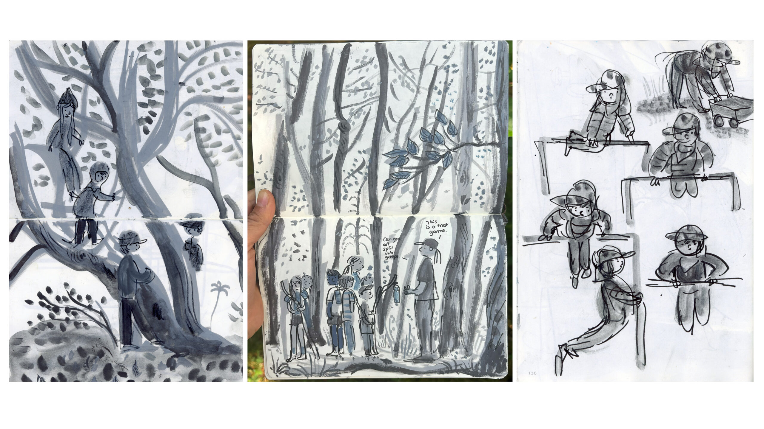
Throughout the project, I kept two dedicated sketchbooks:
One in colour, where I experimented and developed the colour palette and explored textures through playing with paint.
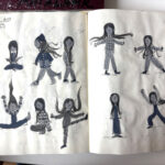
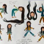
And one in black and white, filled with character studies and observational drawings of plants and nature.
This book feels rich with quiet themes — from identity and self-expression to the power of storytelling. Were there particular visual moments where you intentionally layered meaning or played with cultural references? The gender-swapped Rapunzel scene is especially striking — are there any details or spreads you’re particularly proud of in this regard?
The fairy tale elements, like the dragon and the gender-swapped Rapunzel scene, were all part of Charlie’s beautiful vision. He has such an incredible imagination, and the story is truly his. Charlie also has long hair, so this moment of reimagining a classic tale felt especially personal. The team made sure he was involved throughout the process so we could honour that.
The library setting was the team’s idea, and I loved it. I’ve always been drawn to stories within stories—The Princess Bride is one of my all-time favourite films for exactly that reason. I love fairy tales with a twist, and this visual framing gave the whole book an extra layer of meaning.
One detail I’m especially proud of: my own nine-year-old grew his hair long after the book was finished. I really feel that this story empowered him to do that, and to be proud of it.
The boy’s world is full of connection — to friendships, to wonder tales, to the natural world. Were there specific images or experiences that helped you build that emotional landscape?
For the friendships, I pulled a lot from my own life. I’ve got two boys — I’ve been sketching my nine-year-old since he was two, and my six-year-old basically since birth. My sketchbooks are full of them messing about — climbing trees, playing at the beach, hanging out with friends in playgrounds. So when it came to drawing the kids in the book and how their friendships grow, I just flipped through those pages. It really helped bring that connection to life.
For the natural world, I just so happened to be in Cornwall when I got the email offer — and I happened to have the text on me. I always travel with my sketchbook and art materials, so I spent every day drawing: the cliffs, rock pools, forests at the Lost Gardens of Heligan, stormy clouds, wild plants, crashing waves, even Tintagel Castle with its amazing bridge. My family and I went back six months later so I could do more research. Coincidentally, I later found out Charlie loves Cornwall too — which made all those drawings feel even more special.
For the dragon riding spread, I drew from an observational sketch of my family jetskiing in the Philippines. My son was sandwiched between my brother and niece, speeding across the water, laughing with joy and shouting for my brother to go faster. I used that image to capture the pure exhilaration and delight you might feel riding a magical dragon.
Are there artists or illustrators whose work has influenced you — whether in picturebooks, textiles, or other visual forms? Are there creators you return to for inspiration or grounding?
I source inspiration from all kinds of places.
Observational drawing feeds my imagination too. I carry a sketchbook everywhere. It helps me explore new materials and really see the world — especially people. I love listening to my kids talk and scribbling their conversations down. Little snippets of real life often find their way into my work.
Music plays a big part — I love listening to cinematic soundtracks with an otherworldly feel, often a mix of modern classical and electronic. It really helps set the emotional tone when I’m working.
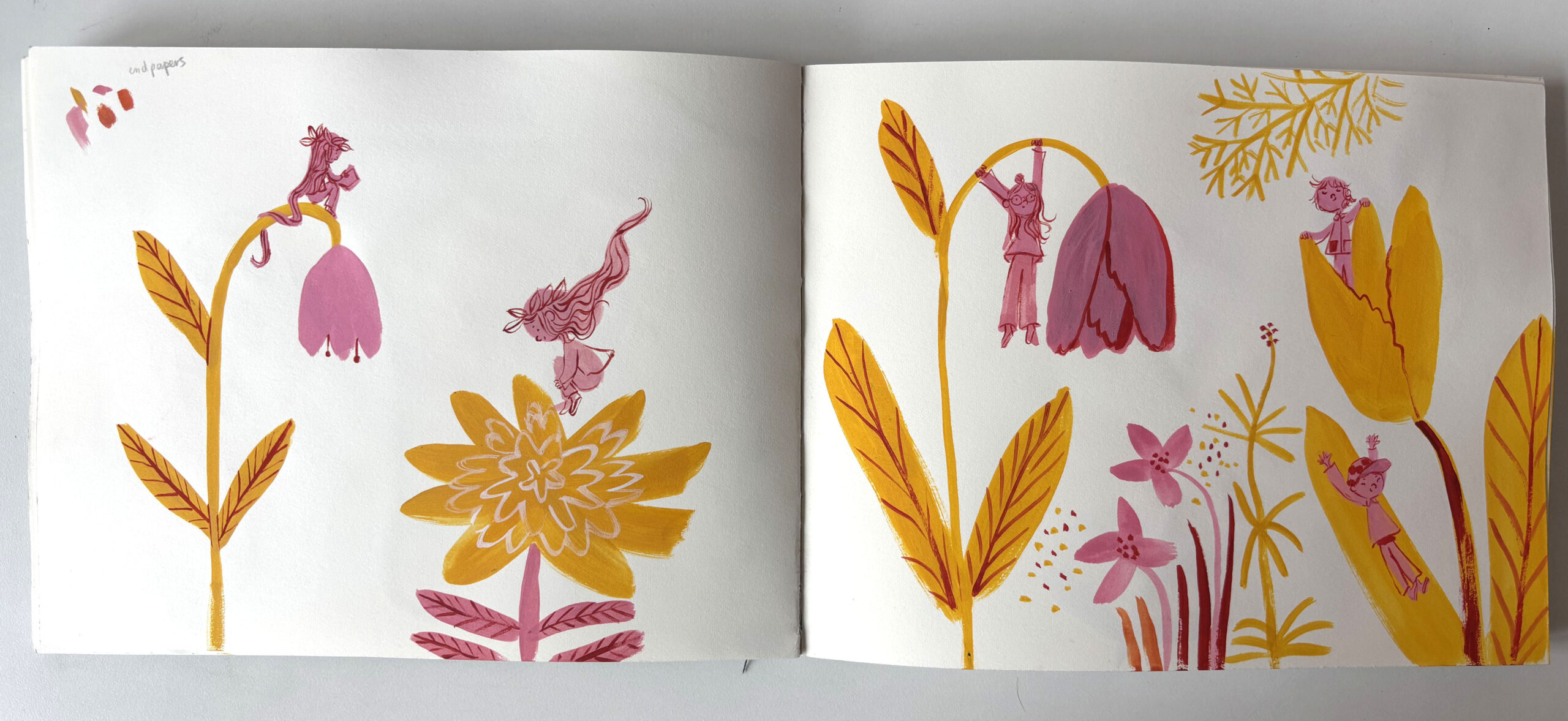
I love Josef Frank as a textile designer — I love his joyful, limited colour palette florals. I think that love for textiles shows in the endpapers.
Artistically, I admire so many people. Henri Cartier-Bresson is one — I’m drawn to his black and white photography and how he captures quiet, powerful moments. I’ve also been watching a lot of Japanese animation lately — the way they use light is breathtaking, and I love how unpredictable the storytelling can be.
My favourite illustrator is Manuele Fior. He makes graphic novels for adults — his mark-making and colour work are just stunning. For children’s books, I have a whole collection of Ariol — a donkey schoolboy in an anthropomorphic world, by Marc Boutavant and Emmanuel Guibert. I grew up in France, so reading Ariol feels nostalgic and childlike in the best way. My kids love them too — they find the humour brilliant.
And I always come back to comic artist Lynda Barry. Her book Making Comics is like a creative recharge — anytime I need to spark new ideas, I reach for it.
You’ve used the peritextual spaces — like the endpapers and title page — with such joy and intention. How did those parts of the book evolve?
I love endpapers — and I really love it when books make the most of those peritextual spaces, so this felt like the perfect opportunity to play.
The endpapers are inspired by textile design. The flowers came from a garden in Peckham, and the concept is rooted in watching my children play in playgrounds. So I imagined the flowers as a kind of floral playground.
I’m drawn to a minimal colour palette — it’s how I work in my sketchbook, often just using Tombow felt tips and a few materials. That limited palette creates a strong, graphic feel, which I wanted to bring to the ends too.
The title page was the last image I made for the book. I had so much fun working on this project and wanted to open the book with a celebratory feel.
Did you work closely with Grace Gleave (editor) and Lorna Scobie (designer), or were you given a lot of creative freedom?
Absolutely — we worked very closely together. Grace Gleave (editor) and Lorna Scobie (designer) are incredible: professional, passionate, talented, and visionary. It felt like a safe space where we could pour all our love into Charlie’s text. The whole process was pure joy.
They also played a key role in keeping the art loose and energetic. At the beginning, I tightened up a lot- I was so worried and self-conscious. But they kept referring back to my observational drawing and reminding me to dare, trust the brushstrokes, and just go for it.
At the same time, they gave me the creative freedom to be myself and interpret the story in my own way. I’d share my ideas, and they would push them even further — often to places I hadn’t even imagined. It was true teamwork and honestly felt like a masterclass.
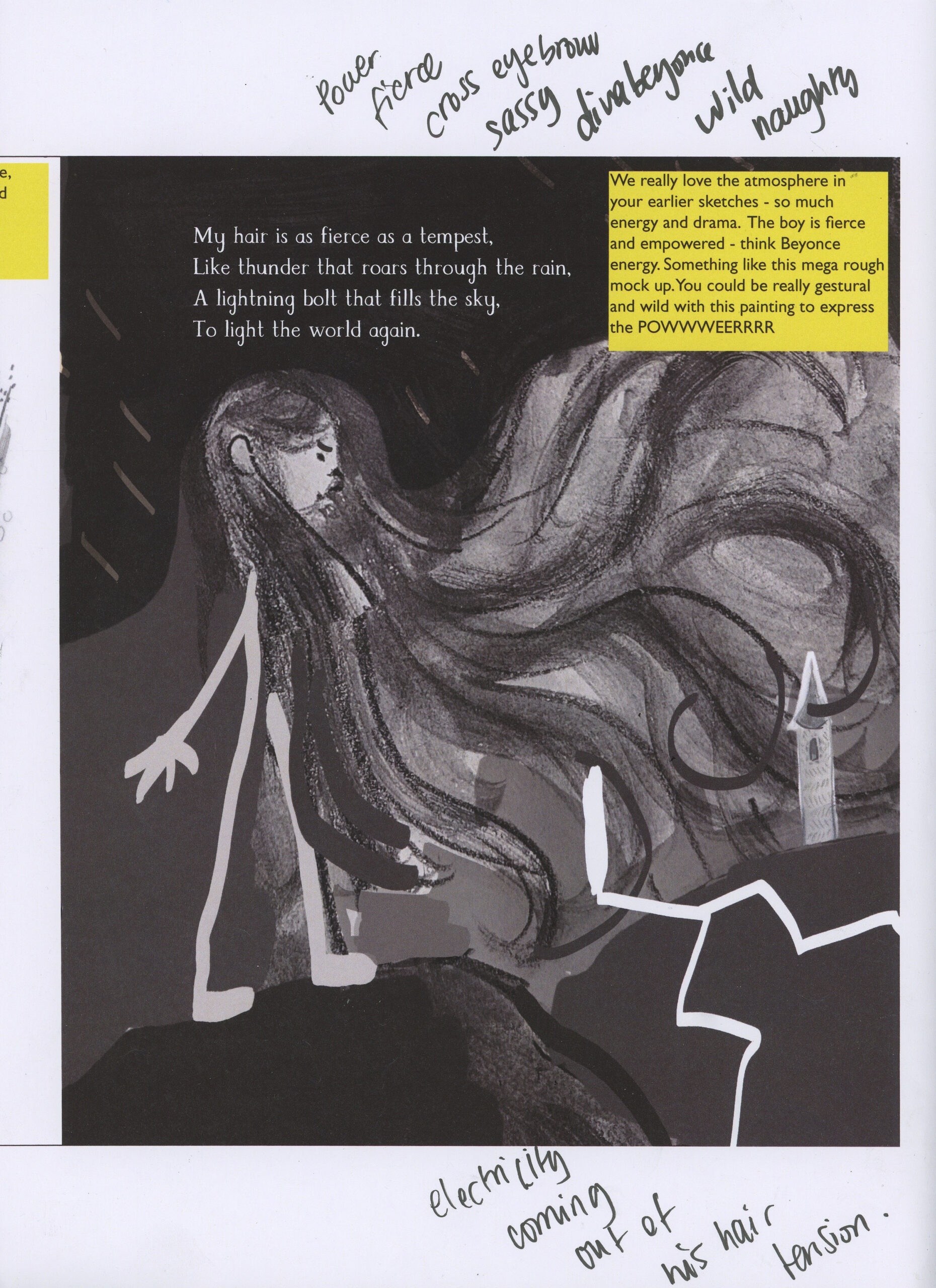
There was one page I just couldn’t get right — the thunder page. I kept reworking it, but it wasn’t landing. Then the team sent me this brilliant photoshopped mock-up with a note that said: ‘Imagine the boy is Beyoncé. How would she shoot lightning out of her hair?’ That completely unlocked it for me.
Even now, when I work on new projects without them, I still hear their voices nudging me to push the emotions and depth in my images. Any illustrator, especially if it’s their first book, who gets to work with Grace and Lorna is incredibly lucky. They are the dream team.
Finally, is there anything you’re working on now that you’re excited about? What might we look forward to seeing next from you?
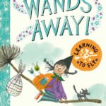
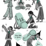
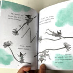
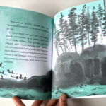
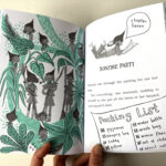
I’m really excited to share Wands Away: Learning to Fly — my debut as an author. It’s out on 28 August 2025 with Simon & Schuster. It’s a four-book early reader series about Ramona Spellstar, a witch in training. The idea came while dropping my boys off at forest camp on our cargo bike — I suddenly thought, ‘What if this bike were a broom? What if this forest were a witch school?’
The story draws on my childhood and my sons’ forest adventures. It’s 128 pages, black and white with a pop of aqua pantone, filled with illustrations, speech bubbles, and lots of silly, magical fun.
It’s been a busy year with dream projects—I just finished painting my second picture book, I Can’t Sleep, which will be published by Rocket Bird Books next year. It’s very close to my heart, inspired by my boys at bedtime, and painted entirely in watercolour using a palette of blue, black, yellow, and splashes of northern light.
I’m also illustrating a hilarious early reader, Indie in Disguise, by the brilliant Katie Clapham (Walker Books, 2026). The character is feisty, funny, and full of heart. It’s been such a joy to bring Indie to life.
My Hair is as Long as a River is published by Macmillan Children’s Books, 978-1035018307, £7.99 pbk.
The Klaus Flugge Prize is funded personally by Klaus Flugge and run independently of Andersen Press.
Website maintenance & Copyright © 2024 Andersen Press. All Rights Reserved. Privacy & Cookie Policy.
