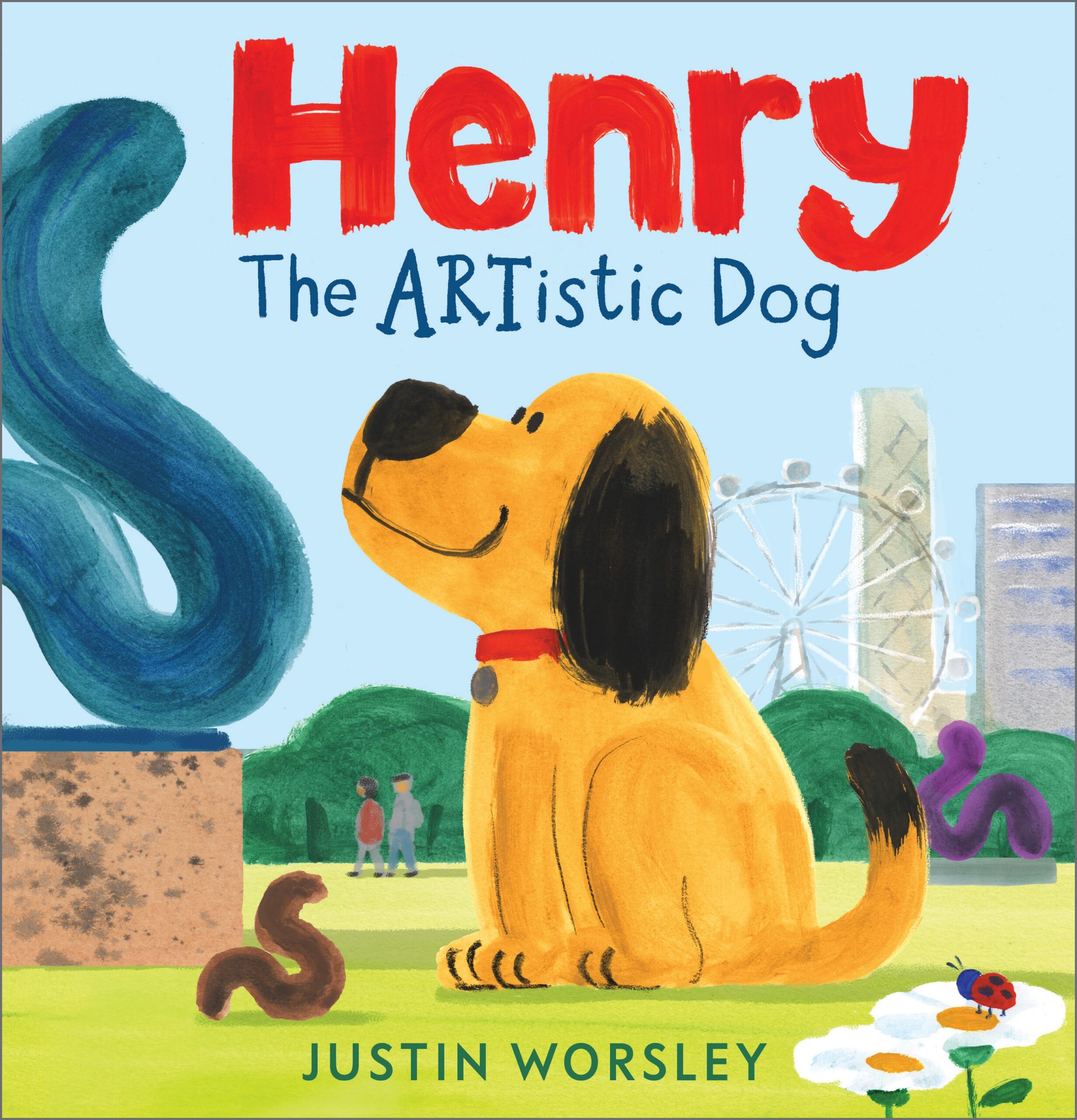
Henry the Artistic Dog, written and illustrated by Justin Worsley
Henry the Artistic Dog by Justin Worsley is one of six books on the shortlist for the 2026 Klaus Flugge Prize.
It stars Henry, a master sculptor who crafts his work out of the only materials he can access… A truly memorable picture book, say the judges, fresh, different and with a unique voice. They particularly admired the use of perspective and the confidence in the bold shapes.
Former Klaus Flugge Prize judge, Senior Lecturer in Education: Primary English and Children's Literature, Oxford Brookes University, Mat Tobin interviewed Justin about his book.
Your creative journey is fascinating because you didn't take the traditional direct route into picturebooks; you have a background in Toy Design. How does your approach to storyboarding a 32-page picturebook differ from designing a children’s toy?
In most ways, designing a children’s toy is very different from writing and illustrating a picture book, but there are some shared skills and similarities in the process and the target audience! Both disciplines involve a great deal of sketching, especially at the beginning of a project, and some toy design briefs require the development of cute animal characters — a skill I’ve found particularly useful when approaching character design for picture books. While toy design is rarely focused on storytelling, and is often more concerned with functionality and price point, a toy still has to be visually appealing if it is to be commercially successful. For most of my toy design career, I was creating products for young children and infants, but, as with picture books, you can’t forget the adult who is making the purchase or choosing the gift. The child may be the primary audience, but the work has to appeal to adults too.
Henry the Artistic Dog relies beautifully on the classic picturebook mechanic of text-image irony; the text declaring Henry a serious, unappreciated artistic genius but the words showing us, at first, that his skill is only appreciated by the small folk. Very small! How did you work with the editorial and design team at Andersen Press to fine-tune the comedic timing of these spreads? Were there any jokes that were tweaked during the editing process to get that balance just right?
I developed Henry the Artistic Dog while studying for a master’s degree in children’s book illustration at Anglia Ruskin - Cambridge School of Art. By the time Andersen Press saw the project at my degree show, it had already been through many iterations and a great deal of fine-tuning, helped by feedback from tutors and fellow students.
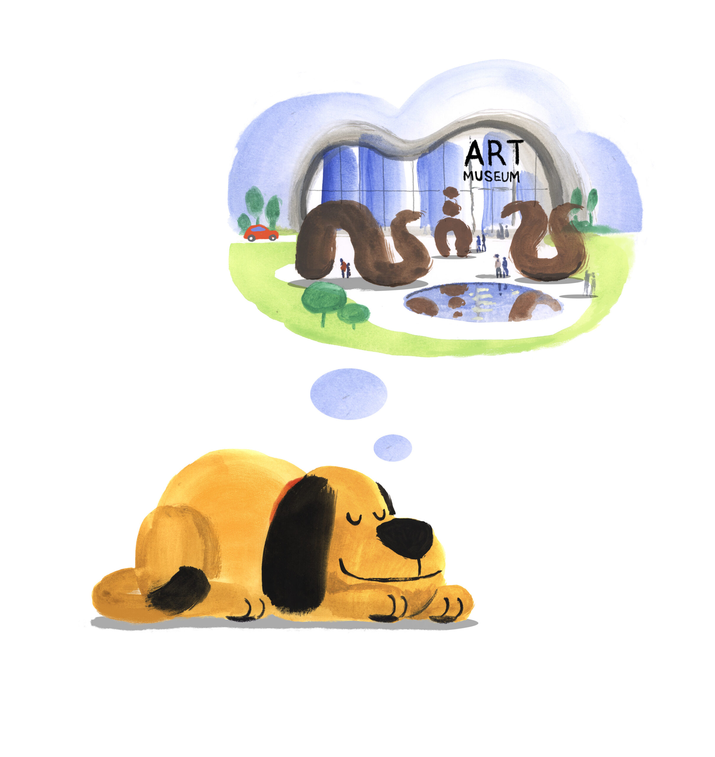
I think as a result, Andersen Press requested very few changes to the comedic timing. There were, however, several other editorial and art changes. For example, my editor, Sue Buswell, stressed the importance of the opening spread in a picture book and suggested I make it more vibrant. I also got an extra page to play with, for the copyright page at the back I created an image of Henry dreaming of his works on display in front of an art museum.
Let’s talk about Henry’s chosen medium. His crowning achievement is sculpting with his own poop! It is clear that primary school children will find this hysterical. Was there ever any nervousness from the publishing team about pushing the boundaries of scatological humour in a debut picturebook, or did they immediately embrace Henry’s raw ‘mixed-media’ vision?
There wasn’t any nervousness from Andersen Press about this. In fact, they expressed quite the opposite view and seemed very happy to embrace Henry’s rather unconventional artistic materials. My literary agent, however, was certainly a little unsure about how it would be received when he first read through it. We also showed the book to other publishing houses before choosing to go with Andersen, and a few of them probably would not have suggested that I make my debut with Henry and his sculptures!
I noted how the illustrations use a wonderfully flat, matte aesthetic with absolutely no digital gloss, yet the texture of those raw brushstrokes is undeniably there. If you are working digitally, you have executed it beautifully. Can you tell us about your technical process? Do you blend traditional physical textures (like ink on paper or dry brush strokes) into a digital environment? How do you strike that perfect balance between a clean, flat style and a messy, tactile feel?
Thank you, the artwork was created using gouache paints in tablet form which have a nice grainy texture especially when applied quite thickly with a big paint brush. The disadvantage to them is that they cannot be easily layered as they are not fully opaque or waterproof when dry, For this reason I painted the backgrounds on separate pieces of paper to the characters and foreground then scanned them into my computer and assembled them digitally. Andersen Press chose to print the book on matte paper rather than gloss and I think it compliments that artwork beautifully.
While the book is a laugh-out-loud comedy for children, it is also a clever, affectionate satire of the fine-art world, referencing abstract expressionism, action painting, and performance art. Are you a fine-art lover yourself? Did you look at specific real-life artists or gallery spaces for inspiration when designing Henry's magnificent, chaotic home gallery?
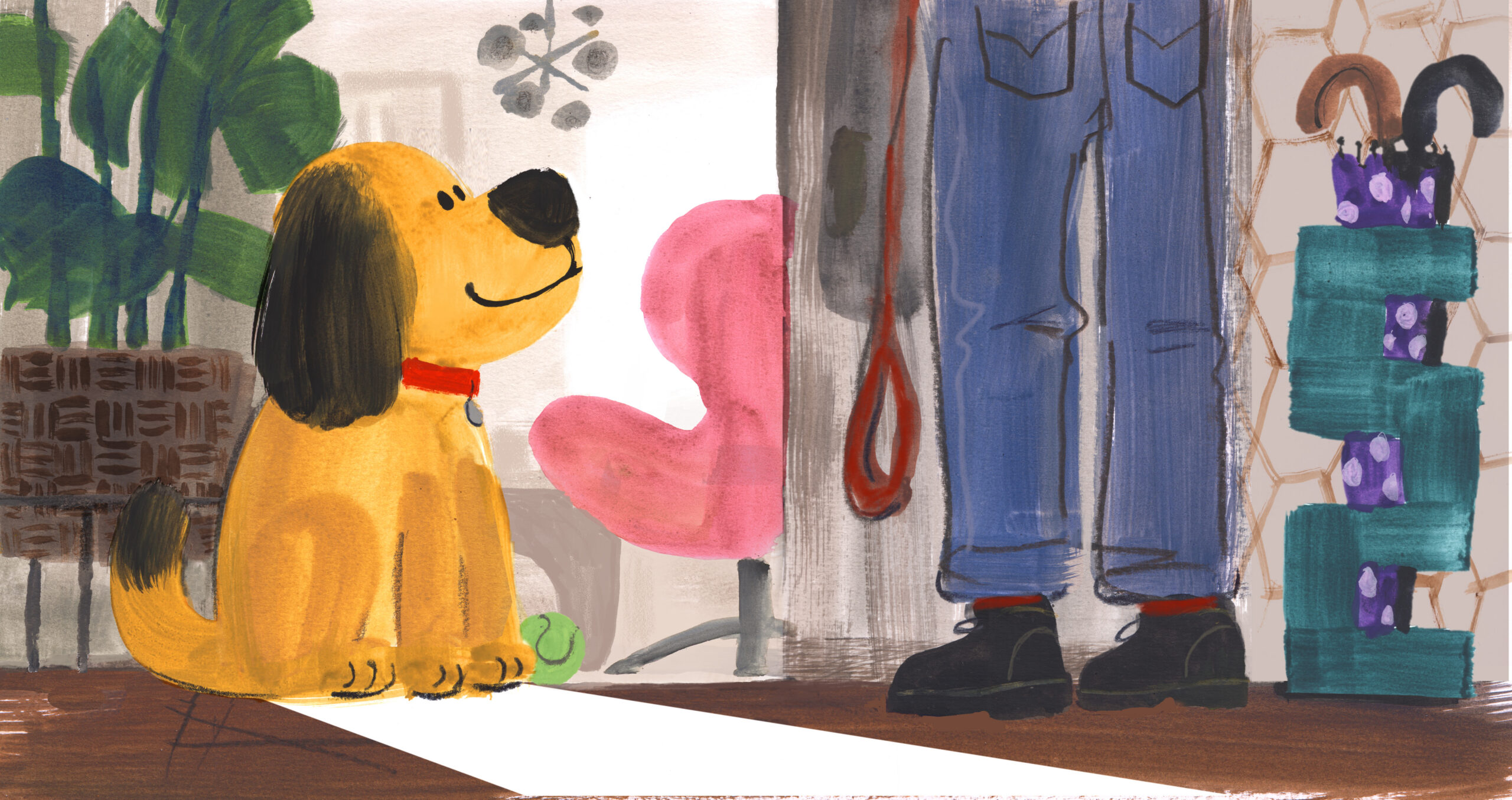
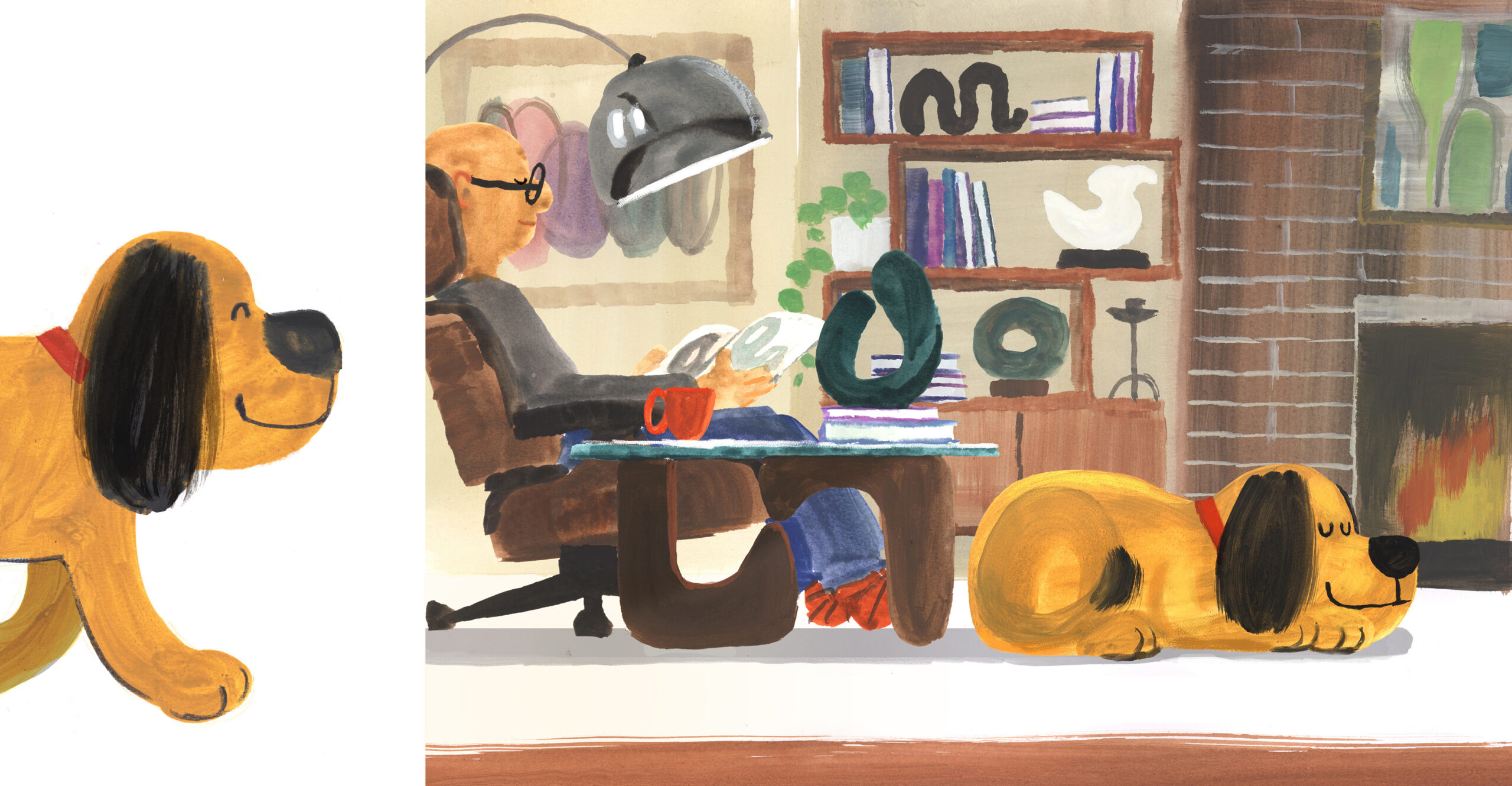
I have always loved visual art in all its forms. The book’s title was inspired by my admiration for the sculptor Henry Moore, whose unconventional work was not welcomed by traditional art critics at the time; some even described it as deplorable and dangerous. For the spread in which Henry discovers street art, I deliberately referenced Keith Haring, whose bold, graphic style — especially his barking dogs — I have always admired. I also love mid-century furniture, and that influence can be seen in Henry’s owners’ living room.
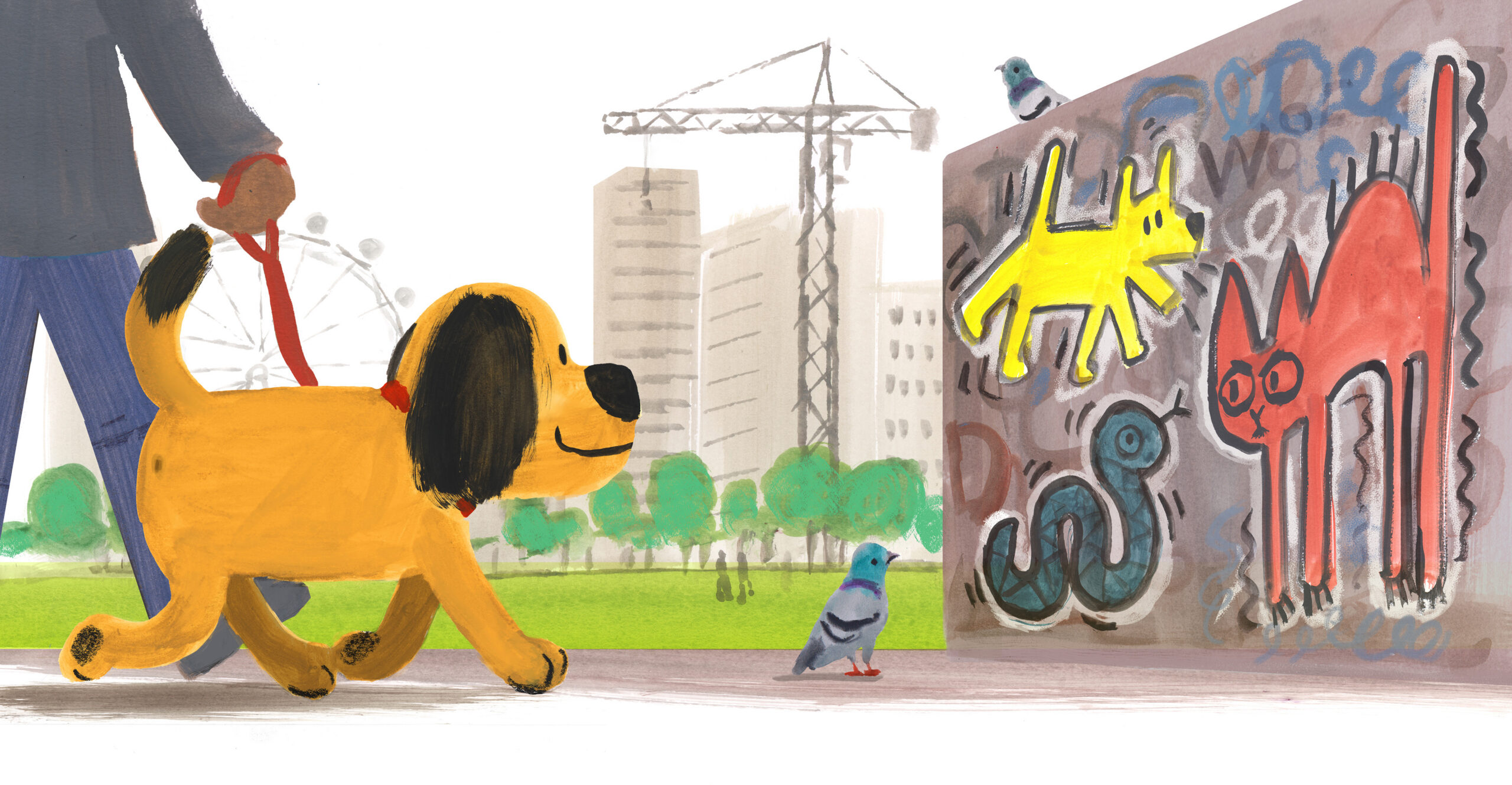
The pacing of the book builds up beautifully to a crescendo of mini-beast art gallery (although the concluding tempo back at home with Henry’s dreams is lovely). How do you map out the visual rhythm across the pages? Do you use a specific thumbnail grid in your studio to check the flow of the page-turns?
For Henry, I made lots of miniature dummy books. The first was only about 8 cm square and extremely rough. (image) I find that reviewing a story in mini-book form lets you experience the page turn in a way that thumbnail storyboards alone cannot. I also have a magnetic pinboard in my studio, which is invaluable for displaying the spreads and seeing the overall flow of the story.

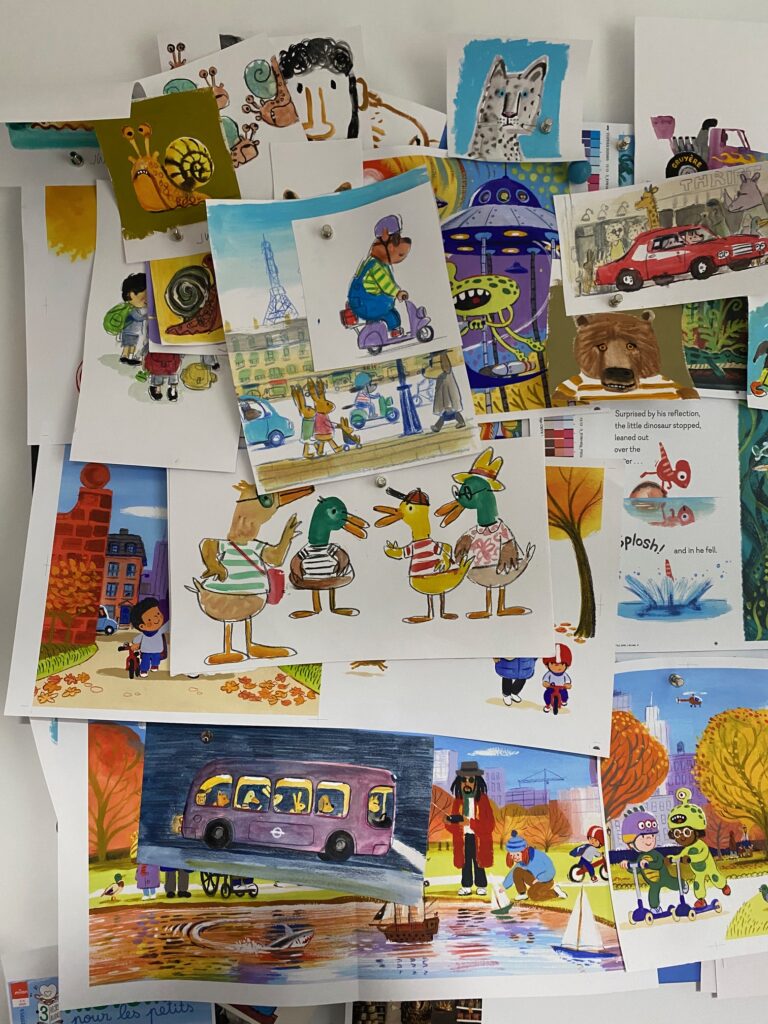
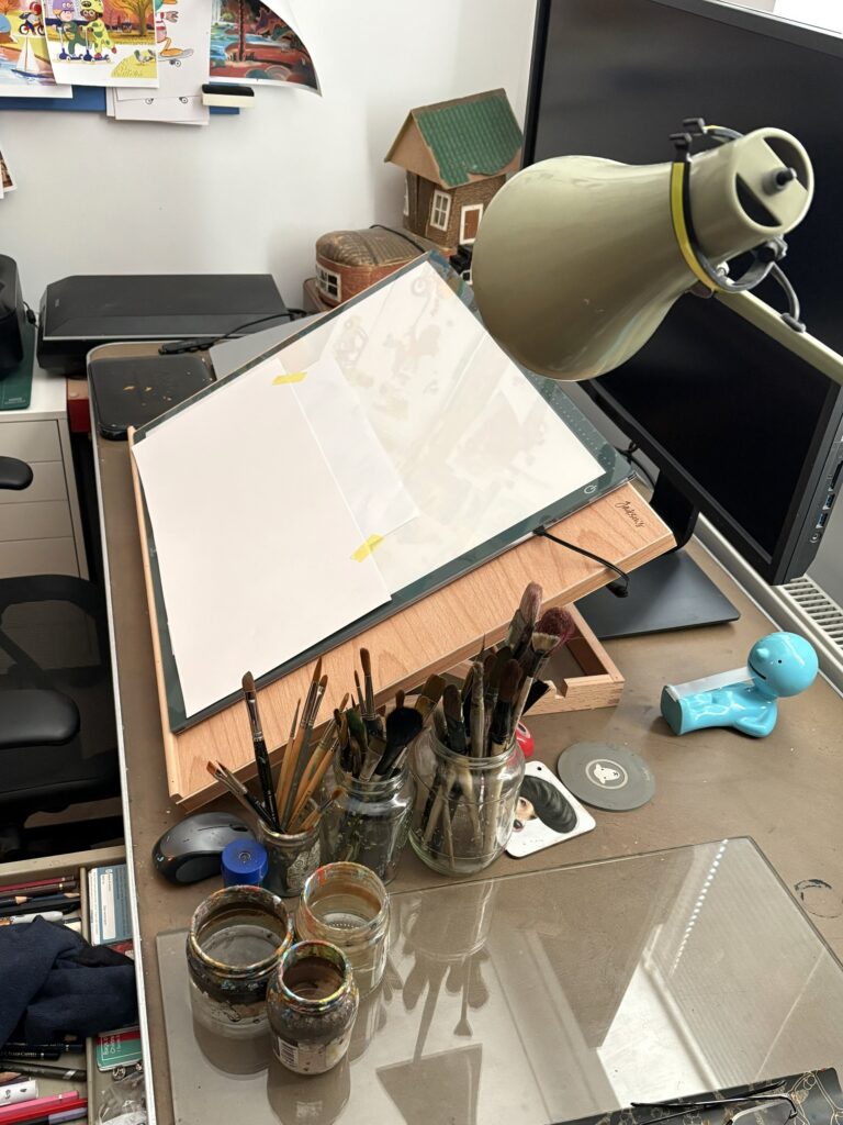
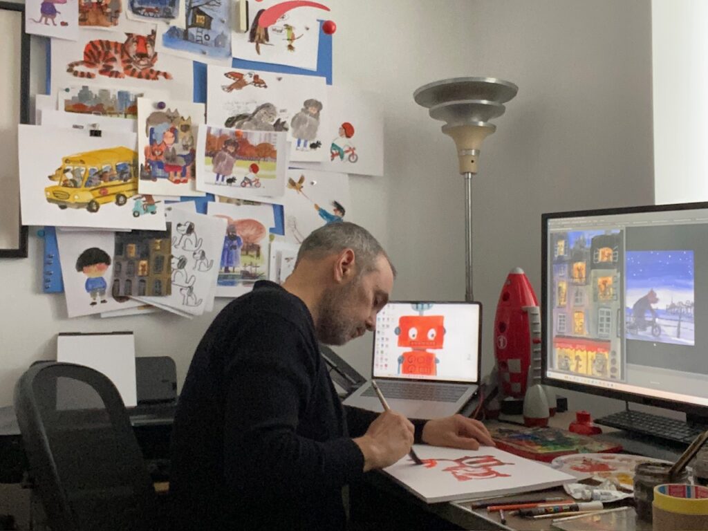
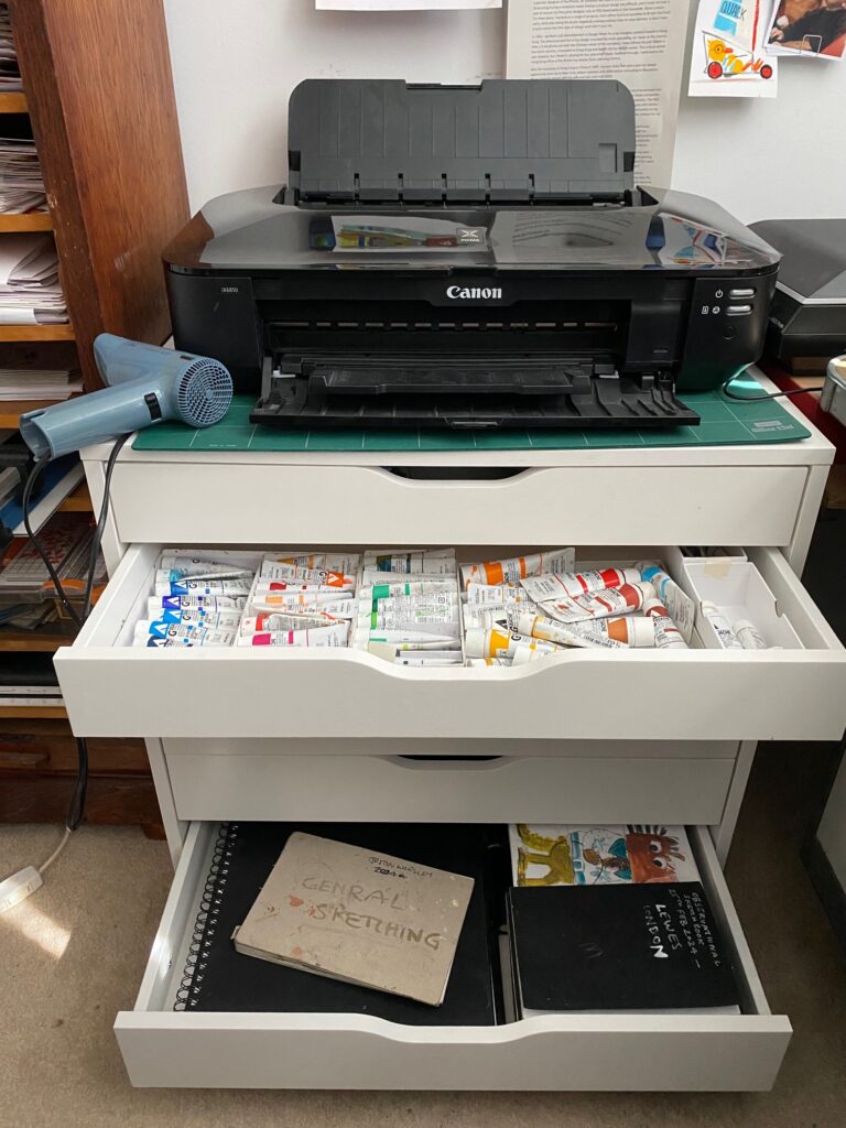
Can we ask for a tour of your workspace? I am always fascinated by where the comic magic happens. What do your physical surroundings look like, and what are the essential digital tools, tablets, or even real-life messy sketchbooks that you must have on your desk when you sit down to create?
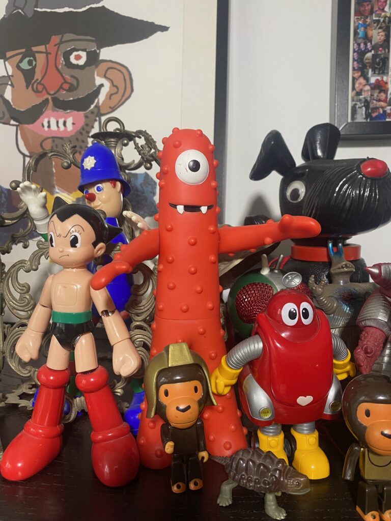
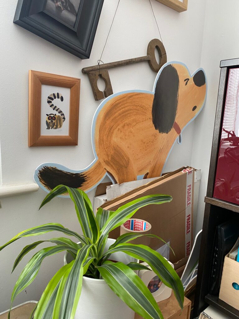
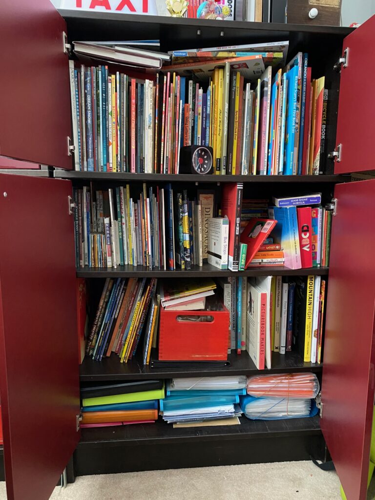
My studio is in what was once a small spare bedroom at home. It’s a little cramped, and I’m quickly running out of storage, but I feel very lucky to have a dedicated space to work. Over the years I’ve collected quite a few toys, and a small selection of them watch over me while I work. I also have an overflowing cupboard of picture books. I’m not especially organised, so the studio as a whole is often messy and chaotic. Ideally, I’d have separate areas for painting and digital editing, but there simply isn’t enough room. As a result, my keyboard has paint splashes on it, and I have to rearrange my desk depending on the task at hand.

I am endlessly fascinated by hearing an illustrator talk us through the exact evolution of a single page from start to finish. Could you choose a favourite spread from Henry the Artistic Dog and guide us through its entire journey from the first loose gesture sketch to the final, punchy, finished piece?
One of my favourite spreads is the final double-page scene, where Henry is asleep in his owner’s living room. It was originally planned as a single page, but I soon realised it needed more room. As the closing spread, it had to make clear that Henry’s human owner is an art lover. The joke, of course, is that despite this passion, he has failed to recognise Henry’s talent throughout the book and has been throwing his artwork in the bin. I also briefly explored an alternative ending in which Henry’s owner was a sculptor, with Henry asleep on the floor of the studio.
Lastly, what is next on the horizon for you? Now that Henry has firmly established himself as a master of the household avant-garde, are there any new ideas, characters, or future publishing projects currently brewing on your desk that you can share a little sneak peek of? Are we going to see more of Henry, or are you exploring a completely different character's world next?
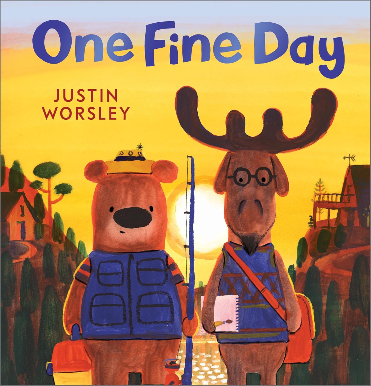
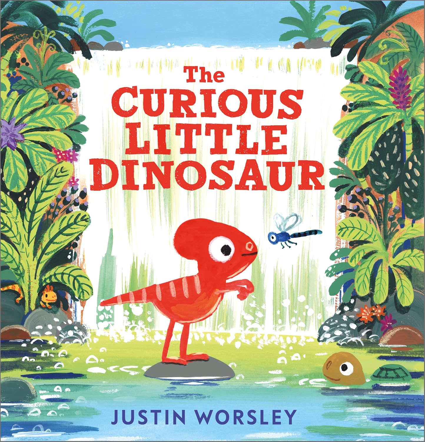
At the moment, there are no plans to continue Henry’s story or develop his artistic adventures further. My second author-illustrated book, One Fine Day, is out now, and my third, The Curious Little Dinosaur, will be published by Andersen Press in spring 2027. Both share a certain scatological humour with Henry. I’m also working on a series of interactive books with flaps for Magic Cat, which I did not write, and I’m about to begin illustrating a story for HarperCollins in the USA about a wicked bunny searching for minions. So, thankfully, I’m keeping very busy!
Henry the Artistic Dog by Justin Worsley is published by Andersen Press, 9781839135057, £7.99 pbk.
The Klaus Flugge Prize is funded personally by Klaus Flugge and run independently of Andersen Press.
Website maintenance & Copyright © 2026 Andersen Press. All Rights Reserved. Privacy & Cookie Policy.