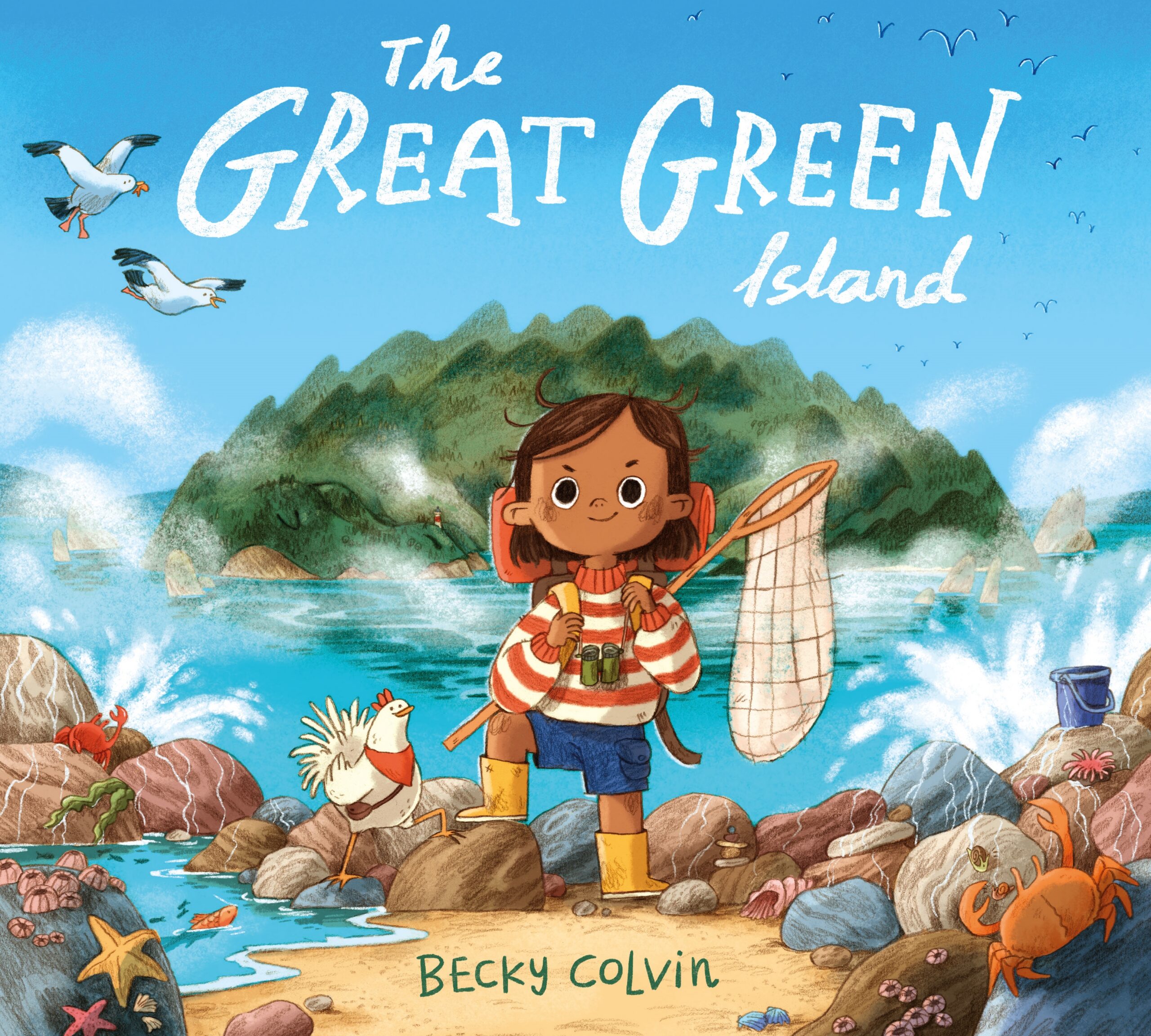
The Great Green Island, written and illustrated by Becky Colvin
The Great Green Island by Becky Colvin is one of six books on the shortlist for the 2026 Klaus Flugge Prize.
Ali lives with her dad on a beautiful island with a busy fishing village. So busy in fact that, no matter how hard she tries, Ali can never persuade anyone to stop what they are doing and come exploring with her. That is until the morning everyone wakes to find ALL the fish have disappeared. The Klaus Flugge Prize judges admired the clarity of composition and the emotional connection to the characters, both of which that mark out The Great Green Island as an extremely accomplished debut.
Former Klaus Flugge Prize judge, Senior Lecturer in Education: Primary English and Children's Literature, Oxford Brookes University, Mat Tobin interviewed Becky about her book.
Your debut picturebook has a fascinating evolution, coming on the heels of your university project, Shut Down, which was highly commended. While Shut Down explored a child navigating grief inside a robot costume, and The Great Green Island follows a community facing an ecological crisis, both books are deeply rooted in the themes of loss, emotional isolation, and the vital need for connection. Can you tell us about the transition from that deeply intimate, award-winning student dummy book to building this project with Macmillan? Did your approach to visual storytelling change drastically when shifting from a personal story of grief to a sweeping landscape narrative about appreciating the world around us?
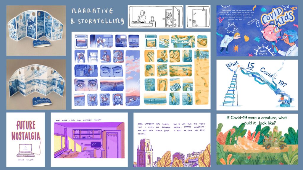
The approach differed massively. Shut Down was totally story driven. I started it knowing I wanted to make a book about grief inspired by my own experience. I had no idea what it was going to look like to begin with, apart from knowing I wanted the style to be soft to mirror the sensitive themes. It is quite a standalone story in my portfolio for this reason. I developed a big interest in storytelling, comics and children’s books when I was at university and aspired to illustrate some one day. I never thought I’d write them though. I didn’t know that I could. Shut Down was my stepping stone into writing but my brain naturally operates in a more visual way. I find it a lot easier to just draw, have fun, create characters and scenes and get lost in a new world and use these visual pieces I collect to puzzle together a story.
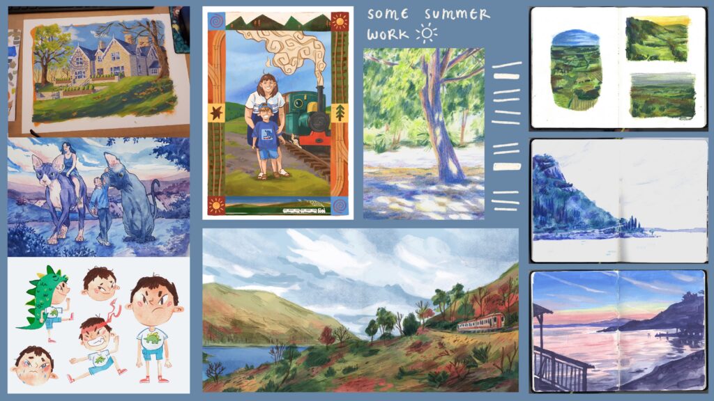
So, in comparison, The Great Green Island was much more visually driven. It was inspired by a sketchbook painting I did in Italy and the story came second, shaped to fit around visual moments I knew I wanted to include (e.g. the aquarium stomach spread or the reveal of the crocodile).

You completed your studies at UWE Bristol, an institution known for nurturing incredible graphic talent. Looking back at your time there, was there a specific module, workshop, or breakthrough piece of advice from a lecturer that directly unlocked the visual language or print style you used for this book?
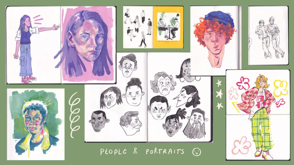
In terms of a project that particularly influenced my visual language, nothing immediately springs to mind apart from Shut Down. It was the first time (I think, I could be totally lying, I think my temporal lobe is broken) I used pencil drawings as the foundation for my digital painting process, which has since become the predominant way I work. I was a bit of a visual language floozy at uni and didn't like sticking to one thing for very long, dipping my toe in many a print style and technique.
As for a piece of advice, whenever I’m unsure of where to start and I’m staring at a blank page, I think about my lecturer saying ‘draw what you enjoy and draw what you want to be hired for’. It’s so easy to get caught up in what you think you should be doing or what a good idea is on paper but frankly if you’re not into it, what's the point? The best stuff is bled from passion so you gotta follow the weird and wacky stuff that gets your brain buzzing.
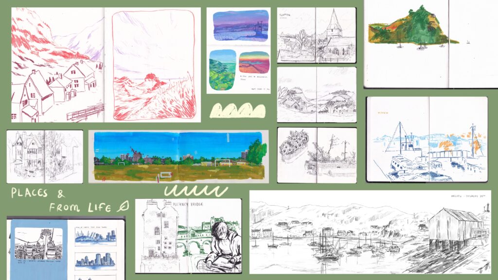
I found some slides from some kind of presentation I did while at uni which shows a range of stuff I made. It feels rather exposing so be nice.
Both Shut Down and The Great Green Island confidently step into emotionally and socially complex territory - from breaking down Western taboos around death and grief to facing environmental imbalance. In the UK we often shy away from tackling these heavy, challenging subject matters with children in picturebooks. Why do you feel it is so vital to bring these themes into books for young readers? And in your experience of bringing these stories to life, who do you think these topics are actually a challenge for - the children reading them, or the adults trying to protect them?
It's incredibly important because these themes are universal. Death/grief, for example, doesn’t discriminate. At some point in our lives, we will experience it and we have no control over that. And that, sadly, includes children. Unfortunately, as adults, we can’t protect them from that but we can help them understand what it is that they’re feeling and help them through it. Breaking the taboo and normalising it through things like books, can make such big topics a bit more digestible for young people.
And hey, I get it. Big and scary things are big and scary, even for adults, and sometimes it can feel impossible to talk to young people about something that you hardly understand yourself. But shielding them from it entirely and pretending nothing is big and scary, is not helping prepare them for reality.
The Great Green Island relies on a magnificent, high-stakes visual twist - the island itself forming the body of a giant crocodile. What were the compositional hurdles in ensuring the crocodile was well-hidden enough to surprise a child on the first read, while still leaving clear, rewarding visual clues for them to discover when looking closely? How did you map out the geography of the island to make that dual-identity work so flawlessly?
I honestly think it got to the point that we were so used to the idea that the island was a crocodile that we forgot that it was the big reveal that the entire book hinged on, ha! The teeth in the cave was an idea I knew I wanted to incorporate quite early on but I guess the other hidden clues fitted into the pages rather naturally once the story had been mapped out. I did fear that the clues were going to be glaringly obvious though, but it was nothing that showing a couple of fresh sets of eyes didn't help quell.
Figuring out the reptilian geography was just a matter of drawing it a relentless amount of times until I landed on something that felt like it would serve the story.
Your characters have such a wonderful, distinct graphic quality to them, yet they feel incredibly warm and human. How did you develop the character designs for the villagers? Did you create extensive character model sheets to ensure their expressions and posture stayed consistent across those wide, epic landscapes?
Honestly? For the background characters, it was just pure stubbornness during the roughing stage. Just drawing them and rubbing them out over and over until I was happy with them. I have no evidence of this (thank god, I don't think anyone should have to see the horrors of those rejected villagers). Extensive character model sheets are a wonderful idea that probably would have saved me a lot of headaches. I shall now steal that for future projects, thanks!
The pacing of the book feels deeply cinematic, shifting effortlessly from vast, full-bleed ocean views to intimate, detailed vignettes of village life. How closely did you work with the design team at Pan Macmillan to choreograph these shifts in scale? Were there any spreads that required multiple layout overhauls before the pacing felt perfectly tuned to the text?
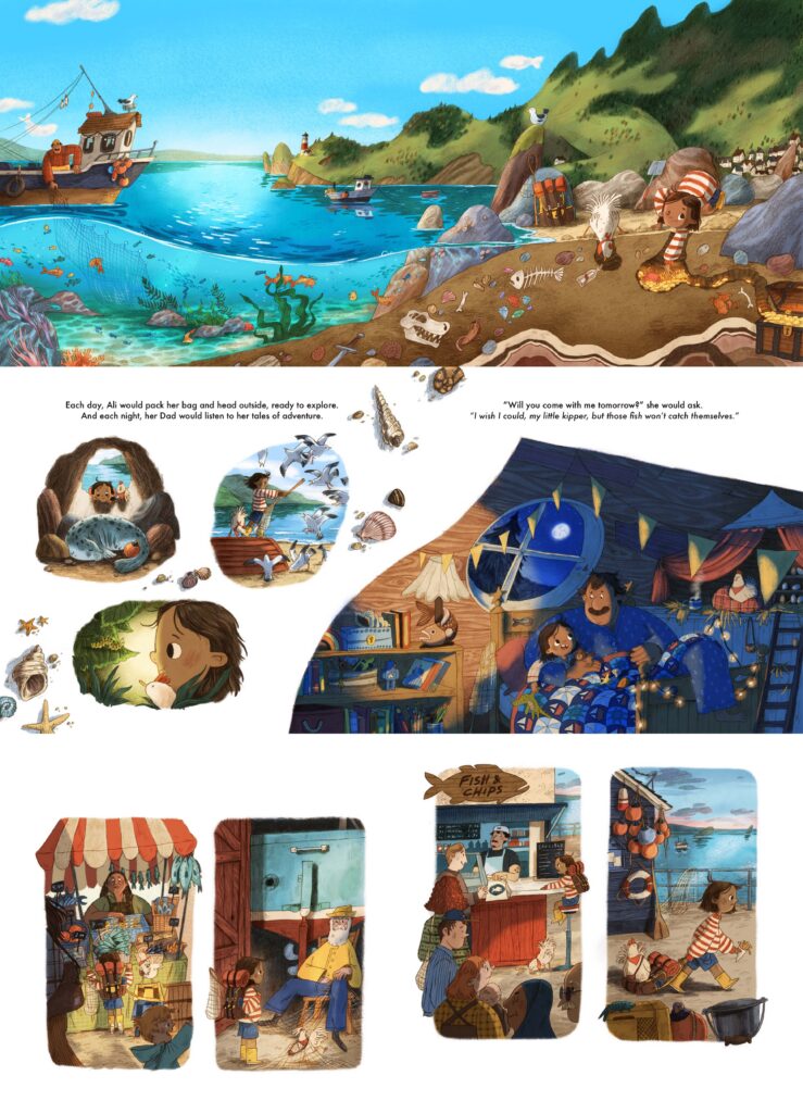
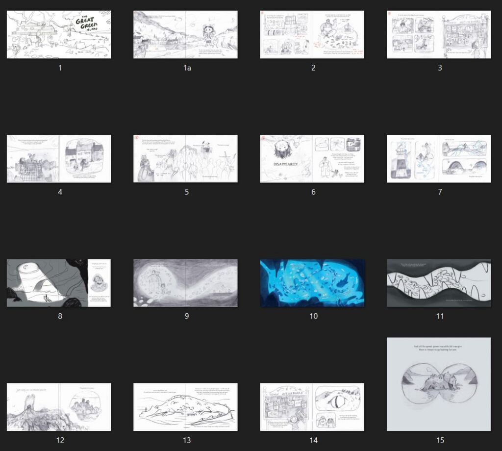
The design team (the very lovely Becky Chilcott and Lydia Coventry) gave me a lot of freedom while I drafted the compositions. I don’t think they wanted to influence the creative flow too much and see where we’d end up by letting me go solo, which was incredibly brave of them ha. We went through a lot of thumbnails and roughs due to the story shifting a lot and because I found it easier to problem solve visually rather than trying to get the text perfect before picking up the pencil. As anyone involved in picture book making knows, it can be incredibly difficult to fit all the moments you want in and sometimes elements of a story need to be sacrificed. One brilliant suggestion from the designers was to do ¾ spreads which allowed me to continue doing the vast scenes that would usually demand the space of a standard double page spread but also meant I could include extra context/vignettes.
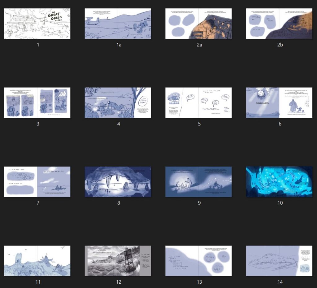
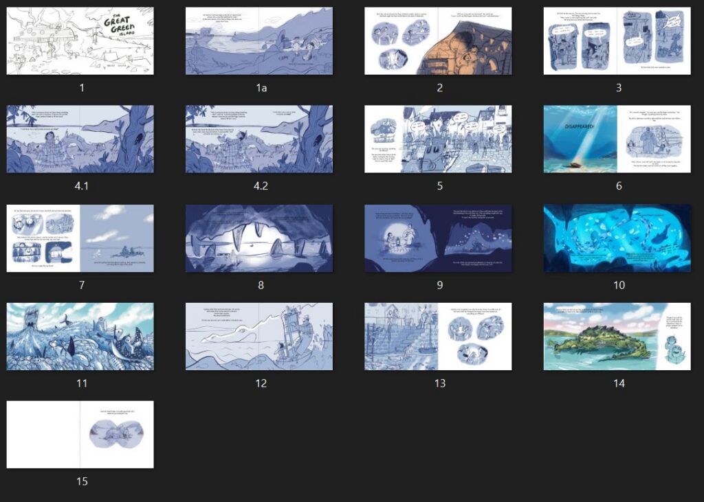
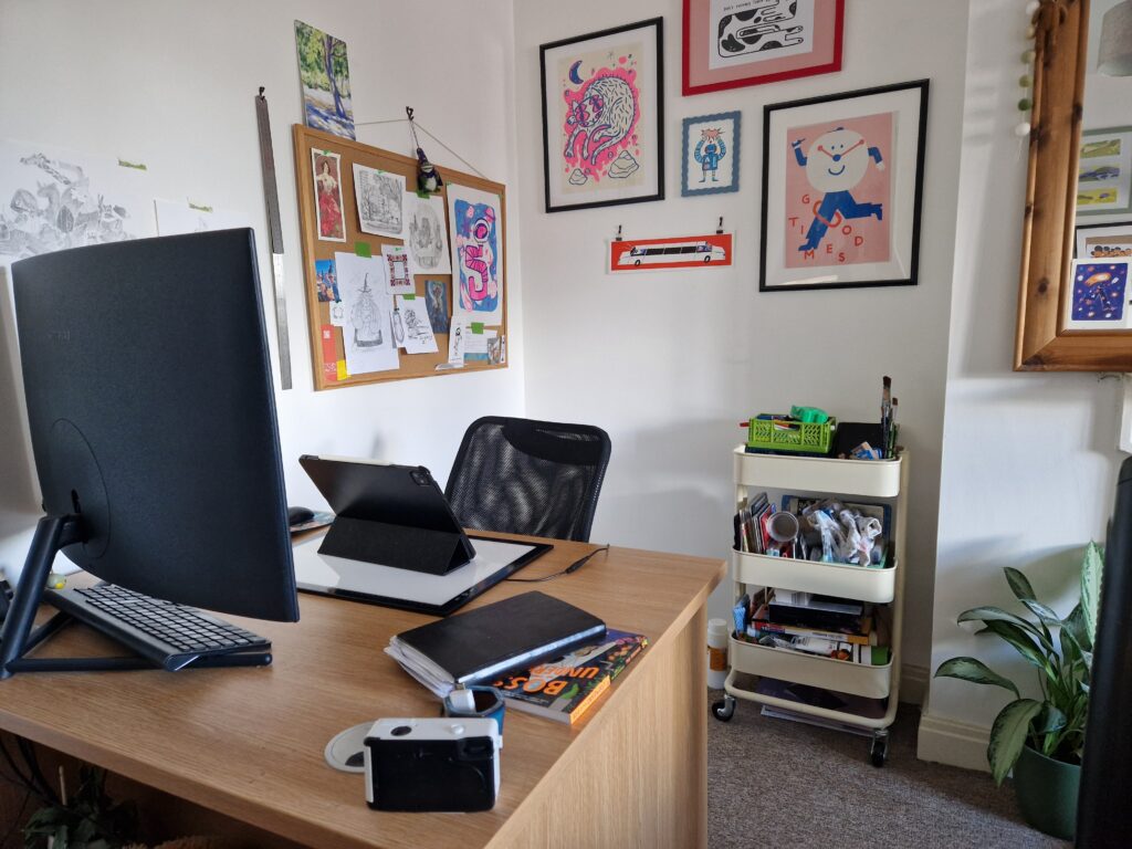
Can I be cheeky and ask for a tour of your workspace? I am always fascinated by the physical environments where such vast worlds are dreamed up. What do your surroundings look like, and what are the essential tools, sketchbooks, or specific materials that you must have on your desk when you sit down to create?
I am yet to reach the lofty heights of a proper studio so, at the moment, my workspace is but a humble desk in the corner of my room with an obnoxiously large monitor. Or alternatively, if I’m fancying a change of scenery from the rather epic view of my bed, I desk nomadically at any of the countless independent coffee shops that bless the streets of Bristol. Must have tools: my singular mechanical pencil that I draw everything with (I really ought to buy a backup), lightbox, iPad and my stupid, evil scanner/printer.
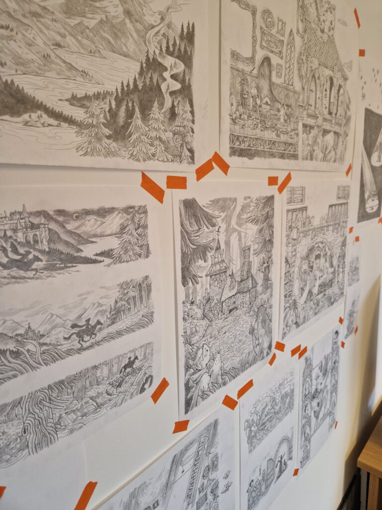
While I was doing the final artwork for my new book Princes don’t Practise, I thought it would be cool to tape all the pencil drawings to the wall around my desk as I went along. I fear it looked more like the inside of a maniac’s brain rather than ‘the cool and mysterious illustrator next door’ vibe I was going for.
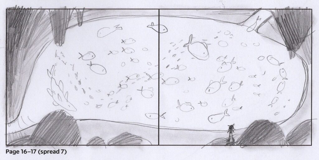
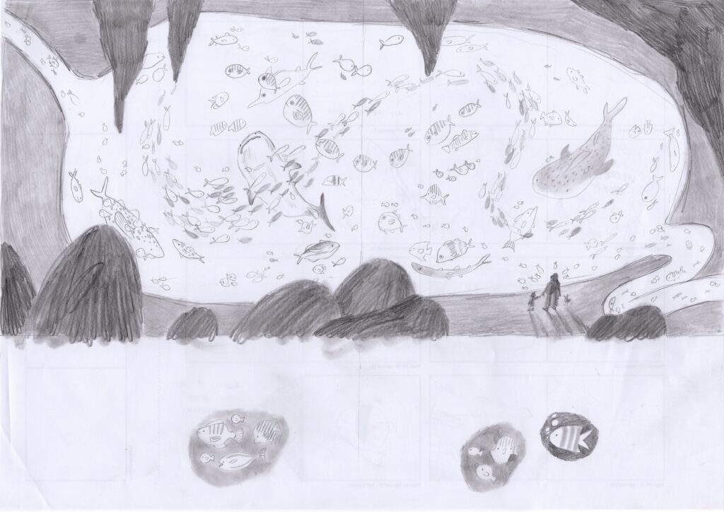
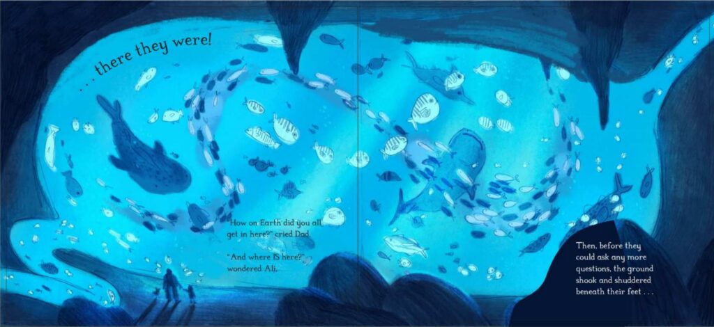
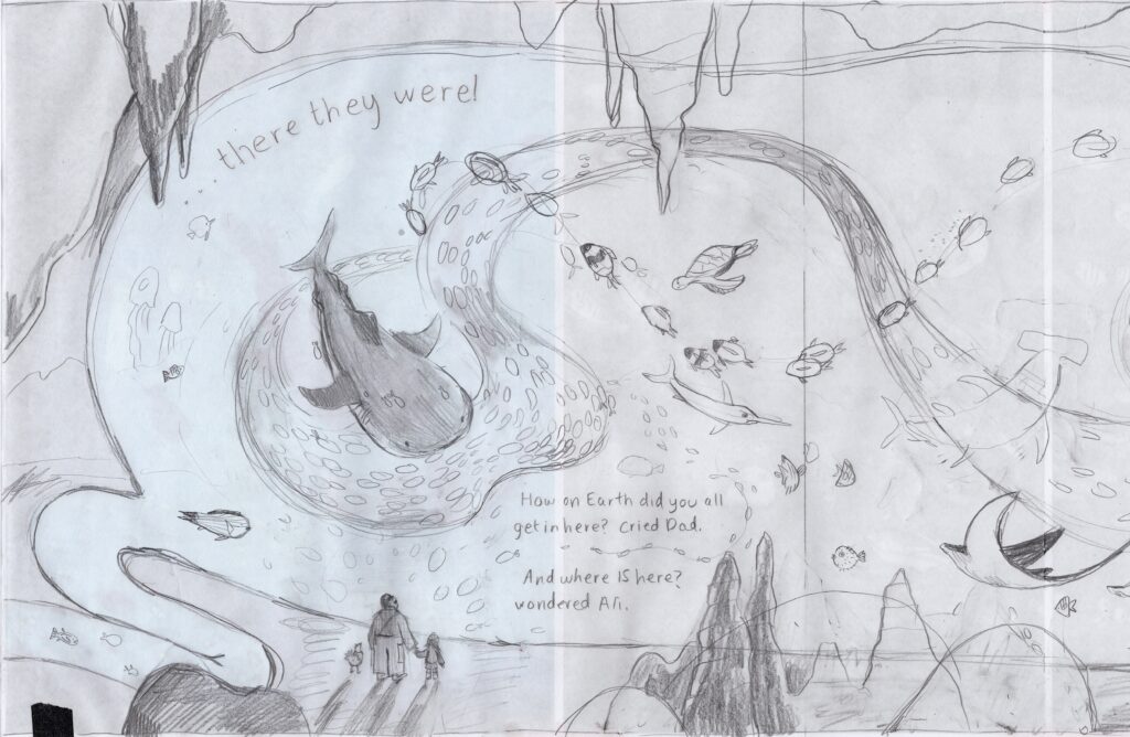
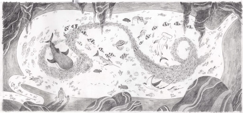
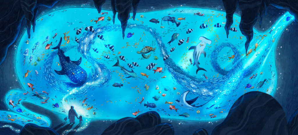
I am endlessly fascinated by hearing an illustrator talk us through the exact evolution of a single page from start to finish. Could you choose a favourite spread from The Great Green Island and guide us through its entire journey—from the very first loose gesture in your sketchbook, through texture layering, to the final finished piece that we see in print?
I think my favourite spread would either be the title page or the ‘aquarium stomach’ spread. Seeing as I seem to have more of a process documented for the latter, I shall go for that.
This spread was pretty pivotal for the development of the story. My team and I had been wandering around in circles with the story and I had been focusing too much on what I thought the story should be. It wasn’t until we looked at a few random thumbnails that I did, including a rather early naive rendition of the stomach, that the story started to emerge. Knowing that this page was going to be one of the major plot points, it became easier to map out the rest. I could start asking questions like, so we know Ali and her Dad need to end up in this cavernous stomach, so how do we end up there? And how do they leave?
Anyway, this spread was super fun. Aquariums are incredibly atmospheric, rooms basked in blue hues, children and people silhouetted by the glow of the tanks, weird fish, pretty fish, large fish, small. This page was an excuse to explore all those fun things and just make something look magical.
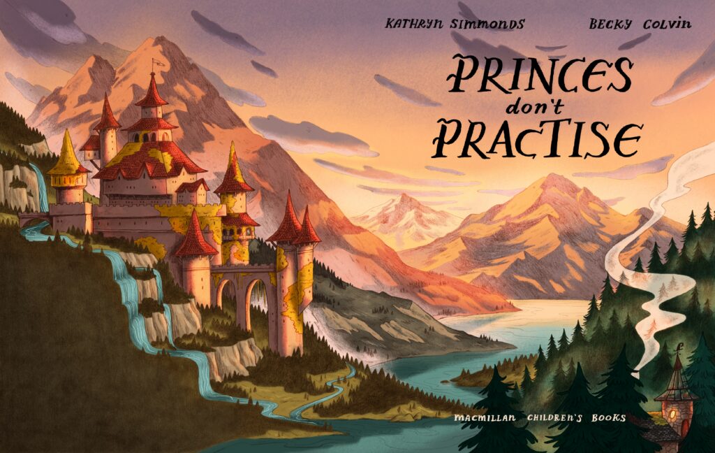
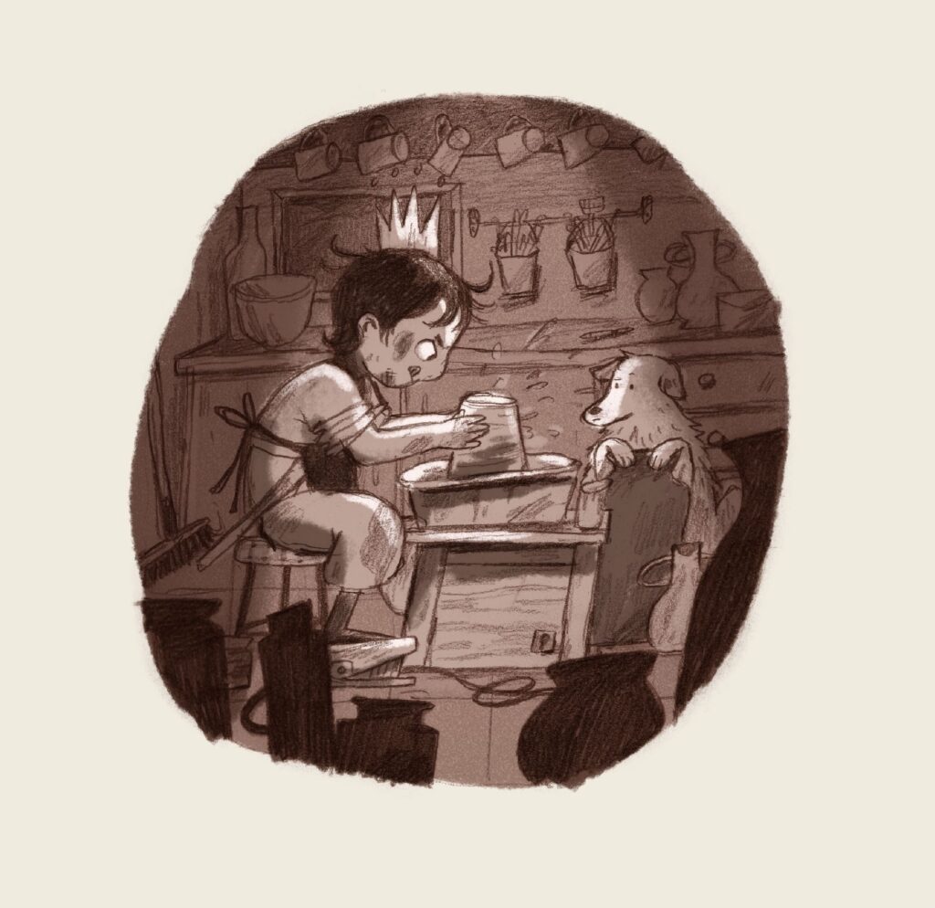
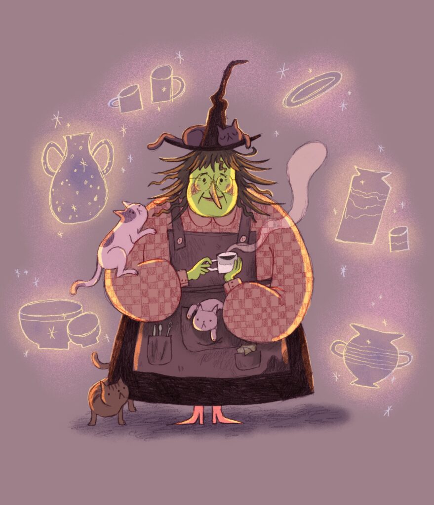
Lastly, what is next on the horizon for you? I’ve spotted that this coming August sees the release of Princes Don't Practise, your brilliant upcoming collaboration with poet Kathryn Simmonds! Prince Lupin’s chaotic belief that he shouldn't ever have to practise—combined with a pottery-loving retired witch in the forest—sounds like an absolute comedic joy to illustrate. Can you give us a little sneak peek into what it was like stepping into a rhyming, royal world after the vast landscapes of The Great Green Island?
It was incredibly refreshing to step into a new challenge and story with Princes don’t Practise. There was something rather nice about focusing solely on the visual side and not having to worry about the words/story. Equipped with a troublingly large pinterest board of references and Kathryn’s rhyming words echoing about in my skull, my brain was free to run wild in this new medieval landscape and do what I enjoy most - worldbuilding. And don't be alarmed, I still managed to sneak in some vast landscapes. I just can’t help myself.
As for what's next, you can expect some more from Kathryn and I as well as some other Becky Colvin standalone stories evolving at the hands of Macmillan 😉
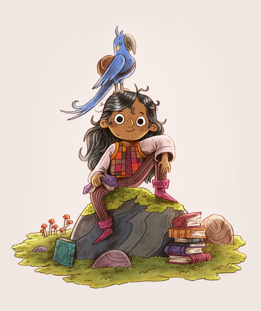
The Great Green Island by Becky Colvin is published by Macmillan, 978-0008693817, £7.99 pbk.
The Klaus Flugge Prize is funded personally by Klaus Flugge and run independently of Andersen Press.
Website maintenance & Copyright © 2026 Andersen Press. All Rights Reserved. Privacy & Cookie Policy.