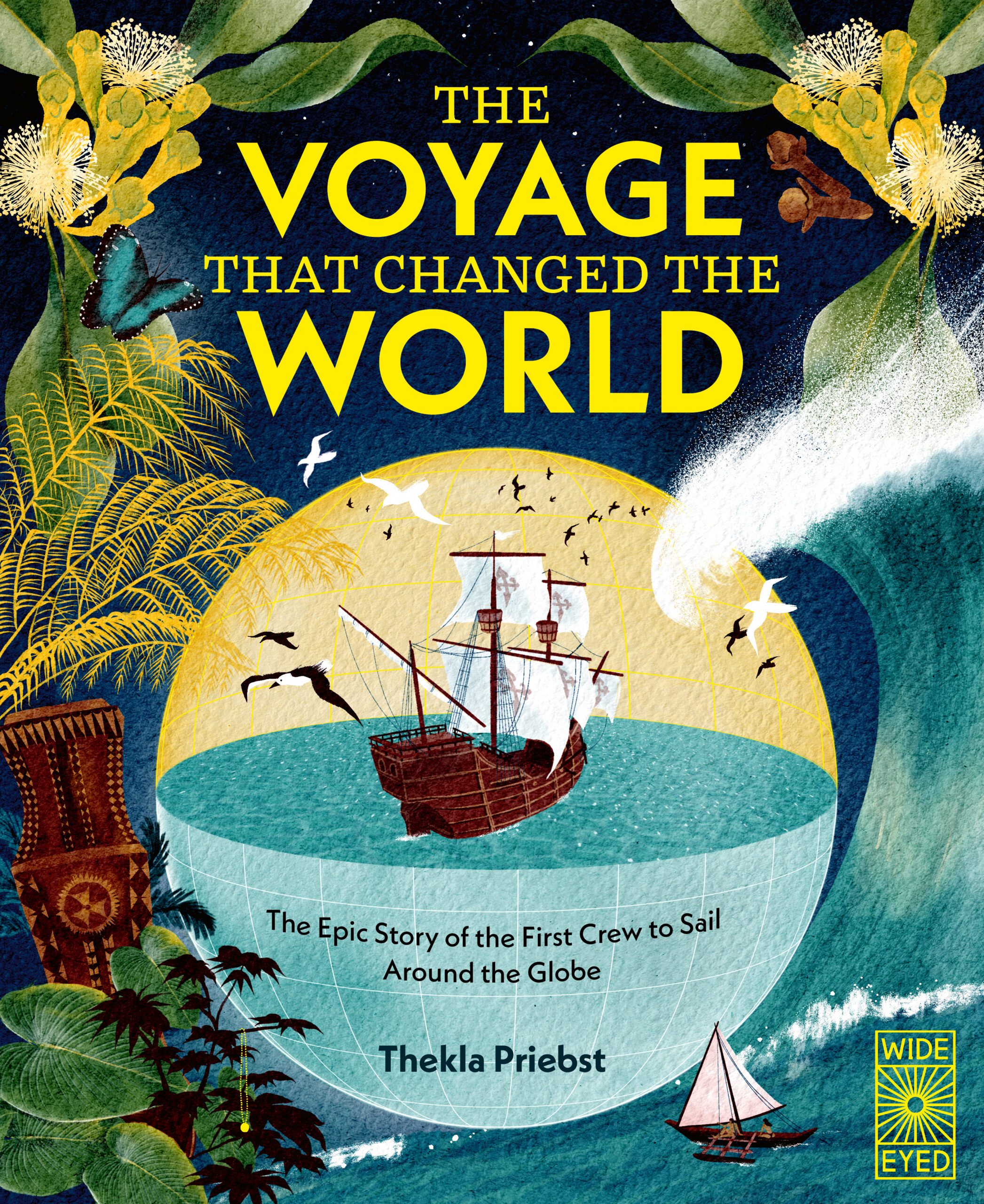
The Voyage that Changed the World, written and illustrated by Thekla Priebst
The Voyage that Changed the World by Thekla Priebst is one of six books on the shortlist for the 2026 Klaus Flugge Prize.
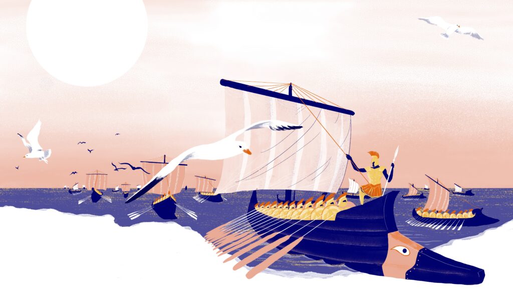
The Voyage that Changed the World takes readers on an amazing journey of discovery with Captain Magellan and his crew as they sail round the whole world. The Klaus Flugge Prize judges describe it as a perfect example of an information picture book.
Former Klaus Flugge Prize judge, Senior Lecturer in Education: Primary English and Children's Literature, Oxford Brookes University, Mat Tobin interviewed Thekla about her book.
Your journey into children’s publishing is grounded in a deep mastery of visual communication, having studied at Bauhaus University Weimar and the Berlin Weissensee School of Art. Can you tell us a bit about how you made the leap from graphic design and art direction into researching, writing, and illustrating an epic 80-page historical book? Was there a specific catalyst or piece of portfolio art that made you realise Magellan's circumnavigation was the exact story you wanted to debut with?
I don't think it ever felt like a leap. Looking back, it feels much more like a long journey towards finding my way back to my own creative voice - and learning to trust it. Drawing and illustrating had been my greatest passion ever since I was a child.
When I started studying, I was only 18 years old, at Bauhaus University in Weimar, I intended to become an illustrator. But there wasn't a professor for illustration at the time, so I studied graphic design, typography and editorial design instead. Later I transferred to Berlin Weissensee because of its renowned illustration department. Ironically, that's where I became known for being particularly strong in graphic design.
At twenty-three, I became a single mother, and design offered the more secure way to make a living. Looking back, I'm deeply grateful for those years because they taught me how stories are structured - through composition, rhythm, typography and layout. I often say that I first had to become a really good designer before I could finally become the illustrator I had always wanted to be.
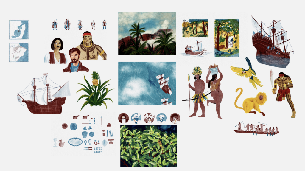
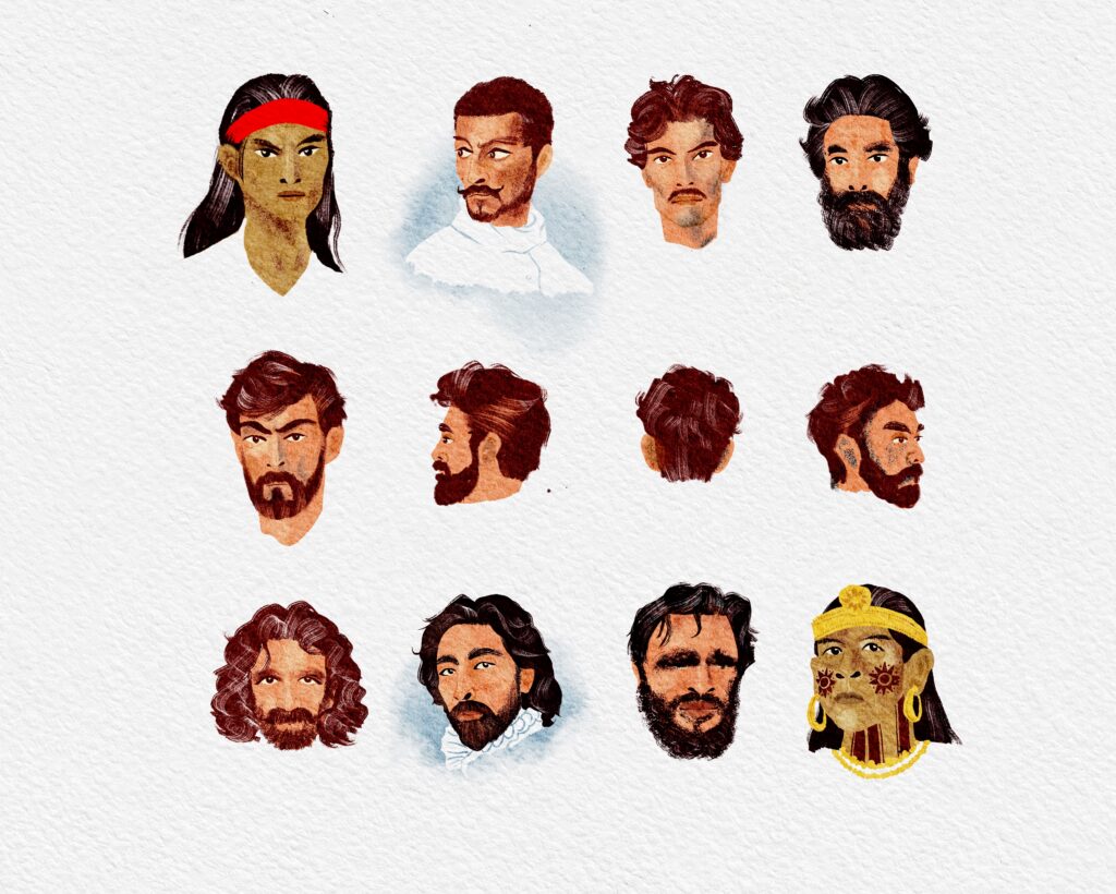
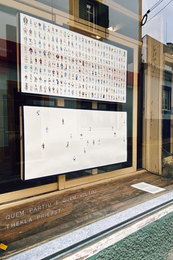
About five years ago, I decided it was time to create the children's book I had always dreamed of making. I started building a portfolio of illustrated non-fiction projects, hoping to find an author to collaborate with. During the pandemic, I read a biography of Magellan, and one of my first portfolio pieces became an illustration of all 240 sailors who set out on the voyage.
At some point, I realised that the author I had been looking for was me all along.
Becoming the author was the part that challenged me most. Thankfully, I found exactly the right partner in Wide Eyed Editions, part of Quarto. From the beginning, they shared my vision to tell this story in a thoughtful, ambitious and historically sensitive way.
Working so closely with the editorial team changed the way I think about storytelling. Until then, I had mostly communicated through images. Suddenly, every sentence mattered just as much. Those conversations about sensitive language and perspective have influenced the way I illustrate ever since.
Looking back, this book wasn't simply the beginning of my career as an author and illustrator. It was the moment when everything I had learned - as a designer, illustrator and as a person - finally came together. For the first time, I felt I was telling a story that reflected not only how I work, but also how I see the world.



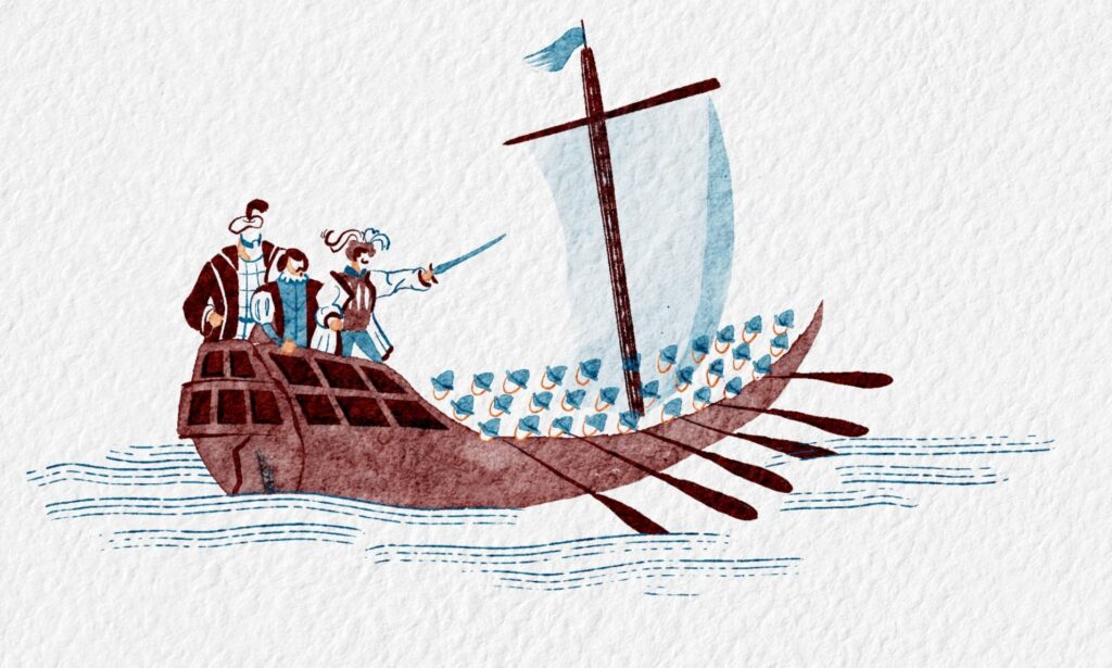
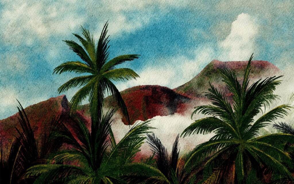
As both the author and illustrator, you had to juggle the massive puzzle of layout design yourself - carving out real estate for maps, captions, historical sidebars, and main narrative text blocks. Can you tell us about your editing and planning process? How do you storyboard an information text so the typography feels completely embedded within your giant rolling waves and volcanic landscapes rather than floating on top like an afterthought?
I love making complex information visual. To me, a good infographic lets you understand the essentials at first glance, but it also rewards curiosity. The longer you look, the more connections and layers of information you discover. That's exactly the kind of experience I wanted to create with this book and that's how I enjoy learning myself.
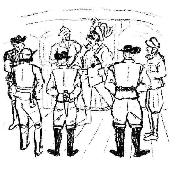
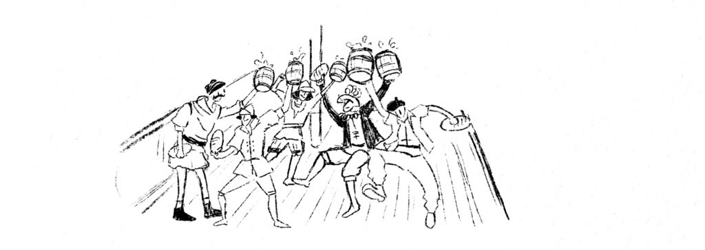
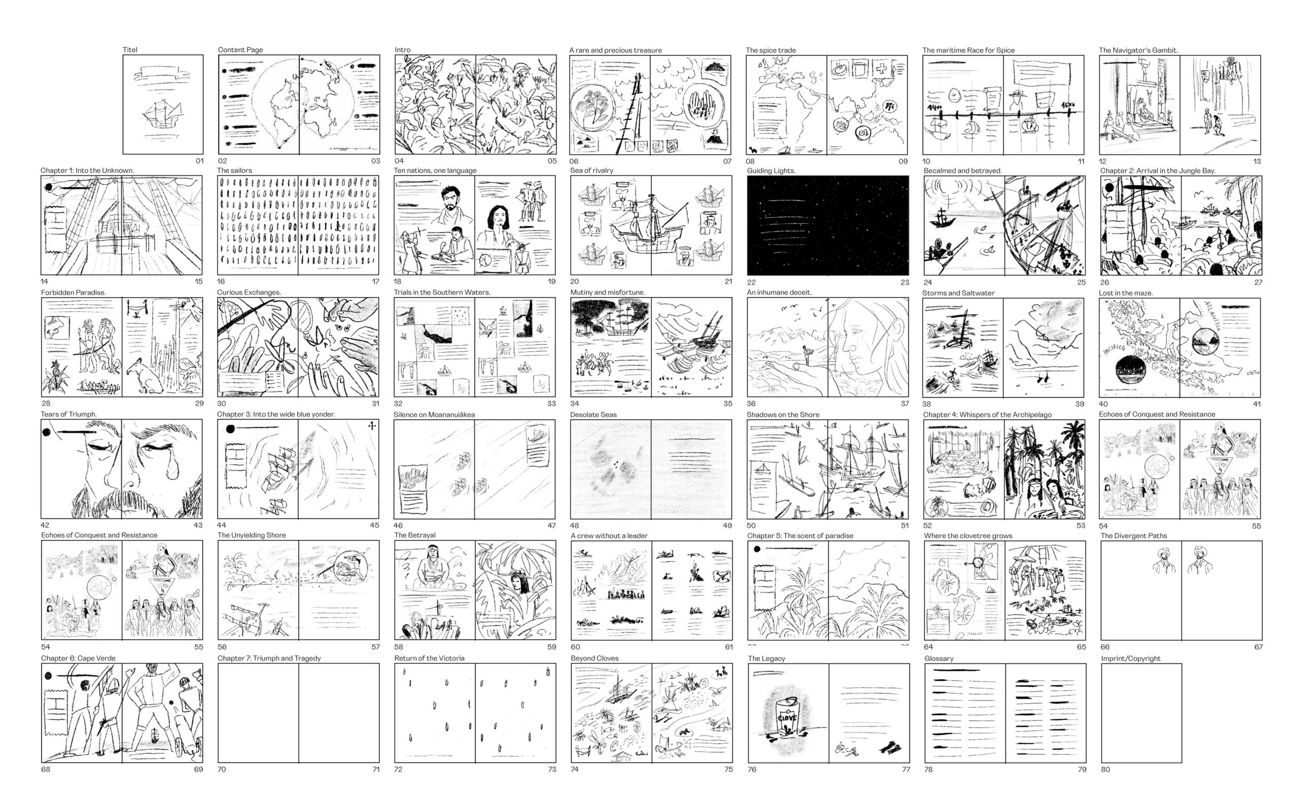
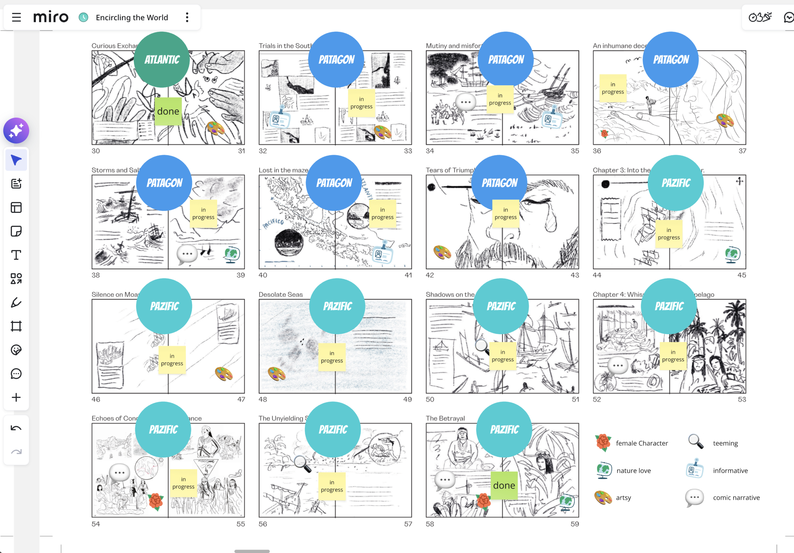
The storyboard became the most important tool for shaping the book. Even though it's made up of tiny, rough sketches, every spread already contains both the visual idea and the key information it needs to communicate. I also created little labels to see, which spread is more informative, where I can include a female character or when it can be visually strong. Once the storyboard was finished, I placed those sketches into the final page format and gradually divided the manuscript into smaller sections. This is where I understand the rhythm of the book - how the text, illustrations and page turns would work together.
Typography is never something I add afterwards. It‘s something I set up straight from the beginning – choosing my fonts and sizes. At stage of the rough draft, I'm composing the entire page at once. The illustrations, the maps, the text and the white space all influence each other. That's probably the designer in me - I don't really separate them.
One Bauhaus principle has stayed with me ever since my studies: form follows function. For me, that simply means that the content always comes first. This principle works for me for Design and for illustration. It isn’t there to decorate information - it's there to help people understand it.
In many ways, I created the kind of history book I wish I'd had at school - one that makes history feel human.
Children’s non-fiction requires a delicate high-wire act between absolute historical accuracy and artistic wonder. Furthermore, your book handles heavy, critical historical truths—addressing colonisation, kidnapping, and the critical but often erased role of figures like the Malay guide Enrique de Malacca. How did you approach balancing the natural excitement of a high-seas adventure with a deeply respectful, honest critique of empire for a young reader?
This was probably the most challenging part of the entire project, and I honestly couldn't have done it without the editorial team at Wide Eyed Editions - especially Kimberly Davis and Hannah Dove. Before we even started editing the manuscript, we spent several months discussing one question: How should this story be told today?
There was never any doubt that Magellan's voyage is an extraordinary adventure. But it's also inseparable from colonialism, violence and exploitation. We knew from the beginning that we didn't want to retell the traditional European narrative. Instead, we wanted to tell a global story for a new generation.
Personally, that process taught me an enormous amount. I realised how much power language has, especially when we're talking about history. I had always considered myself thoughtful and sensitive, but this project made me much more aware of how easily language can reinforce one perspective while silencing another.
One question became the compass throughout the entire book: Whose perspective is missing? It influenced every decision we made - from the wording to the structure of the story, and even where the book begins.
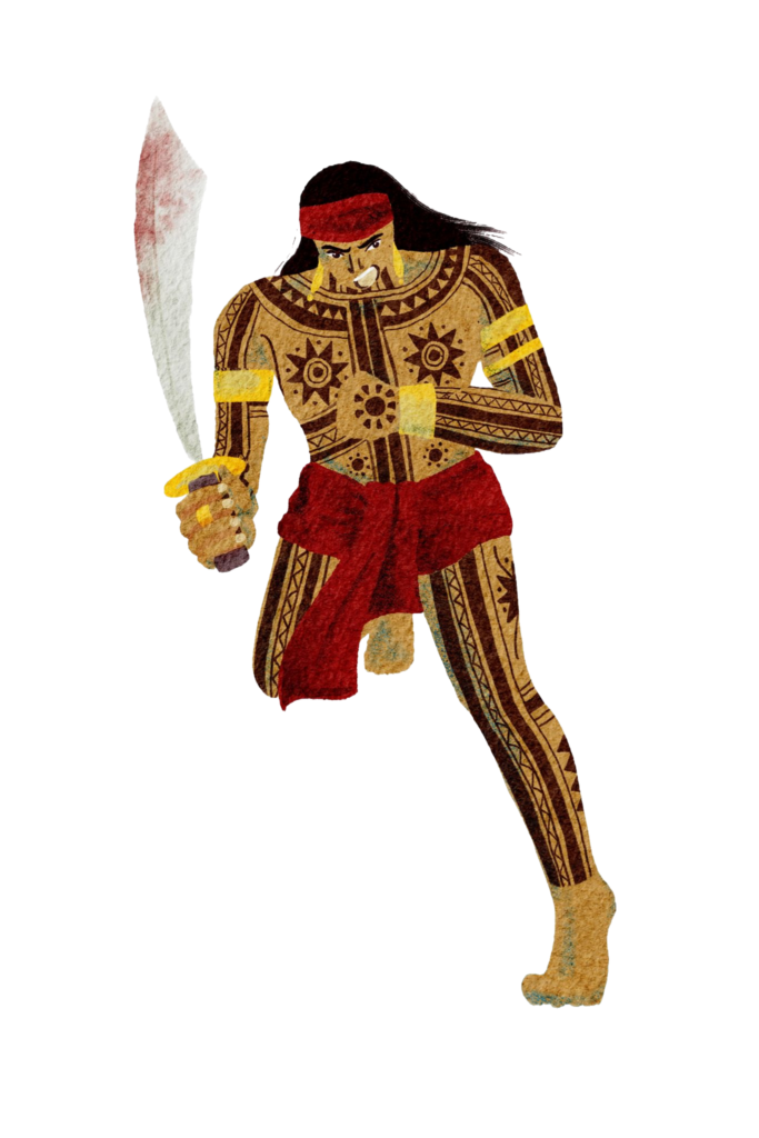
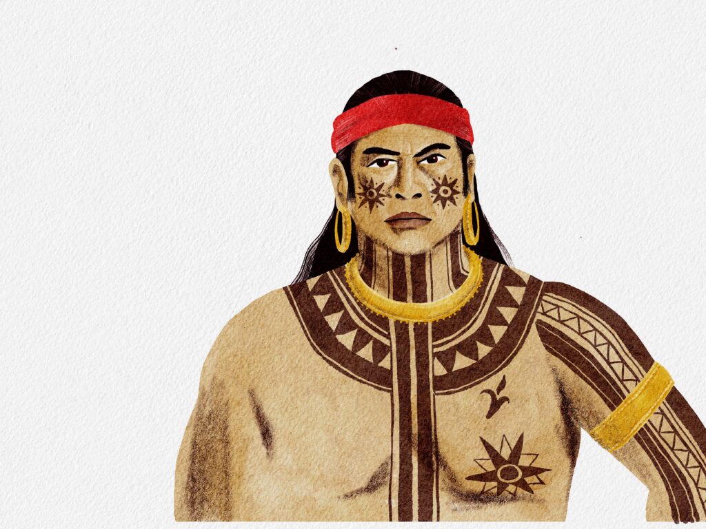
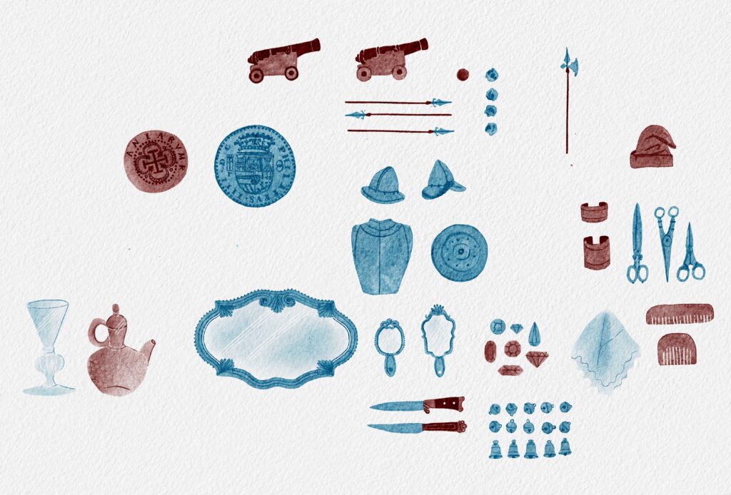
It was just as important to me that the illustrations reflected that same respect. I didn't want to rely on stereotypes or simplified representations. Every landscape, every person and every object is rooted in careful research, museum visits and travelling to some of the places myself. The more I learned, the more I realised that historical accuracy isn't only about facts, it's also about representing people and places with honesty and dignity.
Children are incredibly perceptive. They trust us to tell them the truth. I believe we can celebrate human curiosity and the spirit of exploration while also being honest about the harm that came with it. Those two things don't contradict each other - they belong together.
The perspective in this book is wonderfully cinematic, often using high horizon lines to make the ships feel tiny against the vast, sweeping scale of the ocean and sky. Your official publisher bio mentions that you live on the west coast of Portugal and love to surf big waves! How much did your personal, daily relationship with the Atlantic, moving water, and massive swells influence how you captured the intense, rolling environments across these spreads?
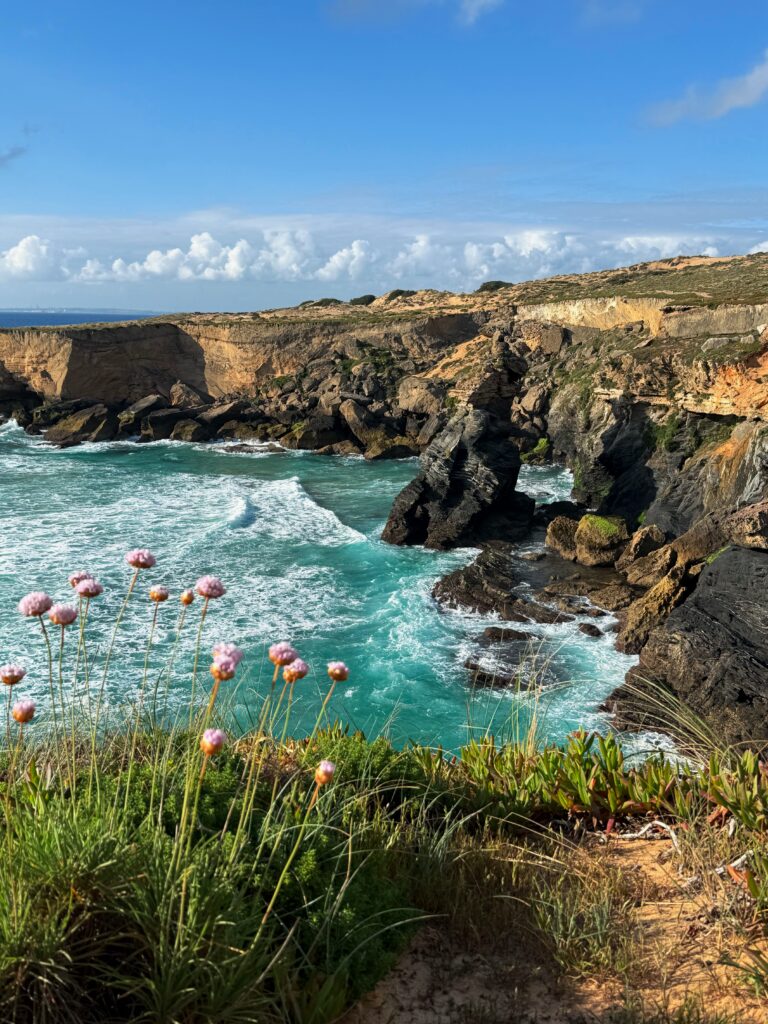
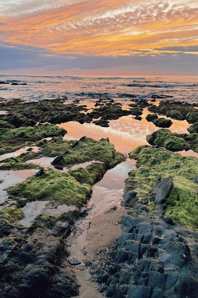
Absolutely. Living on Portugal's west coast has shaped the way I see landscapes. I live in the Alentejo, a part of the country that's still incredibly wild and sparsely populated. Within just a few minutes you can find yourself alone surrounded by dramatic cliffs, endless beaches, dunes and rocky coastlines. Even after all these years, there are still moments when the landscape simply leaves me speechless.
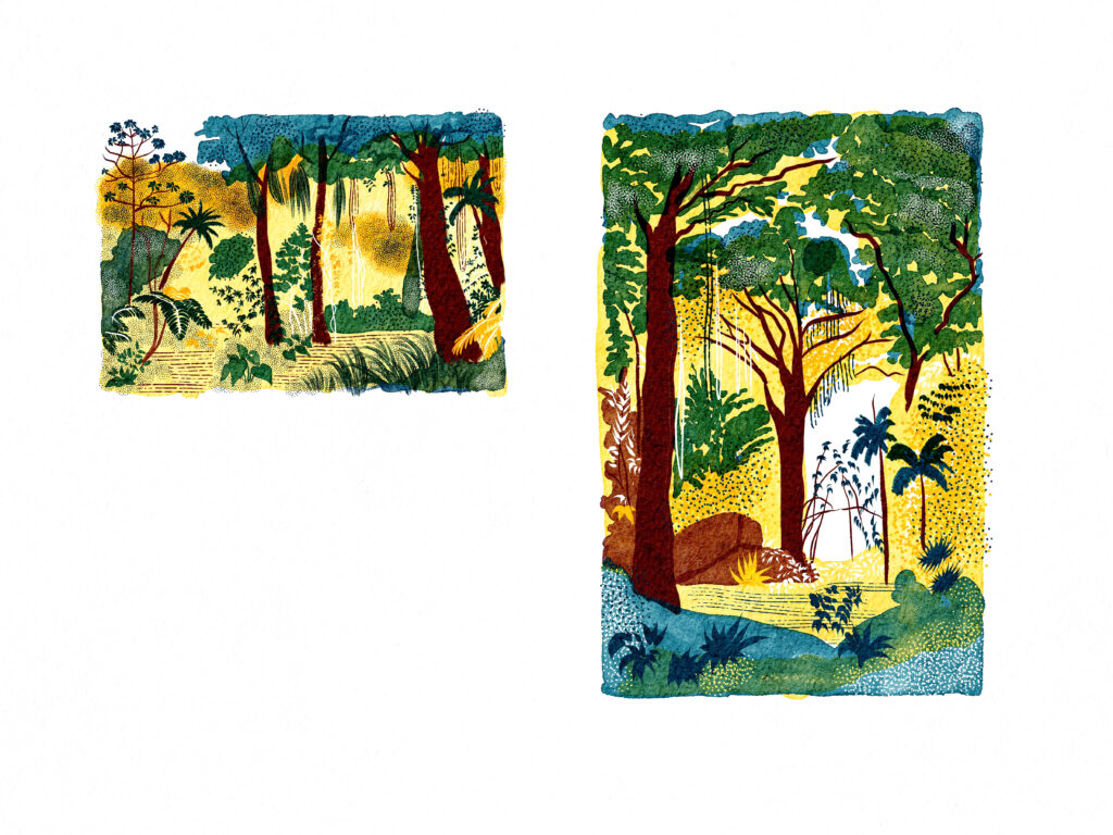
Living here has sharpened my senses for nature. It made me notice the small things just as much as the big ones - the way sunlight sparkles on the ocean, the tiny droplets of a breaking wave, or the movement of grasses in the coastal wind. I wanted to share that sense of wonder with young readers. The landscapes in the book aren't just backgrounds; they're another character in the story. While they're not painted realistically, I wanted them to stay true to the places they represent, including the plants and wildlife that belong there.
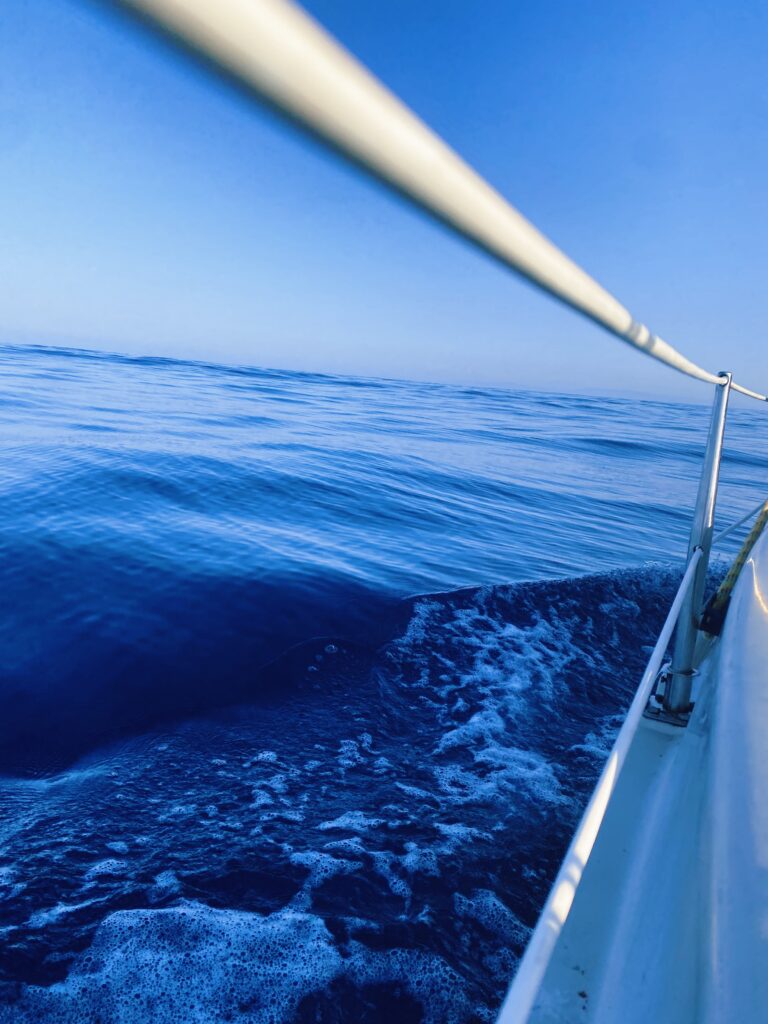
Living so close to the Atlantic has also given me a deep respect for the raw power of the ocean. Spending time on a sailing boat helped me understand its vastness, its unpredictability and its force in a much more physical way. Of course, I can't imagine what it must have felt like to cross an unknown ocean five hundred years ago, but I think it brought me a little closer to it.
Researching the book also took me to Indonesia, where I experienced the tropical rainforest and a completely different ocean for the first time. That journey became just as important as reading books or visiting museums. It helped me understand these landscapes with all my senses.
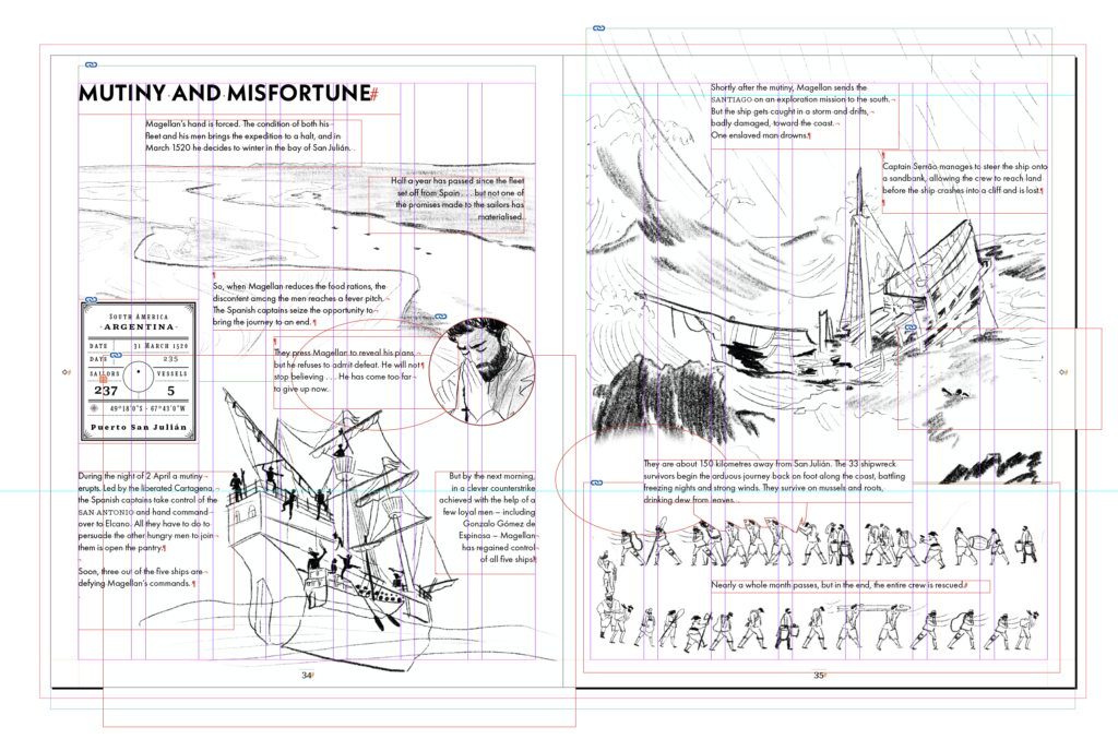
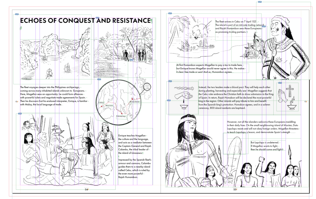
Your background as an art director and designer shines through brilliantly in how you construct your pages. Can you talk us through your fascinating hybrid process? How does it feel to paint directly into a fixed typographic structure, and how do you maintain the freedom of wet, organic watercolours while sticking to such a disciplined, factual layout?
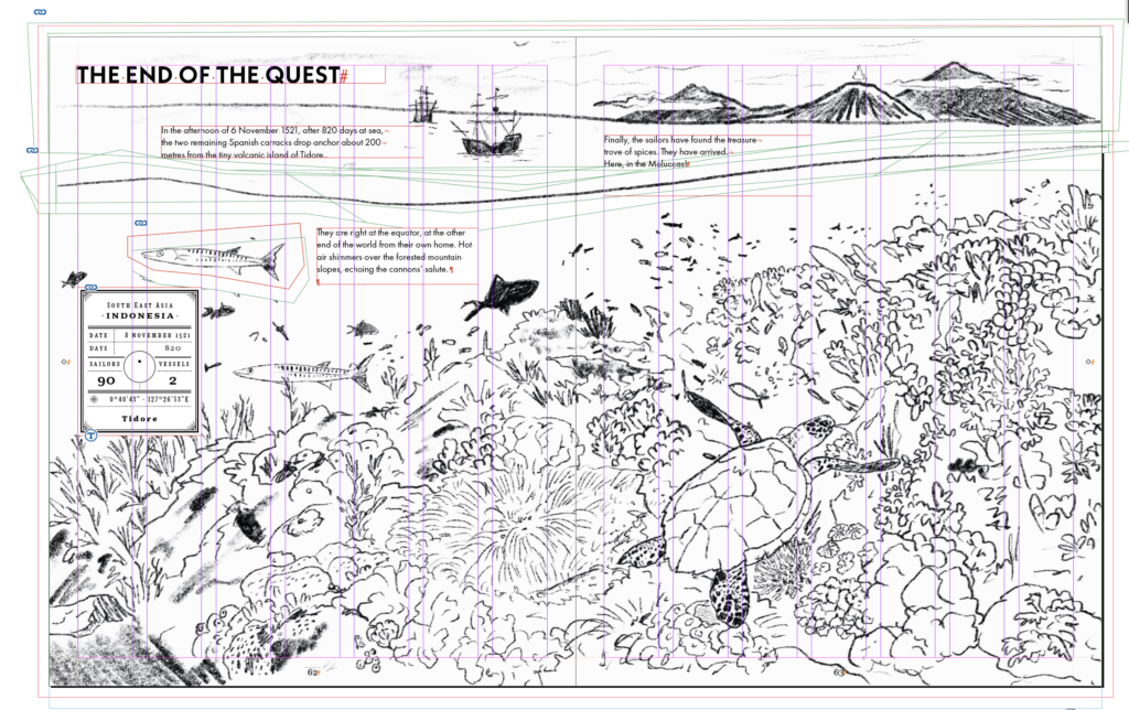
To be honest, I didn't follow my own grid quite as strictly as it might look. It was an incredibly useful framework, but I also gave myself the freedom to move the text whenever the composition needed it. I usually build grids with lots of columns because they give me that flexibility.
The rough sketch is by for the layout the most important stage for me. That's where I find out whether an idea really works. I sketch all the elements that belong on a spread, place them into the layout, scale them, move them around. By the time I start adding colour, the entire composition is already there - including the text. But sometimes even in that stage I change and remove things until everything feels balanced. That's why it often looks as if I'm colouring around it.
What surprised me was how much changed once colour was added. A layout that worked perfectly in black and white could suddenly become difficult to read. One thing I hadn't expected was the production requirement that the typography had to be either black, or white on a completely black background because of the different language editions. That meant some colour choices simply weren't possible. A dark blue ocean, for example, might have felt right visually, but it wouldn't have allowed the text to remain readable. So every spread became a balance between colour, composition and readability.
So there was quite a bit of adjusting and refining until both the illustration and the typography worked together.

Following on from that, why do you feel it is so important for young readers to see the ‘hand of the artist’ in a book about science and history? Do you feel that a tactile, hand-painted approach helps make historical figures and centuries-old voyages feel more immediate, real, and human to a modern primary school child?
That's actually quite a difficult question, because I don't think the most important distinction is whether an illustration is hand-painted or digital. Historical information books have always relied on handmade images - paintings, engravings and drawings - long before photography existed. For me, what really matters is the visual language.
Many historical illustrations focus on documenting facts. I wanted my illustrations to communicate emotion as well. Emotion isn't only expressed through a character's face, but also through perspective, composition and the way you invite the reader into a scene.
I also allowed myself some creative freedom when designing the characters. All portraits of Magellan were painted after he had died, so they already reflect another artist's interpretation. Looking at those portraits, I was often struck by how old the sailors appeared. In reality, most of them were in their late twenties, thirties or early forties. I wanted them to feel closer to today's readers—as if they could be someone's father, uncle or neighbour rather than distant historical figures.
I love handmade illustration because it leaves room for individuality and imperfections that make an image feel human and creates space for interpretation. But ultimately, every illustrator makes choices. We decide what the reader sees, from which perspective, and what becomes the focus. I think that's where the real authorship lies, regardless of the medium.
In addition to wide-angle seascapes, you also have to illustrate micro-details, like detailed 16th-century maps, indigenous plants, and wildlife specimens. How did you approach shifting your artistic mindset from painting an epic, sweeping storm at sea to capturing the intricate, delicate patterns needed for an informational diagram or map label?
Peter Marley, the Publishing Director at Quarto Kids, once said to me, ‘Do you know what I love most about your book? Every page is a surprise.’ I think that's still one of the nicest compliments I've ever received.
I realised that's probably because I enjoy shifting perspective. Sometimes I want to show the vastness of a landscape, and sometimes I'm fascinated by the tiniest detail. I think that's how I experience the world myself. I'm constantly moving between the big picture and the small things that you only notice when you stop and look closely.
I've always loved craftsmanship, whether it's textiles, objects or architecture, just as much as I love the endless forms and colours you find in nature. An 80-page book gives you the freedom to celebrate all of that. Every spread can have its own focus.
But choosing a detail is never random. Every detail says something. For example, when the crew arrives in the Moluccas and meets the Sultan of Tidore, the text explains that they encountered a sophisticated trading culture. Showing the Sultan wearing richly embroidered textiles reinforces that idea visually. The illustration tells the same story as the words, just in a different language.
I think that's what illustration can do so beautifully. It guides the reader's attention and helps communicate ideas without having to explain everything in words.
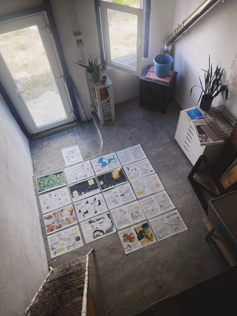
Can I be incredibly cheeky and ask for a tour of your workspace? I am always fascinated by the physical spaces where history is brought back to life. What do your surroundings look like, and what are the essential brushes, paint pots, sketchbooks, or research files that you must have on your desk when you sit down to create?
When I was creating The Voyage That Changed the World, I had a studio in a nearby artists' community called Ateneu do Catorze. I actually gave it up earlier this year, even though I'm already working on my next project.
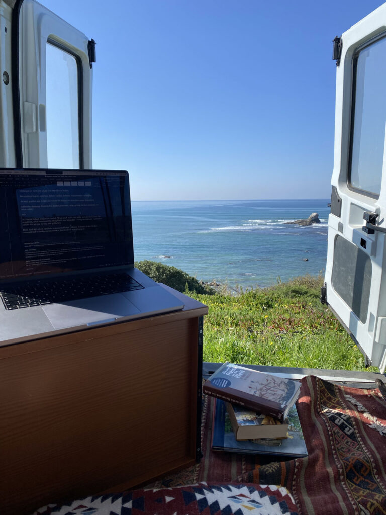
I realised that I enjoy the freedom of not being tied to one place. Because so much of my work is digital, I can work almost anywhere—at my desk at home, in the garden, in a café, or even from my car overlooking the Atlantic.
In fact, I wrote most of the manuscript sitting in my car on the cliffs above the ocean. Whenever I needed a break, I would simply look out at the sea for a while before continuing. All of my traditional materials and painting tools are at home now, so I can still switch between digital and analogue whenever I want. And one day, I'd love to build a small wooden studio in my garden made of old collected windows and doors.
I am endlessly fascinated by hearing an illustrator talk us through the exact evolution of a single page from start to finish. Could you choose a favourite spread from The Voyage that Changed the World, perhaps one of the magnificent island arrivals or a detailed cross-section, and guide us through its entire journey from the first loose graphite gesture in your sketchbook to the final printed page?
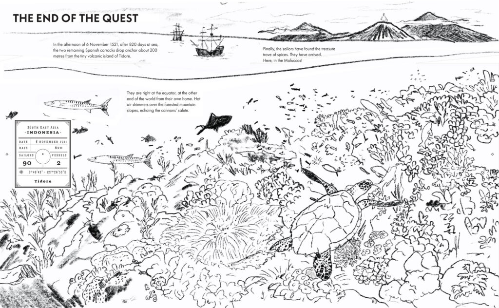
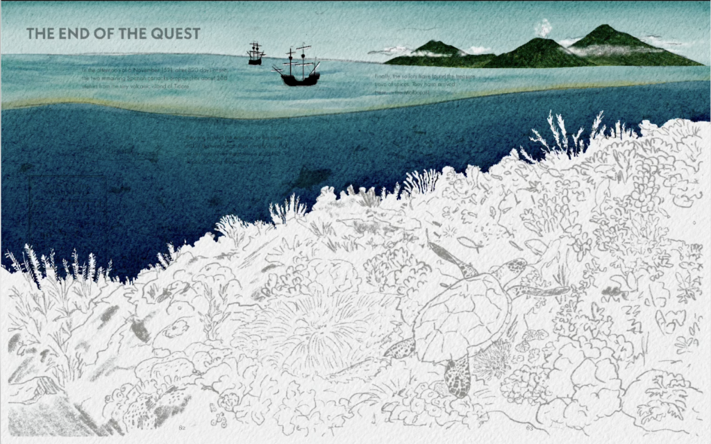
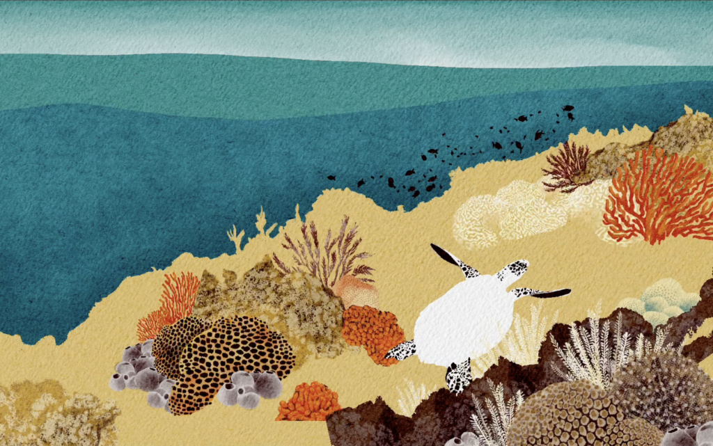
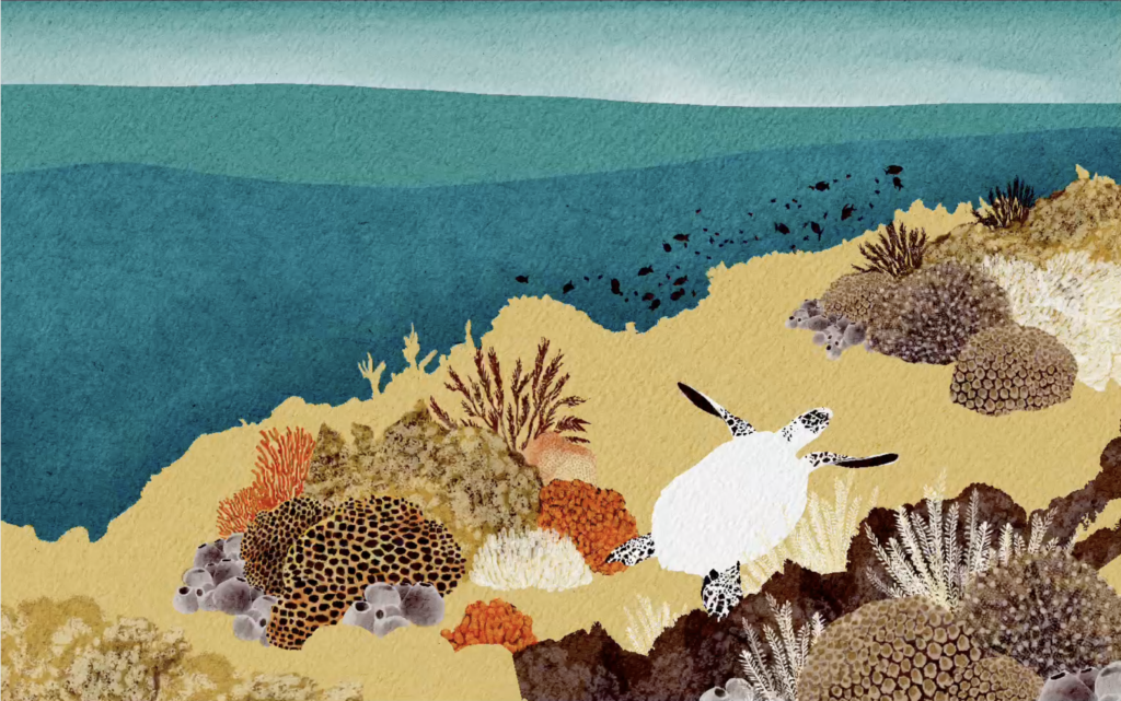
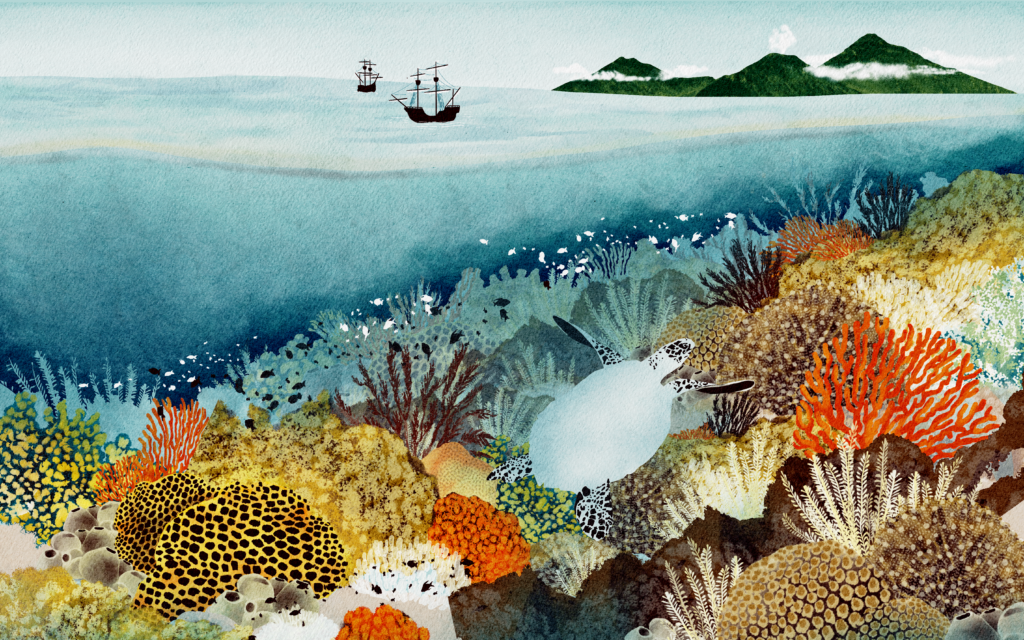
The spread The End of the Quest (page 62-63) is probably one of my favourite illustrations in the whole book. It's also the one that seems to have stayed with many readers, which makes me incredibly happy because it was always meant to be the visual climax. The search is finally over. The treasure has been found. I felt that this moment needed to be told primarily through the illustration.
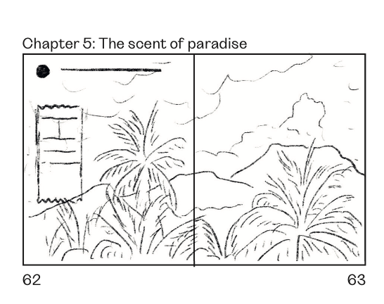
Interestingly, the coral reef wasn't my original idea. At first, I wanted to focus on the volcanic islands of Ternate and Tidore. The original title of the page was: The scent of paradise. I even had a draft for that version painted before I got the book deal, but somehow during the process it didn't have the visual impact I was looking for. It felt not as spectacular as other landscapes in the book. And at the same time repetitive to the beginning.
The final idea came later, during my research trip to Indonesia. Before continuing my journey from Manado to Ternate, I spent a morning snorkeling in Bunaken National Marine Park, one of the most biodiverse coral reefs – 390 species of coral and about 2,000 species of fish. I was completely alone in the water as the sun was just coming up. I've lived by the Atlantic for years and spend a lot of time in the ocean, but I had never experienced anything like that before. Underwater, language somehow disappears. All that's left is observing. I found myself drifting through an incredible world of colours, shapes and thousands of fish. And then, as the reef suddenly dropped away into deep blue water, a sea turtle slowly swam past me. Without really thinking, I followed it. A moment later I found myself surrounded by six sea turtles, floating in the open ocean. It's still one of the most memorable experiences I've ever had in nature.
Later, while I was in Ternate, Professor Maulana told me that both Ternate and Tidore had once been protected by extensive coral reefs. At that moment everything came together. Today, much of that reef has disappeared, but through illustration I could bring it back to life. Suddenly, the arrival at the Spice Islands wasn't only about finding cloves. It also became a celebration of the extraordinary biodiversity that once surrounded them—and a reminder of what has been lost.
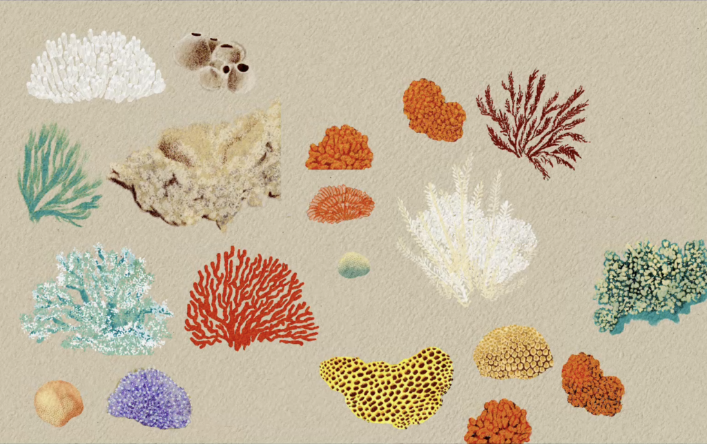
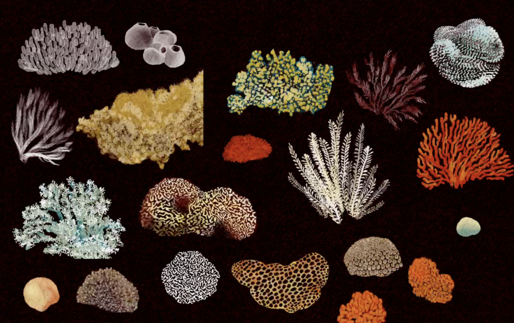
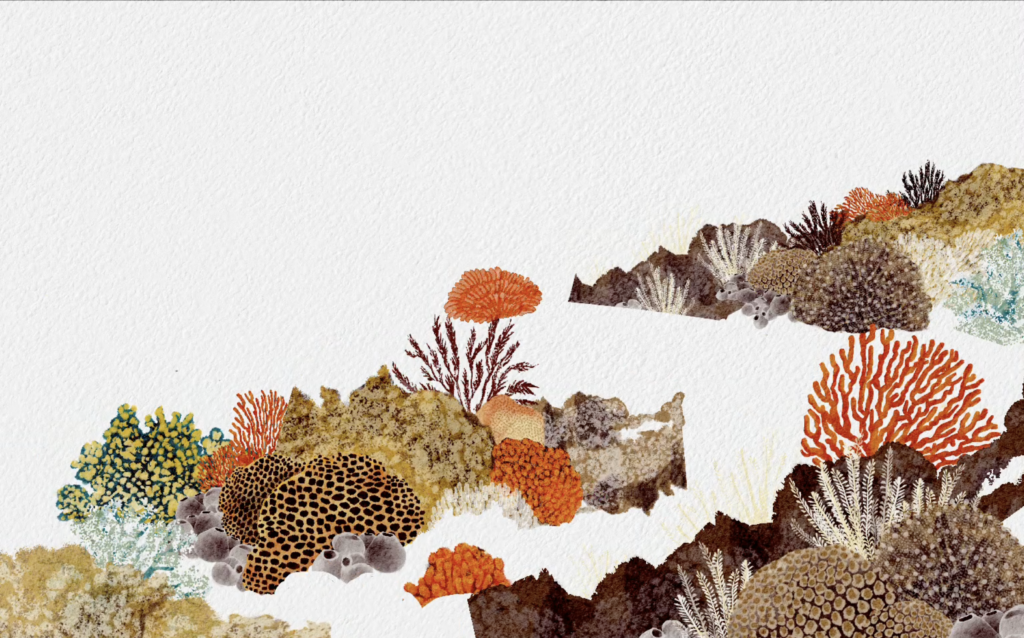
Creating the illustration was quite different from the rest of the book. Instead of painting the whole scene at once, I first illustrated individual coral species, based on photographs and scientific references, and then assembled them almost like a collage before adding the fish. I even repainted the entire colour version because the first one felt far too dark. At that stage of the project I was under enormous deadline pressure and usually only had a single day to colour each spread, but for this one I allowed myself three days because I really wanted to share what I had experienced myself – that moment of beauty and wonder.
For the Europeans in the story, the treasure may have been cloves. For me, the real treasure was discovering the world beneath the surface.
Lastly, what is next on the horizon for you? Now that you have successfully navigated the globe with Magellan and Enrique, are there any new ideas, characters, historical figures, or future publishing projects currently brewing on your desk that you can share a little sneak peek of? Are you staying in the world of non-fiction, or are you dipping your toes into something completely different next?
I have to admit that one of the biggest challenges while creating The Voyage That Changed the World was finding the balance between historical accuracy and creativity. I cared so much about getting the facts right, being sensitive to different perspectives, and telling the story responsibly that sometimes my own wish to be accurate got in the way of my creative instincts.
Looking back, I think the book is a little less playful than my natural visual language probably is. I don't regret that—it was the right approach for this story—but it also made me realise that I'd love a future project to leave a little more room for imagination, fun and visual storytelling.
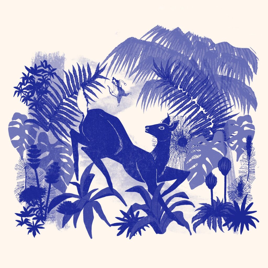
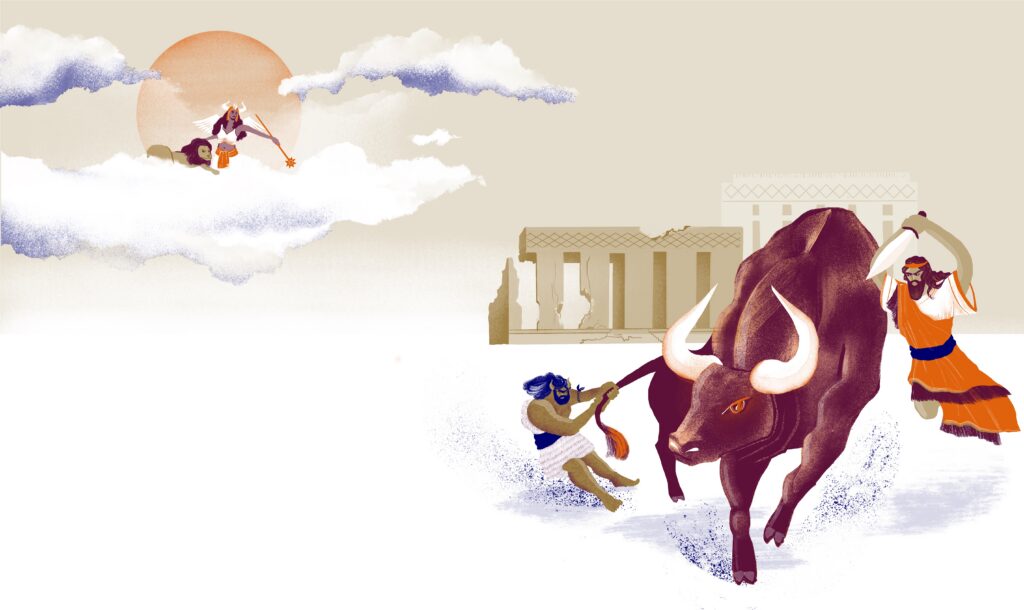
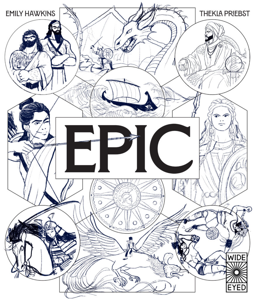
As it happens, my publisher approached me with a new project and paired me with one of their authors, Emily Hawkins. We're currently working on a 120-page collection of epic stories from around the world, inspired by historical artefacts, written sources and legendary figures. It's a fascinating project because it brings together history, mythology and storytelling in a completely different way, and I'm really enjoying it.
At the same time, this whole experience has shown me how much I love being both the author and the illustrator. Having the freedom to shape both the story and the visual world is something I'd really like to continue.
So there are two ideas growing in parallel. Part of me is longing to create something much lighter and more playful - perhaps a story that's told in far fewer pages and relies even more on visual storytelling than on text. And at the same time, I also have an idea for another non-fiction book. I'm very interested in exploring how this hybrid way of telling factual stories can evolve further—how information, narrative and illustration can work together to make non-fiction feel even more engaging and alive. I'm still in the research phase, so it's too early to say much more, but it's exciting to see those ideas slowly taking shape.
The Voyage that Changed the World by Thekla Priebst is published by Wide Eyed Editions, 978-0711293472, £16.99 hbk.
The Klaus Flugge Prize is funded personally by Klaus Flugge and run independently of Andersen Press.
Website maintenance & Copyright © 2026 Andersen Press. All Rights Reserved. Privacy & Cookie Policy.