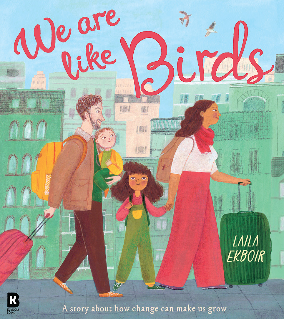
We Are Like Birds, written and illustrated by Laila Ekboir
We Are Like Birds is one of six books on the shortlist for the 2026 Klaus Flugge Prize.
Seven-year-old Flor is moving for the third time. We watch as she leaves her old home behind and begins to settle in a new home, school and country. Laila Ekboir takes a difficult topic and makes it joyful.
Former Klaus Flugge Prize judge, Senior Lecturer in Education: Primary English and Children's Literature, Oxford Brookes University, Mat Tobin interviewed Laila about her book.
Your journey into illustration includes studying at the world-renowned MA in Children's Book Illustration at the Cambridge School of Art, graduating in 2023. Can you tell us a bit about your experience on that course? Was there a specific project, life-drawing workshop, or a defining piece of feedback from a mentor that helped unlock the gentle, deeply human character work we see in We Are Like Birds?
Not to be melodramatic, but I found doing the MA life changing. It was an incredibly happy and stress free time of creative output. Three years on from the MA I’m still distilling many of the lessons I took from the course. It’s hard to pinpoint a specific moment that shaped my work on We Are Like Birds, but I’d maybe whittle it down to three main takeaways:
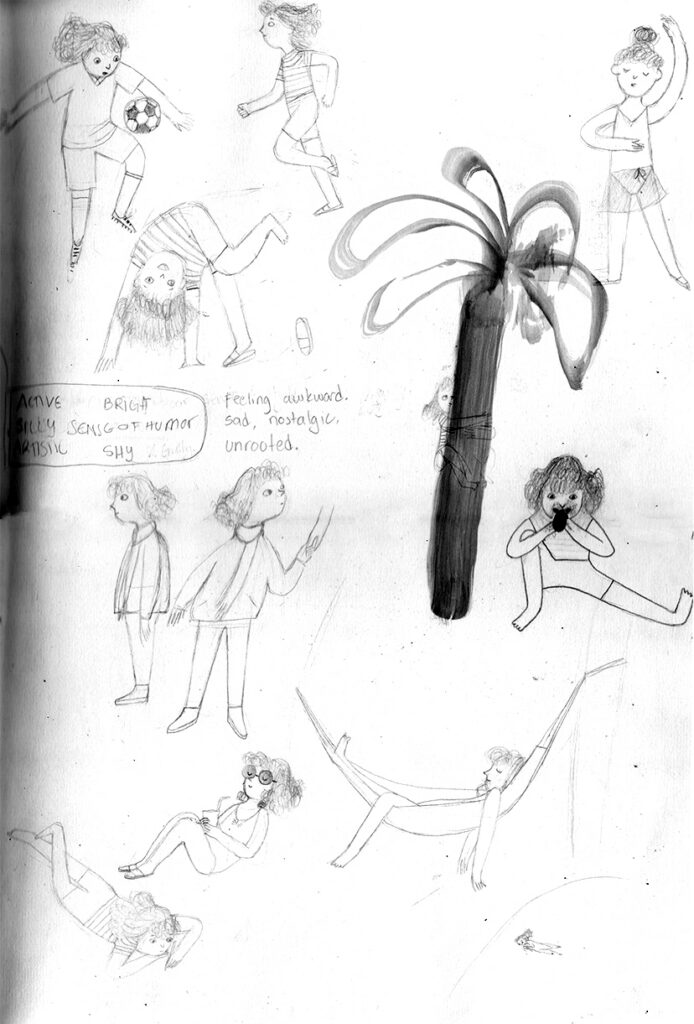
- Observational drawing helped me find a more personal artistic voice and create more authentic characters and environments.
- Spending time in the print room taught me to loosen up and embrace happy accidents.
- Learning to think through images (when in doubt, try it out; make, then judge; the pictures will lead to the story, etc.)


What I find so beautiful and rare about We Are Like Birds is that it completely breaks the usual, often politicised narrative we see in children’s books around displacement. Instead, the story comes across deeply and sensitively as a family who simply moves a lot. By removing those heavy external labels, the focus shifts entirely to a child's raw sense of identity and emotional transition. Why do you feel it is so vital to explore the theme of moving from this internal, personal perspective rather than a politicised one? How did you approach making a story about constant change feel so safe, universal, and deeply grounded for a young reader?
In writing We Are Like Birds, I wanted to share something truthful about my own experience growing up across various countries. It was important to write from an honest place, and as a child I didn’t notice the political implications of being an immigrant so bringing the issue to the forefront would have been dishonest. More importantly, I wanted to make a story people could connect with and readers of all ages connect to feelings, to personal stories, not overarching concepts. I always felt the political dimension was there implicitly, but readers need to empathize with a character before the big picture matters.
As to making the book feel safe, I knew Flor’s family needed to play an important role in the story, because my family was my anchor while we moved around. I thought about them a lot while writing the book.
Early versions of the book ended on a more open-ended note just after Flor begins to feel settled. My editors at Kumusha thought Flor needed to make friends and find her strength through them, which made the story much more hopeful. I’m so glad they had the vision - the book is infinitely better as a result.
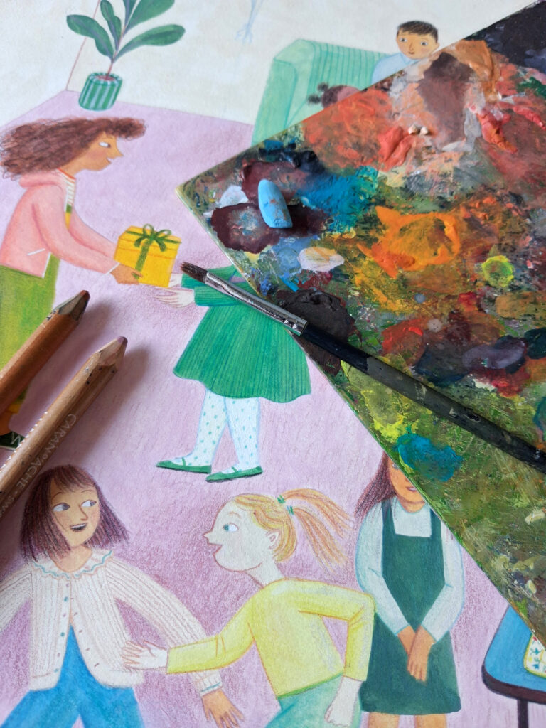
Your choice of traditional materials, coloured pencils, graphite, and crayons, gives the pages an extraordinarily soft, lived-in texture that perfectly mirrors Flor’s internal emotional journey. Can you talk to us about your relationship with these physical tools? How do you choose the specific grain of your paper or the density of your pencils to create that comforting, tactile depth?
The process of making art with traditional media is profoundly enjoyable and that is so important. I think it comes through in the final result when you’re having fun. Finding the right combination of materials took a lot of trial and error, but it’s all fairly intuitive… One day I tried gouache and I liked the painterly result I got. Then I was inspired by the softness in Laura Carlin’s work so I tried layering soft pastels on top. It just felt right. And so on and so forth.


Rather than following a predictable, linear journey from ‘darkness to light’, your use of colour feels like a careful dance between preserving Flor's unique individualism and inviting her into a wider community. How did you plan the colour script across the 32 pages to strike this balance? What was your process for using colour to protect her personal sense of identity while simultaneously wrapping the pages in that beautiful, slow-building community warmth?
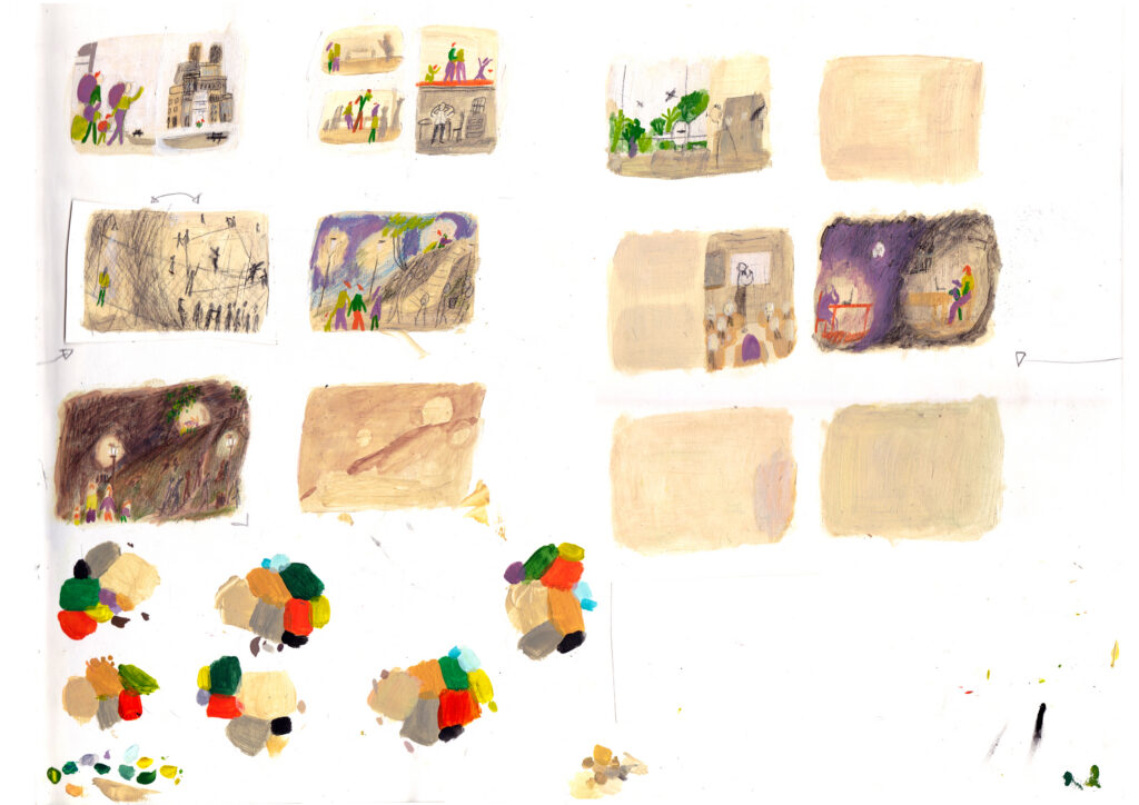
Colour was a real challenge. I knew I wanted Flor and her family to stand out from their new environment through colour as a metaphor for their ‘otherness.’ I made two palettes I’d flick between: one for Flor’s family and one for everything else. The first dummies followed a more traditional colour arch, but my editors at Kumusha thought the result looked too heavy. I shifted from painting Flor’s new home in neutrals to cool hues. The subtext is that Flor starts the book living in a country with a warmer climate and she moves to a cooler country just before school starts in Autumn. By the time they’ve settled, spring arrives so cool yellows and pinks could make their way back into the spreads, allowing Flor and her family blend in more. On the last pages, Flor’s quilt and her family’s clothes hold colours from both palettes to show she’s integrating. I was very nervous about this coming across, so I made colour storyboards with many colour thumbs. In fact, from start to finish, I made at least three colour storyboards - some more complete than others, but it was the middle bit I was most worried about.
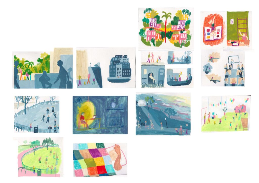
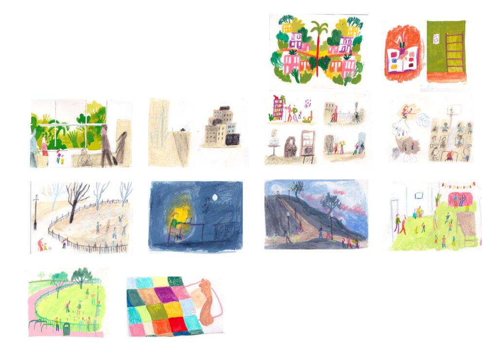
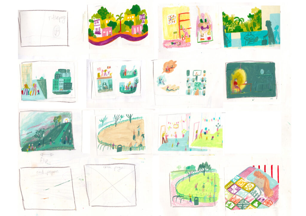

Managing large, busy group scenes, like a bustling classroom full of children or a vibrant playground, is a real compositional challenge. Yet, your crowded scenes feel perfectly organised, allowing the reader to easily spot Flor's expressive face mid-motion. How do you approach the layout of these busy pages? Do you map out specific focal points or use background lines to guide a child's reading eye seamlessly across the crowd?
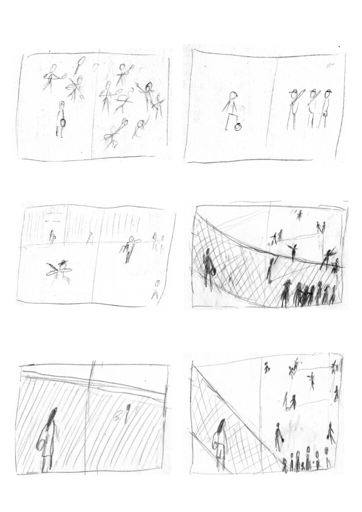
I love making thumbnails. They’re quick, so I can make tons of iterations until I find the right composition without taking too long or getting bogged down in the details. I love playing with perspective and proportions in busy scenes. If some characters are big, and poking out of the frame, it reminds me what it’s like to actually be inside a crowd. I always want to create interesting compositions, I like to think about how to frame the scene, how readers eyes might travel across the page, whether the composition captures the intention I’m going for, but most of all, whether the important bits are easy to read. That being said, sometimes I think my busy scenes are a little too organized - I’m always fighting against perfectionism!

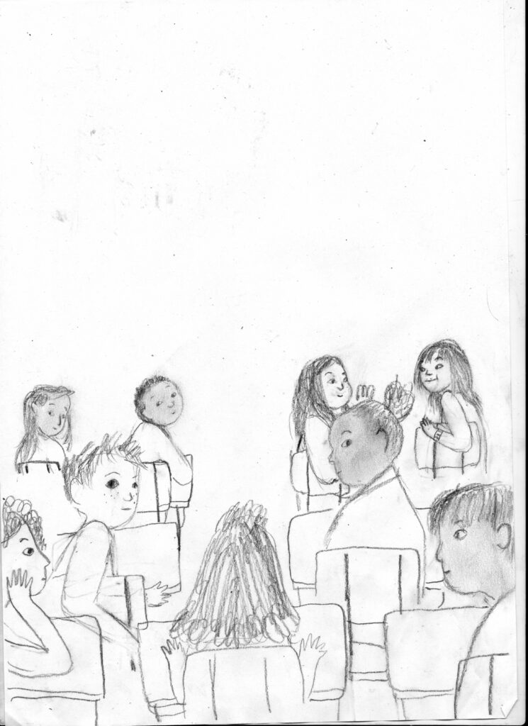
The body language in this book carries so much of the unwritten narrative—the tilt of a head, a protective slump of the shoulders, or the joyful, outstretched arms of children playing. How much of your daily practice relies on real-life observation and capturing everyday interactions in a sketchbook? How difficult was it to keep Flor’s expressions so emotionally consistent across the entire length of the book?
As I mentioned earlier, one of the fundamental takeaways from the MA was how to keep a sketchbook of observational drawings. It’s not exactly a daily practice because sometimes life gets too busy, but it’s been helpful to building a library of characters, poses, and environments that I can draw from. A big part of that sketchbook involves doing specific research for each project, as in finding real-life references. If I can’t do that, I try to look for video footage over reference pictures. I don’t have children myself so finding kids to draw can be challenging. I like to watch documentaries that feature kids to study body language, playing habits, and such. Parks and week-day museum visits are also good places to draw kids.
Kumusha Books is a brilliant new imprint dedicated to celebrating diverse, inclusive voices and authentic stories. What did it mean to you to have your debut picturebook brought to life by this specific team? How did their collaborative design and publishing support shape the final rhythm and pacing of your page-turns?
I’ve touched upon the collaboration with Kumusha already - they were integral to making this book what it is. From nudging me towards the right ending, to helping me develop colour, they saw the potential of what the book could be. They also suggested the layout for my favorite spread: where Flor runs with her quilt to her friends. Originally I had the vignette at the end (where Flor lays under her quilt) as a double page spread. Flor running is so much more dynamic and fitting!
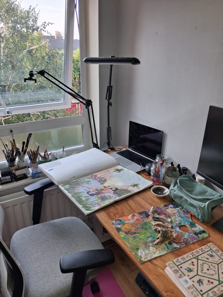
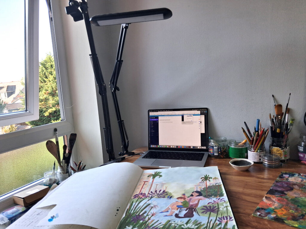
Can we have a tour of your workspace? What do your surroundings look like, and what are the essential tools, sketchbooks, or specific colored pencils that you must have near you when you sit down to work?
This is my very neat and tidy studio (it’s like this 5% of the time).
I won’t show you what it looks like 95% of the time, because it is MESSY. It’s not the most beautiful room… In my fantasy studio, I’d have more light, more plants, less clutter, a bigger book collection and a giant planchest.
For book projects I seem to like using big sketchbooks, I’m not sure why. The wall I most look at is blank at the moment - when I start working on final art for a book project I like to stick each spread up on the wall as it’s finished. Looking at all of the spreads at once helps me maintain continuity and keep track of pacing, etc.
These days I use a lot of gouache, colored pencils, Neo Colours, soft pastels, acrylics, acrylic inks. A recent acquisition I’m very excited about is a cold press laminator I’ve started using as a press!
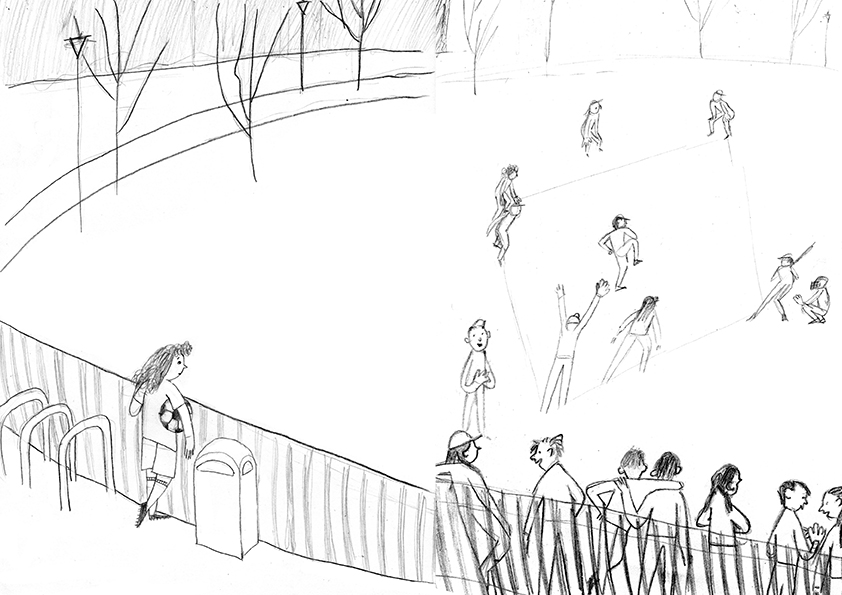
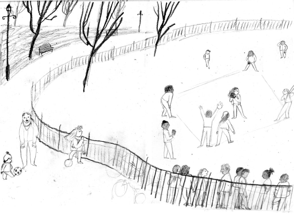
Could you choose a favourite spread from We Are Like Birds - perhaps one of those tender classroom moments or playground scenes - and guide us through its entire journey from the first loose pencil gesture to the final printed page?
This spread went through so many changes. Flor is used to playing football - I wanted the kids in the park to play a game with their hands, but I wasn’t sure which one. I thought about lacrosse, but went with baseball for my dummy. I liked that there was a net behind the home base, which thought I could use to physically separate Flor from the others. In time that net disappeared. Of course when the book sold in the UK, the team at Kumusha suggested I change the game to rounders to keep things more culturally relevant, and that I change the angle so that we got a nice close up of Flor.
Lastly, what is next on the horizon for you? Now that We Are Like Birds is out in the world, comforting readers and inspiring classrooms, are there any new ideas, characters, or future publishing projects currently brewing on your desk that you can share?
There are always a few stories dancing around on my desk! At the moment I’m working with my agent to get them submission ready. I’m particularly excited about a middle-grade comic book about a heroic bird (with a surprise twist) and a picturebook about an ice cream shop that sells very unusual flavors.



We Are Like Birds by Laila Ekboir is published by Kumusha Books, 978-0008693817, £7.99 pbk.
The Klaus Flugge Prize is funded personally by Klaus Flugge and run independently of Andersen Press.
Website maintenance & Copyright © 2026 Andersen Press. All Rights Reserved. Privacy & Cookie Policy.